During my shoot with Wheatus over the weekend, it was decided that lead singer Brendan Brown really, really, really needed a haircut…
During my shoot with Wheatus over the weekend, it was decided that lead singer Brendan Brown really, really, really needed a haircut…
This morning, Brendan Brown and I hiked around some of the more photogenic parts of the North Side of Brooklyn lookin’ for a place to shoot his band, Wheatus, for their upcoming tour. That’s all I’m gonna say for now…you’ll see the resulting shoot soon enough…
Back in the day, one of the guys I assisted quite a bit was Tony Costa, an L.A.-based celebrity photographer who was always coming to New York to shoot for People Magazine. He called me up and said we were gonna be shooting Cissy Houston’s daughter who was getting a lot of notices because she had been recording with Jermaine Jackson. It wasn’t a big deal shoot…just a quick couple of rolls of B&W on seamless in a cheapie midtown rental studio for a one-paragraph mention in the magazine…and then Whitney showed up with a couple of dresses she borrowed for the shoot. No entourage, not even a hair and makeup artist…just a shy 21 year-old girl who was terrified cuz she was gonna be in People magazine. Tony and I were floored! Then she tells us she’s got an album coming out soon and she was signed by Wilhelmina to model and suddenly our quickie shoot had me running out to buy more film cuz we ran out after ten minutes!
And today it’s all so damned sad.
Click on Any Image for Full-Size
______________________________
Maggie Soladay, Photo Editor at American Lawyer, recently sent me down to Washington to photograph Bob Amsterdam, an international lawyer whose clients include Russian oligarchs, South American political prisoners and billionaire Thai politicians. His biography reads like Robert Ludlum spy novel, and I’ll admit that I kinda went into this one with the idea of doing some dark and shadowy images. Problem was, we could only shoot him at his hotel in D.C….in between meetings…and the hotel said there were only a few areas available to use. Let the fun begin!
After a very quick location scout, we decided that one of the restaurants would serve our purposes. Against one wall was a framed tile art piece that sort of reminded me of the movie poster of ‘Midnight In The Garden Of Good And Evil’…
…which after a bit of Photoshop magic looked like this…
Right around the corner was a white-washed paneled wall that provided a simple background for a second portrait…
…and that became the opener for the story…
But I wasn’t quite done yet. Right outside the restaurant was a staircase leading to the hotel’s courtyard. Despite the bitter temperature and rainy day, this fit the dark, forbidding idea I had in my head of this international man of mystery skulking in the shadows, and it helped that it was also shielded from the rain! I convinced Bob to stick around for just a bit longer, and Kaz and I quickly pulled some lights outside…
Nice, but not exactly what I had in mind. After dialing the color temperature down, Photoshopping all those leaves off of the stairs and doing some digital masonry by ‘bricking over’ the distracting area at the top of the stairs, this was our final image…
Three distinctly different portraits in half an hour, and then back on the turnpike to New York!
…and I’m hardly gonna be mistaken for a shrinking violet, but I still think these posters that have sprung up all over town for the new season of ‘Mad Men’ are in bad fucking taste…
Just Google “Mad Men Poster” and you’ll get hit with hundreds of pages with the words ‘Controversial’, ‘Desecration’ and ‘Uproar’ featuring prominently in the headlines. Esquire suggests that the only people upset about this are “bloggers looking to create controversy”, and to that I cry, “Bullshit”! I had heard about the posters a couple of weeks ago when Michael Surtees, a graphic designer friend of mine who catalogs his daily existence on his flickr account, posted a photo of one of the posters he casually took on the walk to work with the caption, “I’m not too sure how appropriate is this Mad Men poster”…
He then posted his own thoughts on the poster and the ethics behind producing such an ad on his designnotes Blog. Within days his photo had been viewed almost 37,000 times!
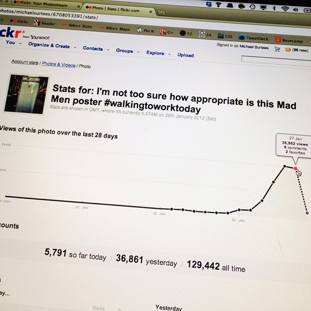
*EDIT* Michael just told me the photo is now at 250,000+ views…!
I hadn’t actually seen one in person until this morning when I got off the Times Square shuttle and the entire tunnel into Grand Central was plastered with them. It stopped me in my tracks. And it really pissed me off. When I was taking the shot at the top of the page, a guy walked by and said, “That Sucks!”, and I wondered if he thought maybe I was just another tourist documenting my time in the Big City and he wanted me to understand the frustration a real New Yorker might have over seeing something like this every Goddamned day as you commute to work. I wanted to say something back to him…to let him know I was just as upset as he was…but he was already gone, swallowed up among the thousands of people who seemed to be purposefully ignoring what was on the walls around them.
I know how ad guys think, and I know that not one of the fuckers who came up with the concept or worked on this campaign or greenlighted the final art didn’t know full well that they were capitalizing on the falling man imagery from 9/11 to advertise a bloody TV show. I know they’re all feelin’ puffed up and important, cuz look at how everybody is talking about what they did! All I can think is what kind of uncaring asshole would be proud of producing this, and especially to place them all over Manhattan! And before you cry that this poster is merely an extension of the show’s opening title sequence that has been part of it from the beginning, again…Bullshit! The Mad Men opening credits start in the context of an office environment and then the artifice falls away and the falling character very obviously implies the downward spiral of the shows main character. This poster was only produced to create the exact kind of controversy us ‘bloggers’ are writing about. And good for them. It worked! After almost two years off the air, we’re all talking about Don Draper again, even if it does bring up all those shitty memories from a decade ago. And maybe I’m wrong, but I seriously doubt Mr. Draper would ever sink so low as to pull up the memory of people leaping to their deaths to sell a product.
Click on Any Image for Full-Size
______________________________
I first photographed the annual Barron’s Roundtable cover story back in January of 2007, which makes this the sixth year I’ve had the privilege, and each year the team of Art Director Pamela Budz, Photo Editor Adrian Delucca and myself have stepped up our game to reinvent creative ways to show the gang of financial prognosticators. This year the three of us came up with the idea that centered around the entire group posing in front of a blackboard. I did a quick mockup using shots of the Roundtable members I had taken previously…
So we packed up our usual thousand pounds of lighting gear along with a blackboard and various other set pieces and headed uptown to The Harvard Club to make it work…
Our main prop…a 4’x6′ blackboard…
Now for those of you who haven’t read about some of the previous Roundtable shoot days, I’ll break down the schedule for you. We have roughly two hours to shoot everybody before the meeting begins at 10:00AM. In that two hours we have to come away with two cover shots (one for main January issue and one for the mid-year follow-up in June), three additional situations that will be used for openers in three January issues, an opener for the June issue and individual portraits of all ten Roundtable members that will get dropped into the copy of the June issue.
Ten People. Two Hours.
Oh yeah…we shoot everybody separately as they arrive at the Harvard Club and assemble those shots into the group photos for the cover and inside openers.
Simple.
Here’s what it looked like…
Adrian reminding me we have very little time…
And this is just from the Blackboard set. You can see the second white seamless setup behind me in one of the above photos, but I can’t show you any of that until it publishes in June.
Once we had finished with the people, we now had to shoot the blackboard, out of the rigging we used to suspend it for the portraits and back on its stand…
…and various elements on the blackboard that I could insert into the final compositions. Since Pam can freehand fonts way better than any of us, she got to draw the cover headline on the board…
Adrian was elected to do the ‘Charts & Graphs’…
And with all of the elements photographed, now it was up to me to push everything together in Photoshop and manufacture that group shot for the cover. The individual photos looked like this…
…so first I had to silhouette the images and paste them into a new Photoshop document…
…and then fill in the group with everybody else…
…do a rough mockup with the blackboard inserted behind the group…
…and after Pam and Adrian had approved the final composition, do a whole lotta fine-tuning…like erasing the rough edges around the silhouette, feathering the hair to blend naturally against the blackboard, add shadows in front and behind everybody and finally cook in my own special sauce of color and contrast adjustments…
With the cover outta the way, next up was the week one opener. I started by seriously stretching out that blackboard so that it would run over a two-page spread, then I added both the people and their names that I had them write on the board…
Using the same fine-tuning I did on the cover, this was the final image…
And here’s how it appeared in print…
And using the same basic technique, just on a smaller scale, here is the image that ran as the opener in this weeks issue…
Just like I said…simple!
Click on Any Image for Full-Size
______________________________
I’ve been shooting Sam Palmisano since he was named CEO of IBM back in 2002, and as CEO’s go, I always found him to be a very honorable, straightforward guy. But I also knew that since he had reached IBM’s mandatory retirement age of 60 he would be stepping down, so when I got the call to photograph him a couple of weeks ago for what would probably be his last hurrah at the helm of the largest IT company in the World, it was a little bittersweet. I did three covers with him and made a lot of connections with IBM in the process. But connections aside, I was still ‘warned’ by the P/R person that Sam didn’t like being photographed and that he would only have five minutes. I assured her that I knew the drill and that Sam and I went way back…we would be ready to rock-n-roll the second he walked through the door. We were taken to the Board Room and went about turning an area that could easily double as the bridge of the Star Ship Enterprise into a white studio, then we quickly set up a second shot, ‘cuz I didn’t wanna come away with just just one since this might be the last time I got to bother Sam with my camera. And when Sam arrived, true to form, he warmly greeted us and asked how we had been doing since the last time I had to put him through a photo torture session. And then with the P/R person looking at her wrist, our five minute clock began to tick down…
You can see how we set up both situations side-by-side, mostly because I knew if I had to walk Sam more than 50 feet a second shot just wasn’t gonna happen!
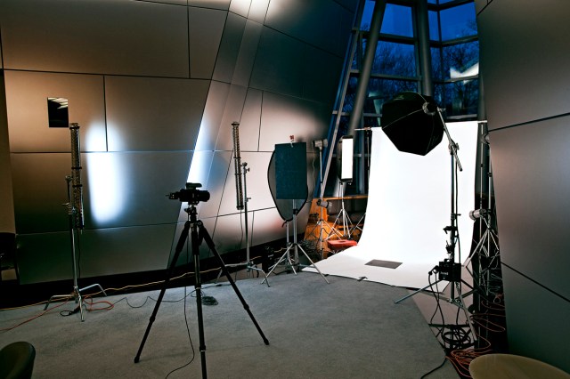
The simply ridiculous area we dropped our white background…
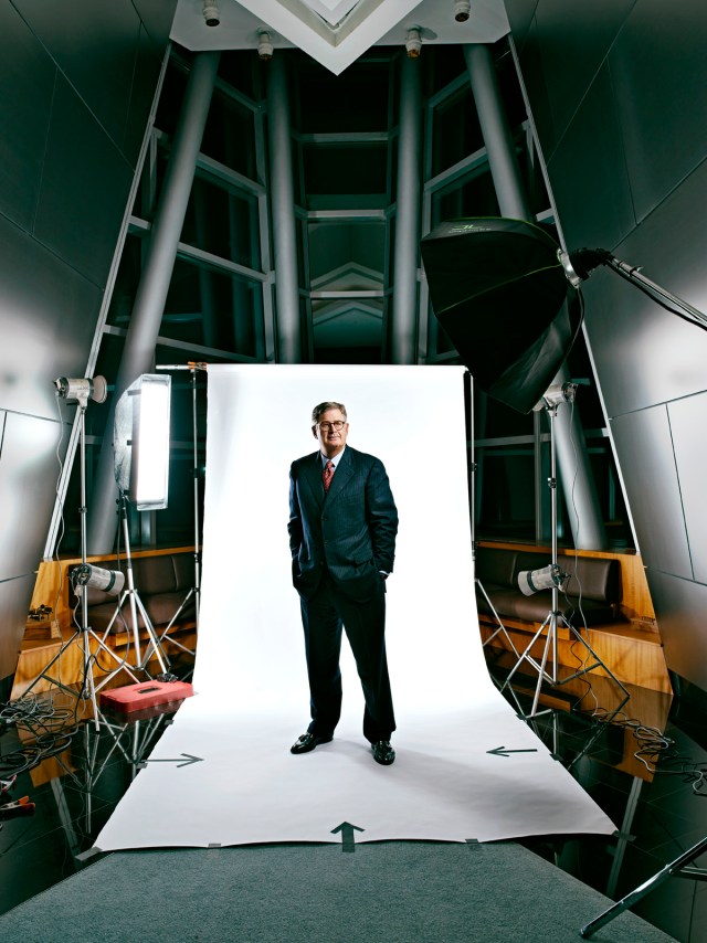
…and the final spread in the magazine…
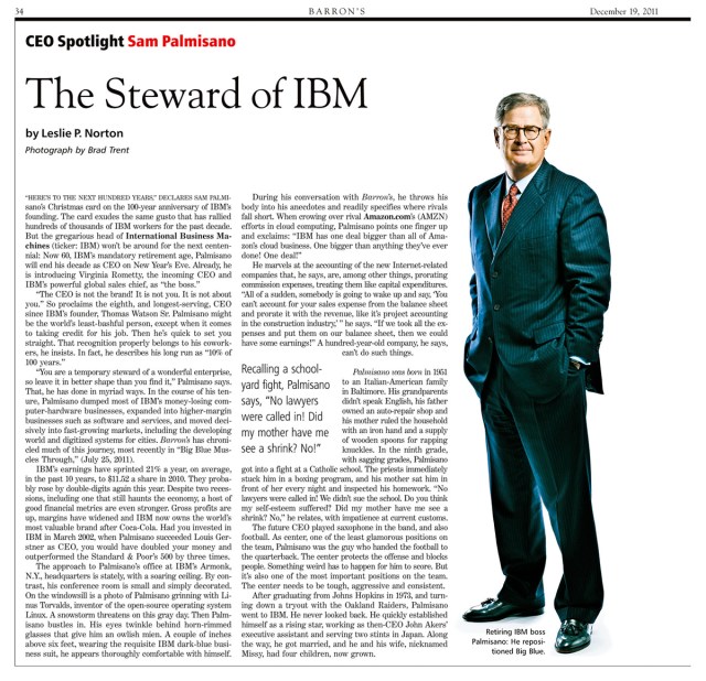
The second shot was deceptively simple…I planned to work with the ambient light in the room and drop him against the stainless steel wall that I had lit with only two of my DIY Kino-Flo lights…
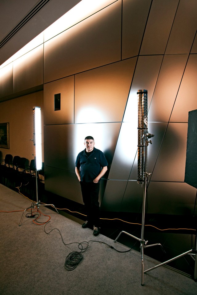
I just checked the metadata on the files. The first shot was at 17:06:54…the last frame was at 17:14:55…..Sam must have enjoyed our last session together ‘cuz he let me go over by three minutes and one second.
Click on Any Image for Full-Size
______________________________
Not to get you guys thinking that I’m in a creative rut or anything, but hot on the heels of last weeks post about my Digitalman, here’s the series of photos I did of Glen Whitney…a Harvard-educated mathematician and former hedge fund manager…for a story on philanthropy in Barron’s Penta.
An unapologetic numbers geek, Whitney is pulling together about $30 million and building the Museum of Mathematics in a prime 20,000 square foot raw space on East 26th Street right on Madison Park in Manhattan. Since the construction hasn’t even begun on the museum, Adrian and I thought it might be kinda cool to inject some math into the portraits, and maybe using a projection technique would be one way to to pull it off. But the magazine budget wasn’t quite as lofty as the previous ad shoot, which meant spending the kind of money required to produce the job with the super-spendy toys I used on the Digitalman was not gonna be in the cards…so we went about as low-tech as possible, left the strobes at home and decided to work with the available light and use nothing but a digital projector. And it all ended up being not only a lotta fun, but we got some very cool portraits of Glen in the process.
I did a location scout, ‘cuz I really needed to get an idea of exactly what we had to work with…a dark, dirty cavern with lots of rough concrete walls and pipes was what I found…
After spending a few days making various Photoshop ‘slides’ using hundreds of real math equations, we rented the biggest digital projector the budget could afford, and Bo and I headed off to MoMath…
…and a couple of the final selects. We used the ambient light from the construction worklights to fill in the background areas, but the shot was essentially lit entirely by the digital projector…
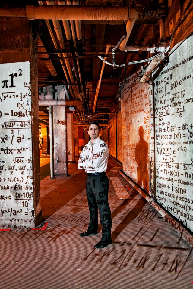
Next, we moved to an area that was a bit cleaner and less cluttered for a cover image…
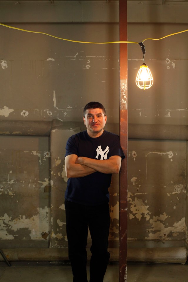
…and I broke out my home-made Kino-Flo florescent lights and we did this…
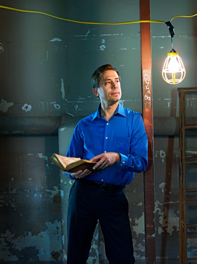
The Museum of Math is scheduled to be completed next year…check out the details on their website and make sure to take the kids when it opens!
Click on Image for Full-Size
______________________________
Sure…with a little Photoshop and a lotta time you could probably manufacture an image like the one above, but wouldn’t it a lot more fun to pull out a $10,000 lighting gizmo and do it all in-camera?!! That’s just what we did to illustrate the idea of the flow of a digital data stream. The hyper-priced toy was the Profoto ZoomSpot…
…the type of follow spot used to create stage lighting effects, but in this case it’s fitted with a 4800 w/s flash tube. All I had to do was make up a few transparencies of ‘zeroes’ and ‘ones’ to drop into the projector and then we could play around with color combinations and lighting ratios until I got the kind of dramatic image I had floating around in my head. The lighting diagram shows the setup wasn’t that complicated…
A large Chimera Super Pro and both skim lights were covered by two Full CTB gels to bathe the entire set in blue light. The background light…with a half-blue and a magenta gel…was aimed through a wooden Matthews cucoloris that created the shadows on the seamless. All that remained was to get the color and lighting ratio of the ZoomSpot just right so that the projected image popped at just the right intensity. Two full CTO gels and setting the spot about one stop brighter than all those blue lights was what we ended up with.
My eclectic tour of the Nation’s boardrooms recently took me to the offices of Riverpark Capital, where I was to photograph Morty Schaja, Mitch Rubin and Conrad van Tienhoven for a Barron’s profile. Lest any of you think that the life of a photographer is all Supermodels and hangin’ with Diddy, I beg you to read on…
Riverpark’s midtown office would never be described using words such as ‘opulent’, ‘palatial’ or ‘ostentatious’. But they are hardly alone in this…most places I find myself having to shoot in are equally utilitarian…but it can rattle my bones when I keep seeing the same furniture, cubicles, lighting and paint used again and again and again. Still, after a quick tour of the space, I decided to begin in the reception area…
…sort of a mini-history of the financial markets as seen through the eyes of Time Magazine. I kinda thought it would be a good place to start, so we dropped Mitch and Morty onto the little couch and went to work…
But we also had to photograph a situation with Conrad, the third partner in the firm, and there was zero chance of him fitting on that couch. That part of the story brings us to this conference room…
The first thing you gotta do when faced with the dreaded White Board/Conference Table scenario is ignore how frightfully normal the situation is and try to envision it instead as a set piece that will only work because of the personality you can bring to it. That first means usually cleaning it up and add some tasty lighting…
Next, stir in the talent…
…but the whole serious/symmetrical thing wasn’t doin’ it for me, so I told the guys to just go about doing what they normally do…let loose and ignore me…and they did…
…and that kind of unguarded moment was exactly what Adrian wanted for the story…
Click on Any Image for Full-Size
______________________________
When my friend Gabrielle Aimée asked me to shoot her new CD cover, she was very specific. She wanted to keep it very simple, but very direct. She wanted an intimate connection with the viewer, with minimal styling…maybe just a white t-shirt. Oh yeah…and we had to keep it dirt cheap, ‘cuz in case you forgot, my indie friends aren’t exactly rolling in GaGa Money to throw at their self promotion!
Now one of the things that always impresses people when they first arrive at Damn Ugly Photography is the giant 17 foot by 9 foot high South-facing window that greets them, and on the day Gibbles came up to my place to go over a few ideas, I had her stand up against the wall next to that window and popped off a few quick frames, just to see how she looked on camera with no styling and just a big wash of soft light…I was kinda blown away with the results…
So blown away, in fact, that I told her maybe we should just shoot here, and use the same big, soft lighting. I had an idea to include some rough hewn wood planks and maybe a painters canvas drop as backgrounds, but the real focus had to be her expressions. With that in mind, here’s a bit of what we did…
We started with a few seated poses on my new plank floor…
After a quick wardrobe change we did a few close-ups, but amped-up the window lighting to brighten things up a bit…
Then I turned our plank floor into a wall and we moved in this direction…
And even though we were diggin’ the window light, I figured I would fire up a couple of lights and do a few moodier variations…
And then, just when we thought we might be done, I messed her hair up, cranked up the ringlight, and things took on a totally different look…
Finally, Gibbles told me she wanted to do something fun for her boyfriend, Brendan Brown, the driving force behind the cult alt-rock group, Wheatus. That ‘something’ involved her brand new guitar…and not much else…
Gabrielle is set to release ‘I Know Better’…the first single off the album…and all you have to do is go to today’s Song of the Day to download it.
Click on Any Image for Full-Size
______________________________
Normally when you get the call to shoot a Billionaire industrialist, you can pretty much bet you’re gonna have five minutes in a stark boardroom and there won’t be a whole lotta fun involved. This was exactly what Jeff Beasley…the Picture Editor at FourFourTwo magazine…hoped wouldn’t happen when he asked me to shoot Bob Rich, the Chairman of Rich Products Corporation, for a feature on unlikely soccer club owners. Rich had recently gotten involved with the Bedlington Terriers F.C.…a small football club playing in the Northern League based in Bedlington, England…after tracing his family tree back to the area and after his wife purchased the title of Lord Bedlington for him as a gift. Jeff wanted a portrait that would show Rich’s Big City American roots…something that might mimic a photograph I did of Howard Sontag high above Madison Avenue…while still tying in the Soccer aspect of the story. It turned out the Buffalo-based billionaire was going to be in New York City for a couple of days, but his schedule was extremely tight. We had a tiny window of opportunity to shoot him at his hotel…the Peninsula New York…but while extremely nice, was not exactly a soccer pitch in midtown. I called the hotel and their P/R person told me they that since it was Mr. Rich, they would gladly make the roof bar area available to us and that it has a “lovely view” of Central Park. Feeling buoyed by that news, I headed uptown (in the rain) to scout it out. This was the “lovely view” of the Park…
It wasn’t exactly the pastoral oasis amongst the concrete I had envisioned, but panning the roof I figured I could make something with what I had to work with…
The next morning the rain had stopped and Kaz and I arrived at the (extremely humid) crack of dawn and went about moving the 50 or so tables out of the way to turn the Salon de Ning Rooftop Lounge into our studio for the day…
With the sun out, lighting was super simple…all we needed was the Mola Setti on a boom and the backlighting did the rest…
We even broke out the tried & true ‘Ball Juggling’ routine…
Bob approves…
…and FourFourTwo liked it, too…
Click on Any Image for Full-Size
______________________________
For Part Two of my story featuring Anthony “Superman” Scaramucci, Bloomberg Markets magazine had me head back up to SkyBridge Capital to photograph Managing Partner Ray Nolte and Senior Portfolio Manager and Managing Director Troy Gayeski. Since I had already shot their boss shadow boxing in his office surrounded by cartoon characters, I kinda had to think of something equally offbeat for their portrait, but the rest of the SkyBridge office was decidedly not offbeat. It was, quite frankly…pretty utilitarian…office cubicles and a rather small trading area. But as Kaz and I were walking the halls we passed a tiny little kitchen area that caught my eye…
Now, I’ve been shooting guys in their offices my entire professional life, but this was the first box of ice cream cones I’ve ever come across. And even though the space was barely big enough to swing a cat, ice cream cones in a financial office had to be a sign to stop and take a photograph! So we did…
…and when Troy…who is actually at least an inch taller than Ray…jumped off the counter and stood next to him, we pulled off this almost Funhouse Mirror-style image…
Even though they were standing next to each other, the combination of the super wide-angle lens I was using and Troy leaning back slightly on the counter made him look freakishly small! But it certainly makes you stop and look.
Next, we decided to shoot them in the Sea of Cubicles that made up the trading area, but add a little bit of surreality by dropping a white seamless behind them…
…and the final image…
Click on Any Image for Full-Size
______________________________
Even with the highly charged, Occupy Wall Street attitude that is gripping the country, you hafta look at Anthony Scaramucci as a pretty interesting guy. Besides being the founder and managing partner of SkyBridge Capital, an asset management fund with about $8 billion in the bank, at 47 he’s already written his autobiography…‘Goodbye, Gordon Gekko: How to Find Your Fortune Without Losing Your Soul’…had a cameo in Oliver Stone’s ‘Wall Street 2: Money Never Sleeps’, volunteers on the board of The Lymphoma Foundation and The Brain Tumor Foundation, is a rabid Mets fan who also hangs out with New York Jets head coach Rex Ryan, got nicknamed “Gucci Scaramucci” by former President George W. Bush, and he has enough jam to draw investment superstars like Steven Cohen, Leon Cooperman and Kenneth Griffin and political heavies like Colin Powell and Gordon Brown, to the SkyBridge Alternatives Conference, his annual symposium for hedge-fund managers and investors. But when I was sent to photograph him for Bloomberg Markets magazine, the one thing that jumped out at me was his unabashed love for all things Superman! Every wall and surface in his office has Superman memorabilia…posters, painting, games, sculptures…it was like I got sent to a 12 year-old kid’s room, and not the office of a Master of the Universe. But I quickly understood how this street-smart Harvard Law School graduate who wants “…to be the Peter Lynch of the hedge-fund industry!” held the Good vs. Evil metaphors that are at the center of every Superman cartoon close to heart, so we ran with it…
For once, Bo was the perfect height to act as a stand-in…
Our Barrel-Chested Financial Man of Steel…
…and the completed opening spread, with new creative director Siung Tjia’s Superman cape graphic that wraps the headline…
Click on Any Image for Full-Size
______________________________
So I get a call from Andrew Mitchell, one of the photo editors at the London Sunday Times, and he needed me to hightail it to the Palace Hotel to shoot a feature on George Buckley, the Chairman & CEO of 3M. Now the Palace is a really nice hotel, but the idea of shooting a couple of portraits in his suite just kinda seemed flat, so after a bit of pleading with the hotel’s P/R people, they said if I was quick I could use the Gilt Bar as a studio. So Kaz and I packed up the van and made our way uptown, but not before making a stop at an Office Depot for some props. You see, 3M makes more than 55,000 products, including adhesives, abrasives, laminates, fire protection, dental products, electronic materials, medical products, polishes, waxes, car shampoo, car chassis rust protection, electronic circuits and optical films. But if you had to pick the one thing they make that everybody knows, it’s the Post-It® Note, and I bought almost every Post-It® Note on the shelf at that Office Depot! I had been to Gilt a few times and I had an idea to dress up the ultra-modern lounge area with a few (thousand) of the little paper stickies…
Kaz sits in for the first test…
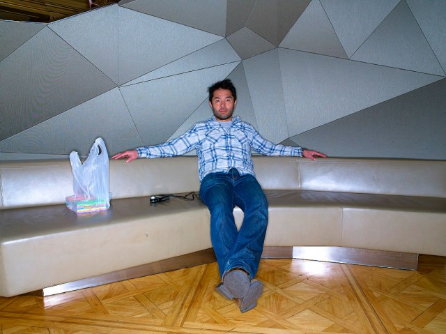
…about half an hour later, after Post-It-ing the set…
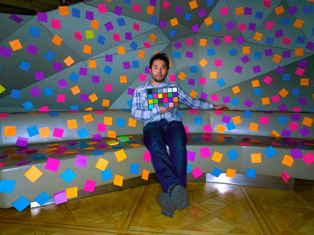
…and the final image of George…

For a second photo, we turned 90 degrees to the left and set up a shot with George framed by a golden wall and warm lights…
That was nice, George…but what do you say we try this…

Dont’cha just love it when the CEO of a HUGE multinational corporation has a sense of humor?!!
Click on Any Image for Full-Size
______________________________
Here’s another from my ongoing series of CEO Spotlights from Barron’s…this time featuring Dr. Marijn Dekkers, the new CEO of Bayer AG. He was up at the Barron’s offices to be interviewed and I was told that because of his tight schedule, I would have precious little time with him for the portrait session. So we set up in the tiny video studio the magazine has tucked away down a back hallway and waited. Precisely on time, Dr. Dekkers and his publicist arrived and yes, they were already looking at their watches. Still, the five minutes was more than enough time to get off a couple of looks…without getting a headache!
Click on Any Image for Full-Size
______________________________
Jim Grant, the publisher of Grant’s Interest Rate Observer, is one of Wall Streets greatest critics, and Adrian Delucca had me head downtown to shoot him for a recent Barron’s feature. Jim’s office was pretty small, but an institutional yellow wall behind a doorway…
…and his wall of books…
…gave me what I needed for a couple of nice portraits…