Cooking With Cash For The Barron’s Roundtable

2013_02_04_cmyk_NL_

Click on any image for Full-Size

_MG_0006

Here’s a quick follow-up to what we did with that $30 Grand in cash I needed as a prop for the Week Two and Week Three group shots of this years Barron’s Roundtable shoot. Once again, our object was to shoot as many different single images of each Roundtable member playing around the cooking theme so that we could later assemble them into our little stories. Since the theme played on the idea of cooking up a recipe for the perfect economy, cash…lotsa cash…was required as our main ingredient!

_MG_0116

_MG_0141

_MG_0187

_MG_0048

And here’s how the final pages looked…

2013_01_28_cmyk_NL_

2013_02_04_cmyk_NL_

Behind The Scenes At The Most Expensive Barron’s Roundtable Yet

Click on any image for Full-Size

We here at Damn Ugly Photography have done many, many, many Barron’s Roundtable shoots over the years, but this time we came close to breaking the bank…literally! Our cover idea was to have the members of the Roundtable rockin’ Chef Props as they cooked up the perfect economic recipe for the coming year, and for our ‘ingredients’ we needed cash…lots and lots of cash

IMG_0167

Since Photoshop has added high-tech security filters that make it almost impossible to scan money and print it out…and prop money looks way too fake…we decided to hit my bank and just get real cash (that’s about $30 Grand in the bag) to use in our recipes…

IMG_0189

The basic cover setup was a raised plexiglass platform that I could shoot from both a low angle for the cover image, and from slightly above for the inside compositions for the Week Two & Week Three images…

IMG_0155

Hasselblad H1/50mm f4.0 with a Leaf Aptus 33 for the cover and the 5DmkII/24-70mm f2.8 for the higher-angle inside shots…

IMG_0162

IMG_0160

As in previous years, we have only two hours to shoot everybody…all separately as they arrive at The Harvard Club for the meeting…on two different sets, and we must come away with two covers (for the January and June Mid-Year issues), two inside openers for those covers, two feature openers for the second and third week follow-up issues and individual shots of each person for the June Mid-Year issue. In those two hours we try to cram in as many different poses and props as possible so we have enough to work with when it comes to assembling the final group shots. Here’s some of the fun…

Marni worked her super-fast makeup magic on everyone before they got on set…

IMG_0164

Oscar Schafer…

IMG_0176

IMG_0174

2013_rt_cover_oscar_schafer_00032.mos

Brian Rogers…

2013_rt_cover_brian_rogers_00001.mos

Fred Hickey…

2013_rt_cover_fred_hickey_00008.mos

Abby Joseph Cohen…

2013_rt_cover_abby_cohen_00013.mos

Scott Black…

2013_rt_cover_scott_black_00028.mos

Adrian and I liked the idea of placing everyone on the edge of a mountaintop made from a butcher block cutting board and viewing them from below…

b_block

…so once I shot a bunch of angles on the board, we had all the raw materials in place. Now it was up to me to assembly the individual shots into our cover and feature opening photos…

The 2013 Barron's Roundtable

Click on images for Full-Size

2013_01_21_cmyk_NL_

The 2013 Barron's Roundtable

__rt2013_inside

This stuff never gets old!

IMG_0172

Stay tuned next week and you’ll see what we did with all that cash once Barron’s runs the Week Two and Week Three images…

In Case You Were Wondering…CEO’s Are VERY Busy!!!

Click on Any Image for Full-Size
______________________________

I logged another CEO Spotlight for Barron’s a few weeks back when Adrian sent us to shoot Bob Benmosche, the CEO of AIG. As usual, the drill is we get told The Boss is extremely busy and I will only be allowed five minutes to get everything I need in the can. I typically take the ‘five minutes’ as shorthand for we hafta be quick, but this time I knew we had no wiggle room. Benmosche was going to shoehorn us in between an earnings statement conference call and a Town Hall Meeting, so his schedule was carved in stone. There was going to be very little time for small talk, but I know how important it is to come away with a portrait that shows the subject’s personality. Obviously, with such little time to shoot we had to have our setups nailed down when he showed up. Here’s how it went.

The CEO Spotlight is formatted as a full-length portrait on white, so on this day we turned the top floor of the AIG building…with it’s 18-foot ceilings and Million Dollar views…into our studio…

That gave us our feature opener…

We also did a second shot where I used my Ghetto-Flos in the hallway area directly behind where we had the seamless set up…

…which gave us this…

…that morphed into this after a wee bit of Photoshoppery…

And we were done…in five minutes.

The Doctor Will See You Now – Sanjay Gupta For Prevention Magazine

Click on Any Image for Full-Size
______________________________

It took a while, but my friend Marybeth Dulany finally called me with a gig over at Prevention Magazine. I used to work for Marybeth a lot back in the days of ‘Rosie’ magazine, but once that folded she moved on to ‘Health’ where my particular style wasn’t a good fit. She ended up at Prevention last year and now she had something kinda cool…a profile of Dr. Sanjay Gupta for the July issue. The Damn Ugly crew made the trip down to Industria and here’s a bit of our day with the Doctor…

We started with a white setup for some cover stuff. Cate Sheehy was styling…

…and Marni Burton handled makeup…

We even did a bit of off-set/artificial portrait stuff that made it into the story…

I also set up a canvas backdrop that had a nice, terra cotta look to it…

I got to use my new 5-foot PLM umbrella for the first time…what a great light! I was really impressed at the quality of light and how large the coverage was. It was set up about 15 feet away from the subject and kicked out an open, but still contrasty light that gave me a wonderful shadow.

Finally, since it was such a nice day, Marybeth asked if we could do a few outdoor shots, so we fired up a 600-B and hit the street…

Marybeth was very happy…

And here are the final pages…

Soccer by the Pool with Olympian Megan Rapinoe

Click on Any Image for Full-Size
______________________________

Stacey Pleasant offered me a fun gig a few weeks ago. She produces a series of advertorials for McDonald’s that runs in Sports Illustrated and they wanted me to shoot Megan Rapinoe, a mid-fielder on the United States women’s national soccer team that’s going to London for the Olympics. Megan was gonna be in town doing some P/R and had very little time available for a shoot, so Stacey arranged to do everything at her hotel, the Dream Downtown. The advertorials are single-page interviews with the athletes and formatted in such a way that there has to be a lot of clean space around the person in order to run the type over the background. For our purposes, the options for locations at the hotel were limited, but we were offered the swimming pool area. Both Stacey and I figured using the pool as a clean backdrop would work perfectly for the type…but we didn’t know about one of the main design features of the Dream’s pool…

Portholes!!! Hundreds of little (and a few BIG) portholes at the bottom of the pool! Well…we were locked into the location, so I was just gonna hafta deal with that later…right now we had to start shooting!

While Marni worked on Megan…

Ben stood in so we could pick an angle on that pool, but without the sun things were looking kinda flat…

Megan’s a pro…she immediately understood the Damn Ugly Photography aesthetic…

And as if by magic…a few frames into the shoot the Sun came out…and all was right with the World. We decided to still keep the full-CTO filtered bare head we set up for a Sun-like skim camera left, ‘cuz it added a nice warmth to the highlight created by the real Sun…

But as good as that looked, I still had to deal with all those portholes…a few hours and a lotta mouse-clicks later, and the shot was now ready for type…

The final page…

With the pool shot in the can, I pressed for a couple of minutes more to do a second shot. Immediately to the left of the pool was a wall clad in Stainless-Steel that could be kinda nice. The natural light was a little flat, so we threw on the ringlight which gave us a hot highlight that ran vertically through the middle of the shot…

That looked like Hell, but once we got the available/strobe balance down, we had a little fun…

The final image…and that ringlight added a nice, smoky highlight rising off of her…

The issue hit the stands this week. Good luck in London, Megan!

The 2012 Barron’s Roundtable Mid-Year Report

First off…I’m gonna thank Timothy Archibald for getting me off my ass and back on the blog! He wondered aloud on his own blog the other day about how facebook might be causing a lotta guys like me to slack off on our blog duties, so thanks T.A.

Now, back to business!

My twice-yearly Barron’s cover story on the meeting of their Round Table participants popped up a couple of weeks back, so just as I did for the Black Board cover back in January, here’s a little behind-the-scenes on how we put together the cover for Part 2…

Click on Any Image for Full-Size
______________________________

Since we only have about two hours to shoot all ten Roundtable members individually for both covers and all the inside photos for the two issues, we have to have our two sets nailed down pretty tight. And because we decided on the very complicated Black Board set for the January cover, the Mid Year cover set had to be somewhat simpler. Barron’s Photo Editor Adrian DeLucca and I came up with the idea to use arrow props that would be held to illustrate the Up and Down market trends and pose everyone on white around a few cubes…

Once we got all ten members shot, now I just had to assemble them into believable groups for both the cover and the inside opening spread…

…the final spread had most of those red arrows changed to blue…

…and for the cover we went without props altogether…

See y’all next January…

There Is No Photoshop Easy Button…

Click on Any Image for Full-Size
______________________________

Over the past few weeks you didn’t have to look too far to find an online review claiming how spectacular the new Photoshop CS6 upgrade is and how it’s gonna make everything you photograph so much better…but all I could think was no matter how easy the software engineers at Adobe make image editing by adding fancy new filters, content-aware tools or sexed-up widgets, none of that amounts to beans if you don’t have the smarts to envision the final result in that pile of mush that occupies the space between your ears. And it reminded me how I recently had to put some of my Photoshop smarts to good use and ‘fix’ a less than ideal situation when I was shooting the Annual Report for Philadelphia-based Glenmede…using Photoshop CS3, no less…

I had gone down to Philly a few weeks before the shoot to scout the location…Lenfest Hall at The Curtis Institute of Music…and on the day of the scout it was bright and sunny and would give us the perfect light & airy backdrop for the Management Committee photograph…

Problem was, on the day of the shoot, those 30-foot high windows gave us a view of Philly at it’s darkest and rainiest…

That’s when it became pretty clear I had to figure a way to let Photoshop brighten things up and get me to where I needed to be.

Here is the unretouched original, straight out of the camera…

The first thing I did was slide a new floor under everyone that was shot separately using a 16-second exposure…

For the next step, I figured the hardest thing I would hafta do would be to blow out all the detail in the windows to give the impression of it being a sunny day…but then things even got more interesting…the layout changed! My client wanted to know if it would be possible to give them more space on both sides of the group. Now this wasn’t something I had planned for, but if James Cameron can make the Titanic come to life I guess there had to be a way to generate a whole mess of information that didn’t exist…right?!!

I had some empty frames I shot after everyone had gone that I could use to clone the wood trim under the windows, but the real test would be adding perspective-correct banks of windows on both sides of the frame…that had me working well after midnight. Then I had to fake the entire right side of the piano, remove the rolling wheels under the piano, erase the clock and lighting panels from the back wall, and then turn on the sunbeams, add a little overexposure flare and brighten up those windows…

For the final step, I adjusted the color balance, heightened the Curves and Levels, and amped up the contrast with a High Pass Filter layer…

To see a larger version of the animated GIF at the top of the post that shows all the steps, click HERE

Going Dark with Bob Amsterdam, International Lawyer…

Click on Any Image for Full-Size
______________________________

Maggie Soladay, Photo Editor at American Lawyer, recently sent me down to Washington to photograph Bob Amsterdam, an international lawyer whose clients include Russian oligarchs, South American political prisoners and billionaire Thai politicians. His biography reads like Robert Ludlum spy novel, and I’ll admit that I kinda went into this one with the idea of doing some dark and shadowy images. Problem was, we could only shoot him at his hotel in D.C….in between meetings…and the hotel said there were only a few areas available to use. Let the fun begin!

After a very quick location scout, we decided that one of the restaurants would serve our purposes. Against one wall was a framed tile art piece that sort of reminded me of the movie poster of ‘Midnight In The Garden Of Good And Evil’

…which after a bit of Photoshop magic looked like this…

Right around the corner was a white-washed paneled wall that provided a simple background for a second portrait…

…and that became the opener for the story…

But I wasn’t quite done yet. Right outside the restaurant was a staircase leading to the hotel’s courtyard. Despite the bitter temperature and rainy day, this fit the dark, forbidding idea I had in my head of this international man of mystery skulking in the shadows, and it helped that it was also shielded from the rain! I convinced Bob to stick around for just a bit longer, and Kaz and I quickly pulled some lights outside…

Nice, but not exactly what I had in mind. After dialing the color temperature down, Photoshopping all those leaves off of the stairs and doing some digital masonry by ‘bricking over’ the distracting area at the top of the stairs, this was our final image…

Three distinctly different portraits in half an hour, and then back on the turnpike to New York!

Behind the Scenes of the 2012 Barron’s Roundtable Cover Shoot

Click on Any Image for Full-Size
______________________________

I first photographed the annual Barron’s Roundtable cover story back in January of 2007, which makes this the sixth year I’ve had the privilege, and each year the team of Art Director Pamela Budz, Photo Editor Adrian Delucca and myself have stepped up our game to reinvent creative ways to show the gang of financial prognosticators. This year the three of us came up with the idea that centered around the entire group posing in front of a blackboard. I did a quick mockup using shots of the Roundtable members I had taken previously…

So we packed up our usual thousand pounds of lighting gear along with a blackboard and various other set pieces and headed uptown to The Harvard Club to make it work…

Our main prop…a 4’x6′ blackboard…

Now for those of you who haven’t read about some of the previous Roundtable shoot days, I’ll break down the schedule for you. We have roughly two hours to shoot everybody before the meeting begins at 10:00AM. In that two hours we have to come away with two cover shots (one for main January issue and one for the mid-year follow-up in June), three additional situations that will be used for openers in three January issues, an opener for the June issue and individual portraits of all ten Roundtable members that will get dropped into the copy of the June issue.

Ten People. Two Hours.

Oh yeah…we shoot everybody separately as they arrive at the Harvard Club and assemble those shots into the group photos for the cover and inside openers.

Simple.

Here’s what it looked like…

Adrian reminding me we have very little time…

And this is just from the Blackboard set. You can see the second white seamless setup behind me in one of the above photos, but I can’t show you any of that until it publishes in June.

Once we had finished with the people, we now had to shoot the blackboard, out of the rigging we used to suspend it for the portraits and back on its stand…

…and various elements on the blackboard that I could insert into the final compositions. Since Pam can freehand fonts way better than any of us, she got to draw the cover headline on the board…

Adrian was elected to do the ‘Charts & Graphs’…

And with all of the elements photographed, now it was up to me to push everything together in Photoshop and manufacture that group shot for the cover. The individual photos looked like this…

…so first I had to silhouette the images and paste them into a new Photoshop document…

…and then fill in the group with everybody else…

…do a rough mockup with the blackboard inserted behind the group…

…and after Pam and Adrian had approved the final composition, do a whole lotta fine-tuning…like erasing the rough edges around the silhouette, feathering the hair to blend naturally against the blackboard, add shadows in front and behind everybody and finally cook in my own special sauce of color and contrast adjustments…

With the cover outta the way, next up was the week one opener. I started by seriously stretching out that blackboard so that it would run over a two-page spread, then I added both the people and their names that I had them write on the board…

Using the same fine-tuning I did on the cover, this was the final image…

And here’s how it appeared in print…

And using the same basic technique, just on a smaller scale, here is the image that ran as the opener in this weeks issue…

Just like I said…simple!

Behold the Power of Blogging!!!

All you regular readers of Damn Ugly will certainly recall how just last week I called out Apple on the little Photoshop mistake they let pass on the Apple Store website……well…surprise, surprise…I’m sure that because of the millions of hits my little blog post generated on their site, they must have figured out that even in tiny thumbnail photo-illustrations, reflections matter and…..they fixed it!!!

Who sez ya can’t fight City Hall??? Maybe I should take up a sword and fight Bloomberg and those bloody bike lanes next?!!

Photoshop Fail of the Day

Checking my Twitter feed this morning, I see that the eagle-eyed folks over at Design Informer (@designinformer) have spotted a pretty good Photoshop fail on Apple’s website…..

Still not seeing it? OK…that big red arrow is pointing to the reflection which clearly shows ‘i5’ and not the ‘i7’ of the Intel chip….rookie mistake!

Behind The Scenes At The 2011 Barron’s Roundtable PART THREE

Click on any image for Full-Size

The year is half over and that means The Mid-Year Roundtable issue of Barron’s has hit the stands. I’ve already spilled the beans on some of some of what went down at the Harvard Club that cold day in January in PART ONE and PART TWO, and now comes the final story of how we shot the ten members of the Roundtable separately and put ’em all together into a cover, an inside opener and individual portraits that would accompany each of their stock picks.

Adrian DeLucca and I figured we would hammer home the Global theme we started in the January issue by shooting each person against a section of a World map and I thought it would be a perfect opportunity for me to squeeze a few Artificial Portraits in at the same time. I photographed a giant map I picked up from IKEA and then printed it out in ten 40″ x 50″ sections that would serve as a backdrop for each individual portrait…..

Since we had precious little time to waste the day of the shoot, I decided to ‘map out’ who would be in front of which section ahead of time…..

I kept the lighting pretty simple…just a gridded 20″ Profoto beauty dish way up high on a boom and an on-camera ringlight…..

Because we were jumping between the two sets, I gave myself a few cheaters to remind me what my settings should be…..

Oh yeah…just about forgot…I added an over the shoulder fill in the form of an open-face Octalite…..

…all of which gave us ten images that I had to re-assemble into a map of the World…..

…which looked like this on the cover…..

…with a variation for the inside opener…..

But while I was shooting the images for the cover, I also had to come away with some individual portraits that were a bit different and that’s where the Artificial Portraits came in…..

…and these shots were peppered throughout the article…..

And another year of the Roundtable was in the can! So until next January, Photo Editor Adrian DeLucca, Art Director Pam Budz and yours truly wish you well!

Don’t Be Lazy…

Now, if you know me at all, you know that I’m hardly afraid of Photoshop and all the creative opportunities it can offer, but I’m also an old-timer who grew up in the bricks-and-mortar World of film photography, so this morsel of wisdom from Albert Watson to young photographers struck a chord with me…

Behind The Scenes At The 2011 Barron’s Roundtable PART TWO

Click on any image for Full-Size

I could have subtitled this post “How To Make 10 People Appear Out Of Thin Air” cuz that’s kinda what we had to do with the inside shots for this years Barron’s Roundtable issue. It took a little arm-twisting, but I convinced Adrian that after all these years of assembling individual portraits of the Roundtable members into our fanciful group shots, this would be a perfect time to pull away the curtain…up to a point…and show a bit of the behind-the-scenes magic and Photoshoppery that is involved in making ten people look like they were actually in the same room at the same time. My idea was to do a pulled-back view of the cover image showing the lights, assistants and set dressing, as well as having some fun with the MacBeth color-checker while we were at it, much like what I do in the Light Test galleries on my website. But the truth was that we would still be tricking the viewer into thinking they were seeing a real look at the set, when in fact the entire shot was created in Photoshop!

You’ll remember from Part One that we shot everybody separately on the black velvet set…..

…but those shots weren’t wide enough for me to insert all ten people, so we cleared the set, widened the black velvet and shot a blank canvas for me to assemble the group shot with…

Unfortunately, even that area wasn’t wide enough, so I had to stretch it even further in Photoshop into this…

You’ll notice that besides making the velvet area wider, I also corrected the lens distortion by straightening the verticals and I also added a few A-Clamps to the crossbar holding the velvet. Now I could get to work filling in the lighting. I added a second hairlight boom, and three beauty dishes on the bottom of the frame…

…and then cloned in the posing table and some sandbags, four times…..

…which got us to the point where I could start adding bodies!

…and then get the whole gang together…

Now by this time, I had worked up a pretty complex file with more than 30 layers…

There were more than 25 image layers alone, with things like hands, shadows, tabletops, light booms, and various body parts overlapping and blending into one another…trust me, it’s a lot to keep track of!

Click for Full-Size

But after all the cloning and cropping and positioning and blending and color-correcting, this was the final image…..

…and here is how it looked in Barron’s…

Now I figure after all that, y’all should have the basics down for how to fake a big group, so I won’t bore you with another step-by-step breakdown of the two additional shots I put together for the following two shots, but here’s what we did for week two and week three of the Roundtable Reports…

Week Two:

Week Three:

So there you have it…for now! Remember, I still have the two situations we did for the Mid-Year cover to talk about, but not until June when it gets published!

OK…OK…there is this…….

Now THIS Is Impressive…

The other day I stumbled across what I thought was just one more way to waste serious time on the web, but instead really knocked my out…PhotoFunia Dot Com!!! It’s a site that uses an online photo editing tool that allows you to upload any photo of yours into one of a couple of hundred (and counting) stock images. Now this ain’t exactly new…I’ve seen plenty of other sites like this in the past…but what truly impressed me was the way PhotoFunia’s proprietary technology automatically identifies the face in the photo and imports it so damned well into the funny face photo montages….and it does it in seconds!

It takes about five seconds to upload the image and no more than five seconds more before you can download the finished montage to your desktop. And it’s all so well done…I’m not kidding when I say this is the kind of Photoshop work that some cases would take me hours! It’s kinda freaking me out with how this type of photo manipulation is advancing…but it’s still a lotta fun!

Check out PhotoFunia…I guarantee you’ll have a blast!

How’d You Do That?!!

Click on Any Image for Full-Size
______________________________

Ever since I posted THIS Song of the Day last week, I’ve been getting e-mails from photo geeks around the World asking me about the shot of Kate Tucker in that field. I’ve had more theories tossed my way than I ever could have imagined, from the type of lighting…did I use an HMI spotlight or studio strobes or small, battery-powered flash units…to whether or not Kate was even in the field…a lot of you actually are convinced she was shot in the studio and stripped into a stock field shot! All of this speculation knocked me out, especially since the truth is that it was a kind of a throwaway that neither Kate or I thought was working, so we bailed on it and moved on to another idea after only five or six frames!

So…for your photo-geeky viewing enjoyment…here’s a breakdown of the shot and the post-processing steps involved in making it look the way it does…

We shot this on the Hasselblad H1 with the Leaf Aptus 75 back which gave us this very normal, if a little flat, RAW file. To keep the lighting dramatic, the only light I used is that Profoto beauty dish (with a grid) you see above her head. It was powered by a Profoto 7B at about half power which nicely darkened the mid-day ambient light down to mimic twilight…

Next, I had to do a bit of cosmetic retouching and obviously the light boom and sandbag had to go, but since I grey-balanced the shot heavy on the blue side, I had to bring back the vivid red of the dress and yellow tone of the guitar. I also lowered the contrast and added a bit of shadow detail using the ‘Shadow/Highlights’ adjustment because I knew that a few steps down the line I would be amping up the levels and contrast a lot…

Now came some color correction. Leaf RAW files are inherently flat and need a lotta help to get the kind of color I like in my final images, and in this case, because of that very blue white-balance I did, I inserted a Color Adjustment Layer and added 20 Red to the shadows and 20 Cyan to the highlights…

…then I added a Selective Color Adjustment Layer and really increased the Blue and Cyan levels…

Next, I pumped up the contrast in the Curves and Levels Adjustment Layers…

…and the contrast went up even more when I duplicated the image layer, converted it to ‘Soft Light’ and applied a healthy dose of the High Pass filter set at a radius of 150 pixels…

With the higher contrast, the High Pass layer added a lot of drama, but I still felt I had to draw more attention to Kate, so in a final step I created a new Overlay Layer (filled with 50% grey) and I ‘burned’ down the horizon line, the grass on either side of her and a bit of the sky, then I dodged the grass directly around her to make more of a spotlight effect…

That’s it…a simple photo in only seven steps!!! And here are all of those steps…side-by-side…one final time…

The Photoshop Discussion…Take Two!

1no_ps

I tend not to see things like most people. I’m not taking anything away from how most folks see, but I typically look at a scene and try to find ‘the shot’, even when I’m not working. I think I got this way when I assisted Enrico Ferorelli back in the early 80’s. He was always about finding the one perfect shot…and in a lot of ways I’ve been looking for that perfect shot ever since. But in the past tens years or so…a time frame that just also happens to coincide with how long we here at Damn Ugly Photography have been Photoshop-compliant…the way I look at just about everything is in some way based on how I know it will look after I’ve finished working on it in post. Before Photoshop I could, of course, alter reality in subtle ways with film choice or by employing some nifty darkroom tricks & techniques, but my style and the way I shoot has changed as my proficiency with Photoshop has improved. Choosing Kodachrome over Velvia over Ektachrome 100 is fine, but you don’t know color control until you’ve fully mastered the Selective Color tool in Photoshop! And while I’ve never crossed over to the dark side and become one of those guys who has to shoot 20 or 30 elements in order to make one final image, very early on I recognized the amazing potential and the options that were now open to me as long as I was able to reconcile what I believed was possible. I now scout locations and very easily see what can fall away or what can be modified. And while cosmetic changes are an obvious first step, I can alter the reality of a scene in extremely subtle ways to make it better…more appealing…while still keeping the ‘integrity’ of the portrait intact. But I can say this because I maintain that my ‘vision’ as a photographer isn’t held up to the same journalistic yardstick that others find themselves judged by. I’m chosen for an assignment by clients who know up front that my interpretation will not be based on a real color palate or a literal translation of a scene. This has been on my mind since I posted that link last week about the disqualified entries to the Pictures of the Year competition. And even today another discussion started up on The Huffington Post about how the Washingtonian Magazine altered a shot of President Obama for it’s recent cover…the Ethics of Photoshop is becoming a real hot-button issue.

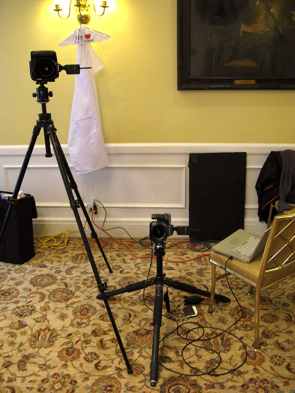
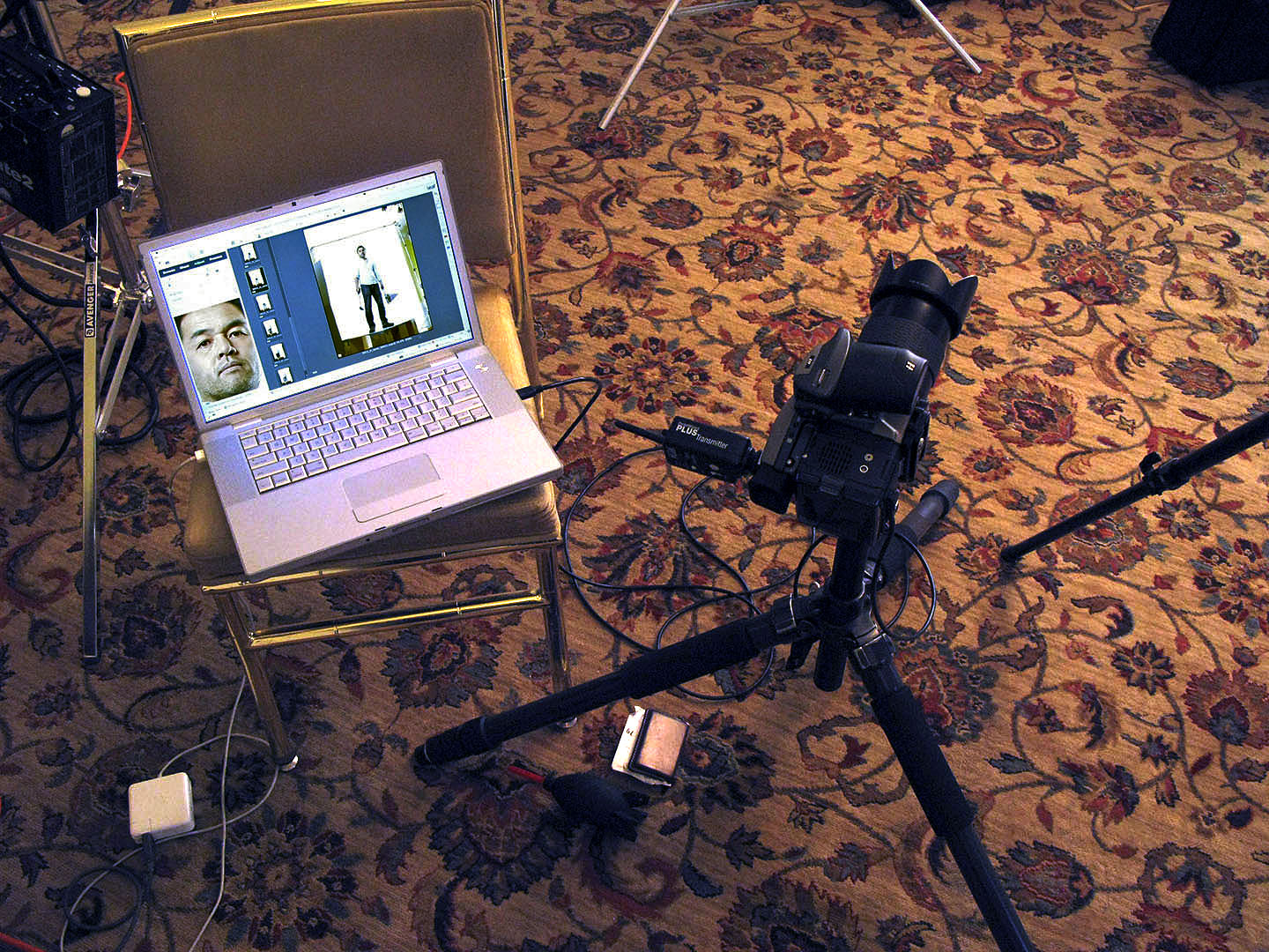
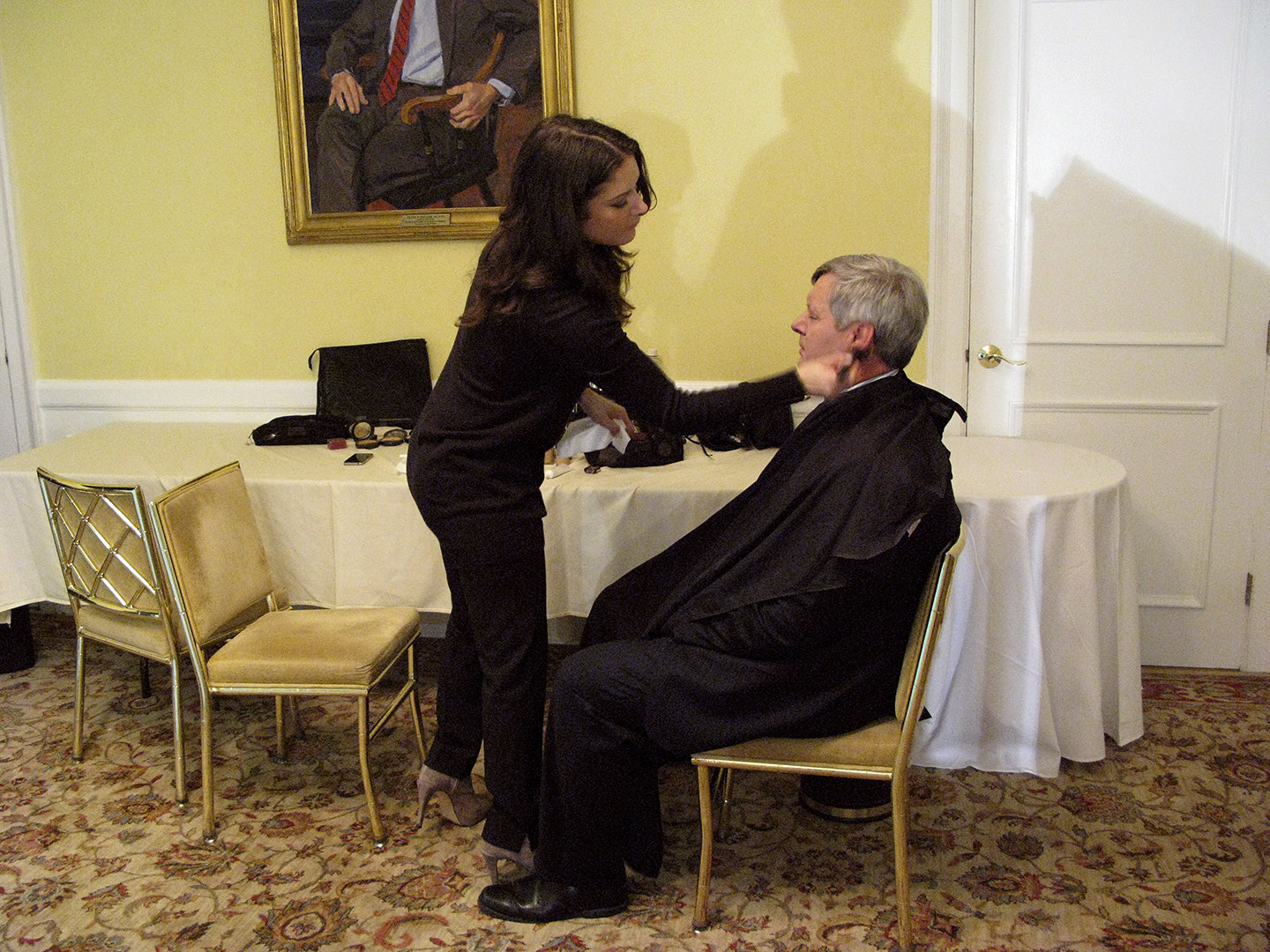
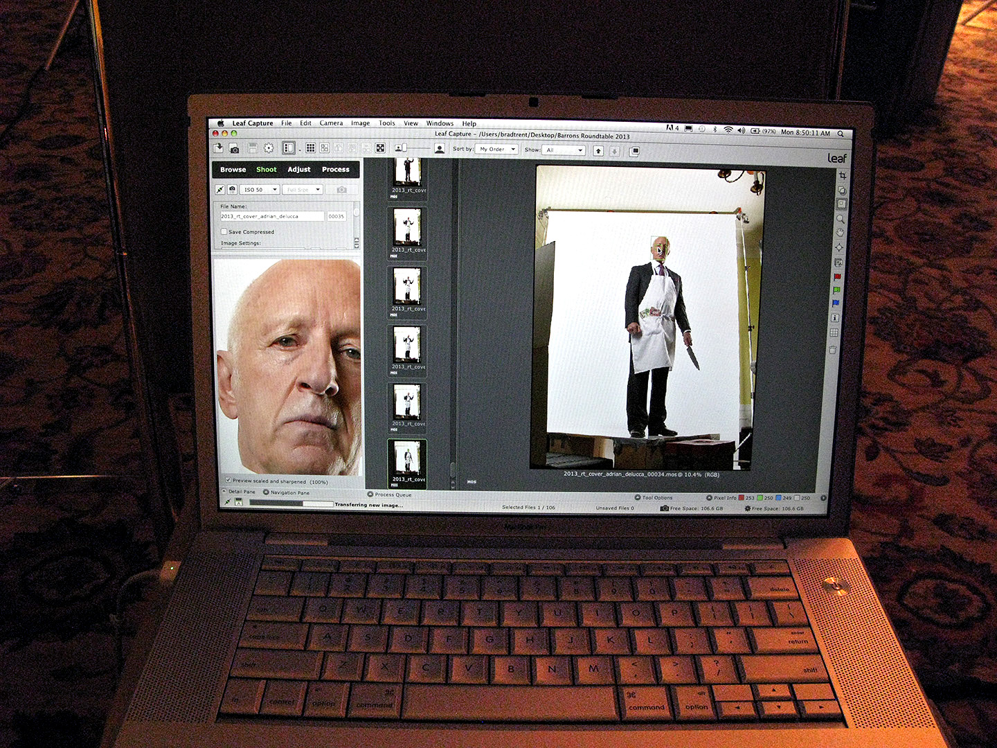
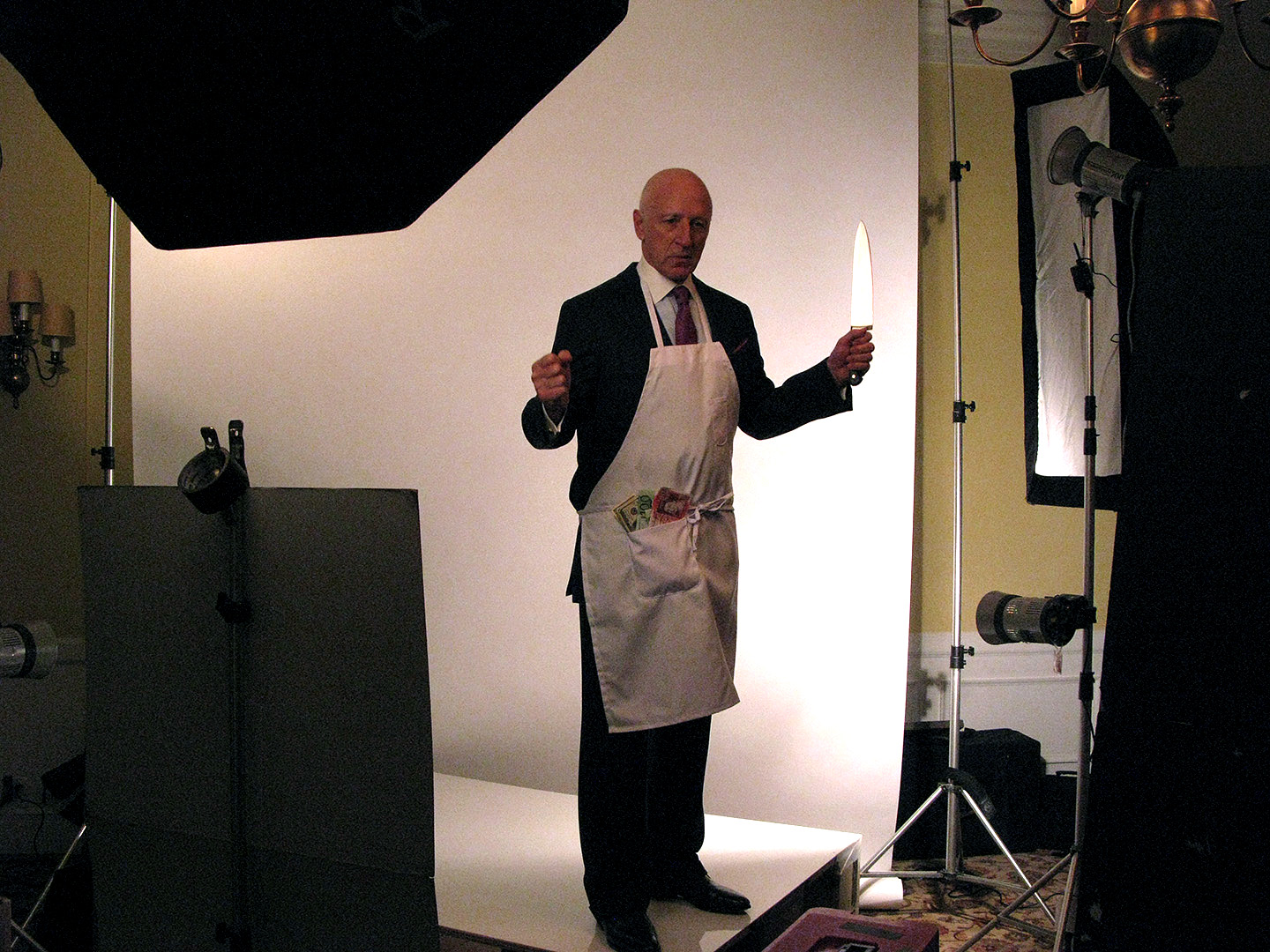
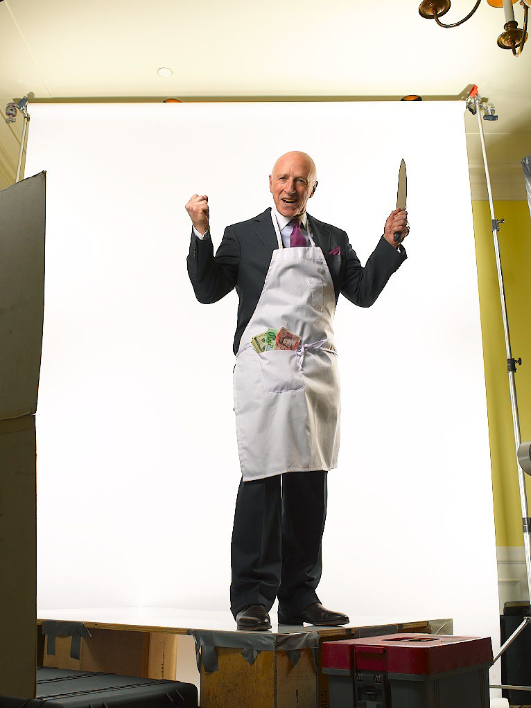
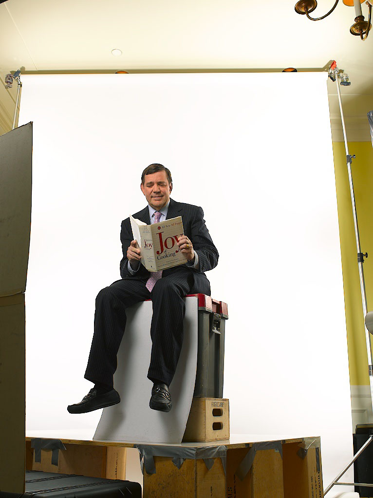
But since a bunch of you wrote to me over the weekend (and why some of you still don’t get how easy it is to post a comment on the blog instead of e-mailing me is makin’ me shake my head!) because you know the amount of post work I have done on some of my images…or at least you think you do…I thought I would pull away the curtain on a few of my shots so you can see exactly what sort of thing goes on after hours at Damn Ugly Photography…..

*Click on any image for the full-size preview*

Here is the RAW file of Jon Bon Jovi…

bon_jovi_raw1

…and the final, retouched version…

bon_jovi_final

This is probably the simplest example I’m showing. Aside from some color-shifting and contrast work, there is just a bit of cosmetic ‘fixing’ to get rid of a few wrinkles and bulges better left unseen.

A much more involved photo was this one of Cornelia Guest. Here is the RAW file…

cornelia_raw

…and the final image…

cornelia_final

With this one I removed the lights over the paintings, the unfortunate wall-socket and the heating duct…then brightened the entire image. Next I shifted the color palate from green to blue and highlighted some areas (the window, gave the dog a bath!) and darkened others (the floor, the corners). But the real heavy lifting came with the cosmetic retouching on the subject…I built a contrast layer that allowed me to highlight her arms and face by putting them in kind of a glowy light. Then I cleaned up any wrinkles and slimmed down the line of the front and back of the dress.

Joe Rosenberg, RAW…

joe_rosenberg_raw

…and retouched…

joe_rosenberg_final

This is just one of the ‘Less is More’ situations…by simply getting rid of the ceiling lights and the heavy black bars in the windows, the shot takes on a completely different feel. And while the color shift looks extreme, this is one of those cases where the RAW file isn’t really showing ‘reality’ either…the original scene wasn’t nearly as muted and murky as the unretouched image leads you to believe. I find that often a RAW file is so much lower in contrast that without a good dose of tweaking in Photoshop you’d be left with a pretty unappetizing image!

Sheila Nevins, RAW…

sheila_nevins_raw

…retouched…

sheila_nevins_final

There are a few of you out there who know the story behind this shot of Sheila Nevins, the president of HBO’s Documentary Division…how I only shot this one single frame when she bolted off the set because the bright explosion of light from the ring light I was using destroyed her eyesight and gave her an ‘ocular migraine’…! I hoped her eyesight was back to normal by the time she was back in her office, but after I checked to make sure my one image was intact, I still had to remove the ugly stainless steel power strip and microphones that ran the length of the boardroom table, as well as brightening the whites and desaturating the pinkish-red skin tones. Oh yeah, then I had to regenerate a reflection of her in the glass table top…

Toxic House, before…

toxic_house_raw

…and after…

toxic_house_final

This BusinessWeek shoot about a family who bought a house sitting on a toxic waste site was definitely made infinitely better by pulling out the Photoshops tricks. To get a feeling of ominous doom, I dialed up the contrast a ton, even for me, and went heavy on the Hi Pass and Multiply layers, so much that it left a glowing halo around the edges…almost like the house was vibrating. Then I highlighted their faces in the masks with sort of a spotlight effect to pull detail out of their faces. I also oversharpened the living daylights outta the thing to make it look even edgier, and finally darkened the sky to further add to the sense of peril.

Steven Spielberg and the scary tree, before…

spielberg_tree_raw1

…and after I made the tree bigger and scarier…

spielberg_tree_final

I shot Steven Spielberg just before his remake of ‘War of the Worlds’ came out, and for one of my three set-ups I placed him in front of a huge tree in front of the Amblin offices on the Universal backlot. The way the tree looked with it creepy shedding bark, reminded me of the scene in the original 50’s film where the aliens crawled outta the crater that was caused when they crashed, so I lit him with a monster-light from down below and finished it off in my computer. As big as the tree was, I still wanted to dwarf him a bit more, so I cloned the trunk on the top and left of the frame, then I shifted his baby-blue shirt to grey and went about desaturating and increasing the contrast overall. Finally, I darkened the whole shot overall and brightened the light on his face to separate him and give the appearance of something glowing off-camera….in a crater…..with the aliens!

Is It Wrong???

Haiti Aftermath 02

real_life1

There is a fascinating discussion going on at the Judge’s Table at the Danish Pictures of The Year Competition regarding how much Photoshop is too much when it comes to photojournalism. Apparently, the entry of photographer Klavs Bo Christensen went way over whatever acceptable standard had previously been allowed, and his photographs were disqualified. Now God knows I twiddle the knobs as much as the next guy, but then I don’t claim to be a ‘photojournalist’ either. I’m not gonna editorialize, but check out the story yourself and lemme know what you think…..

FOLLOW LINK:
Too much Photoshop? Judge for yourself