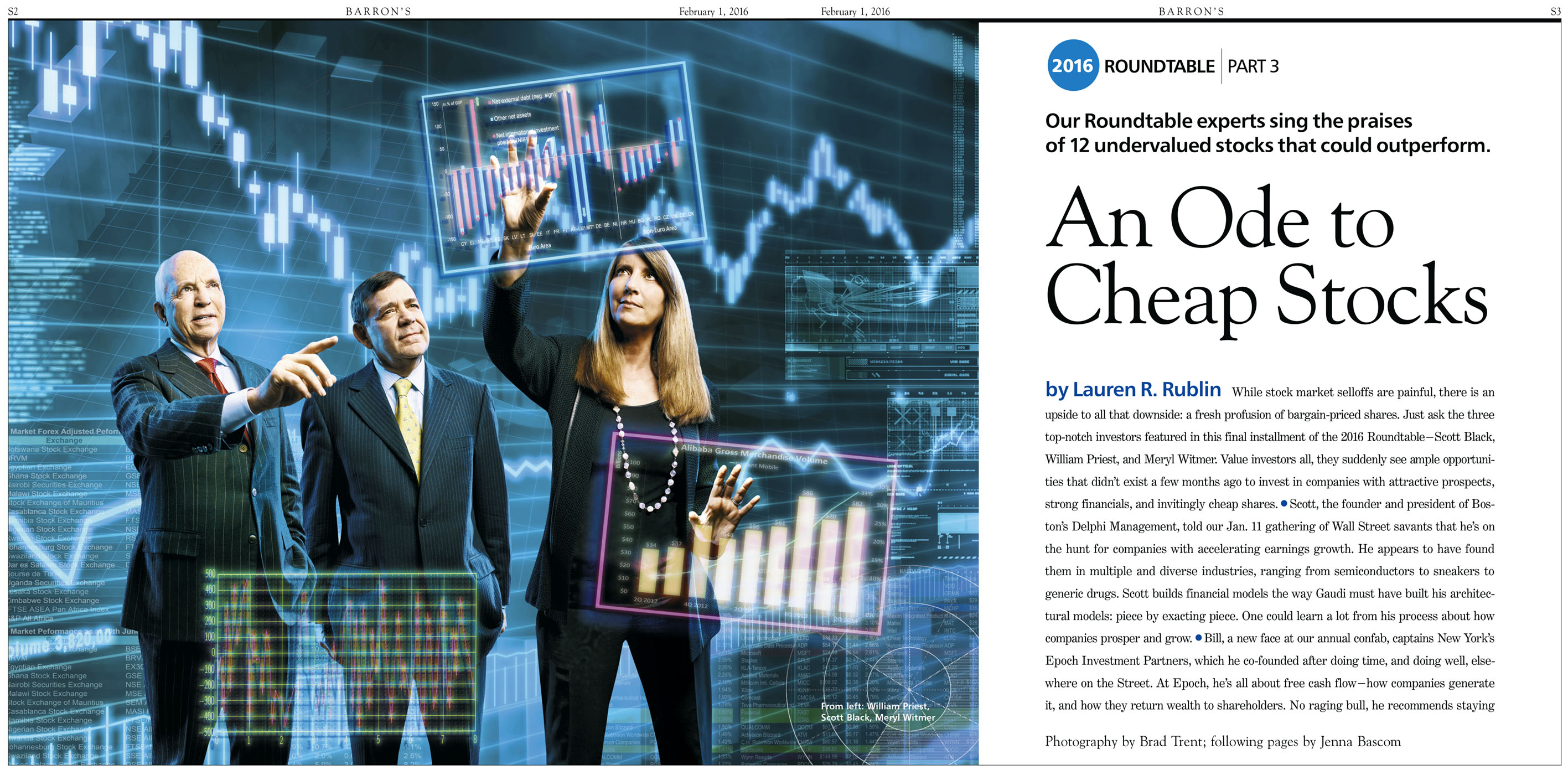
Click on Any Image for Full-Size
______________________________
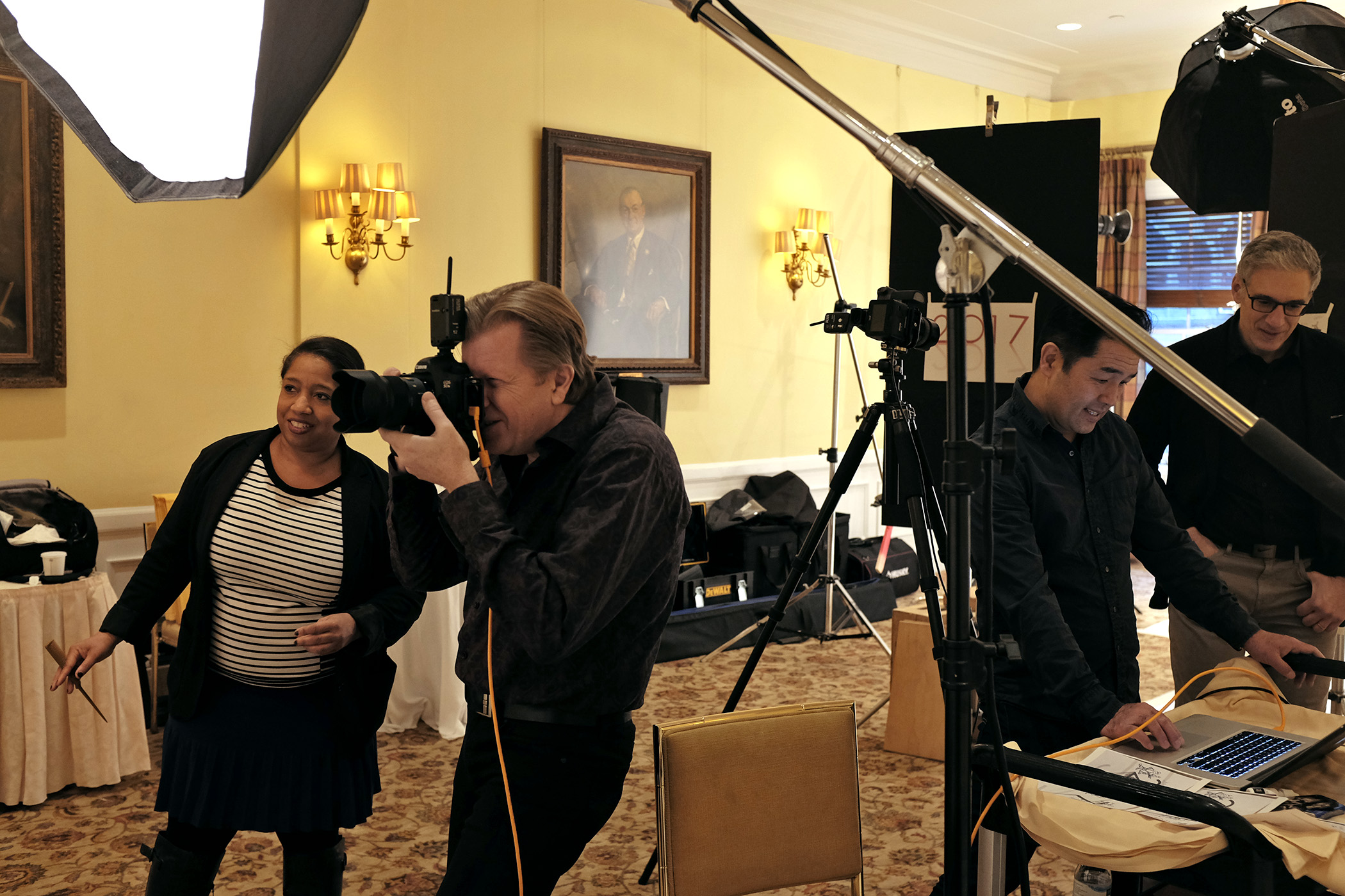
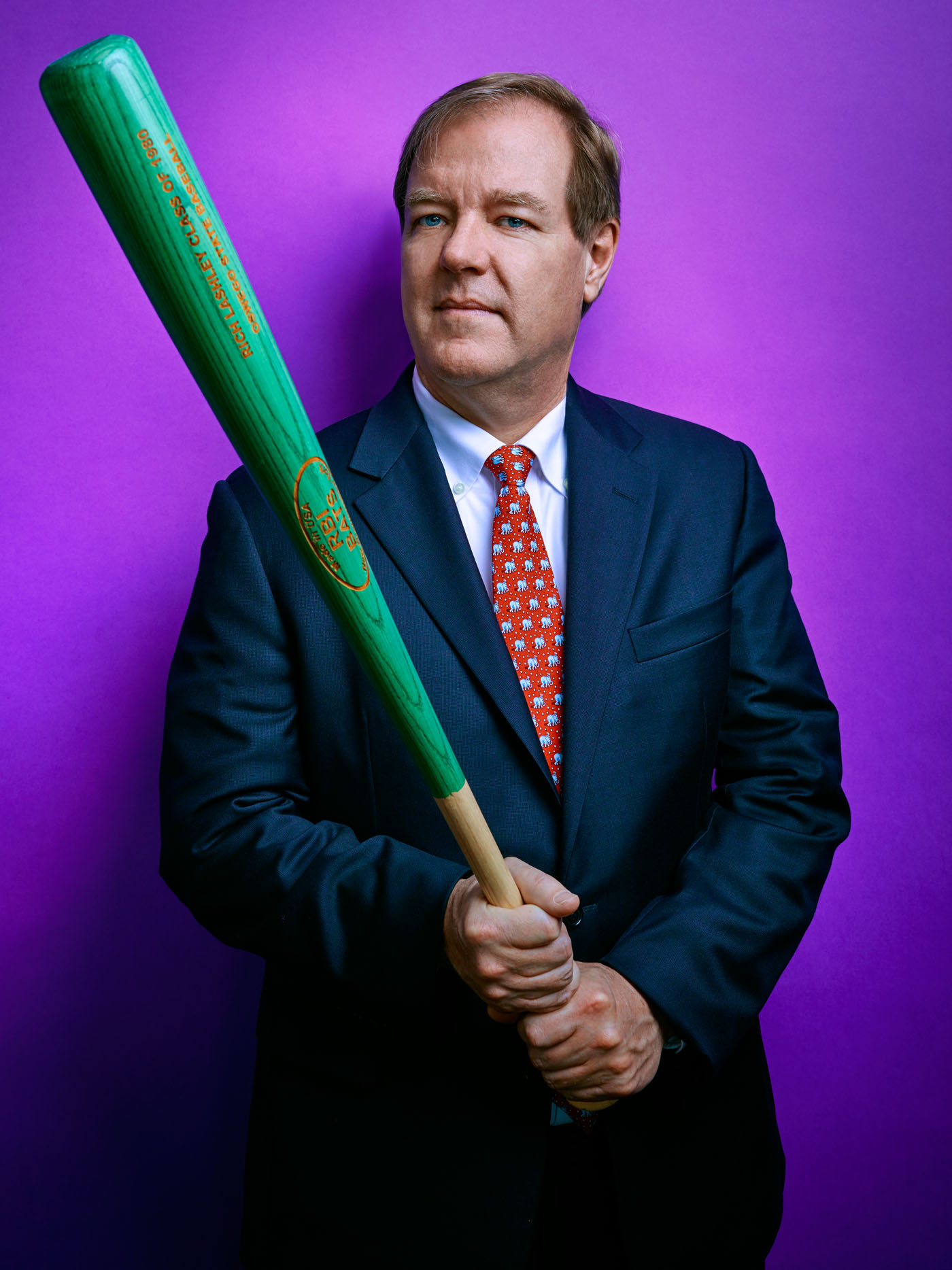
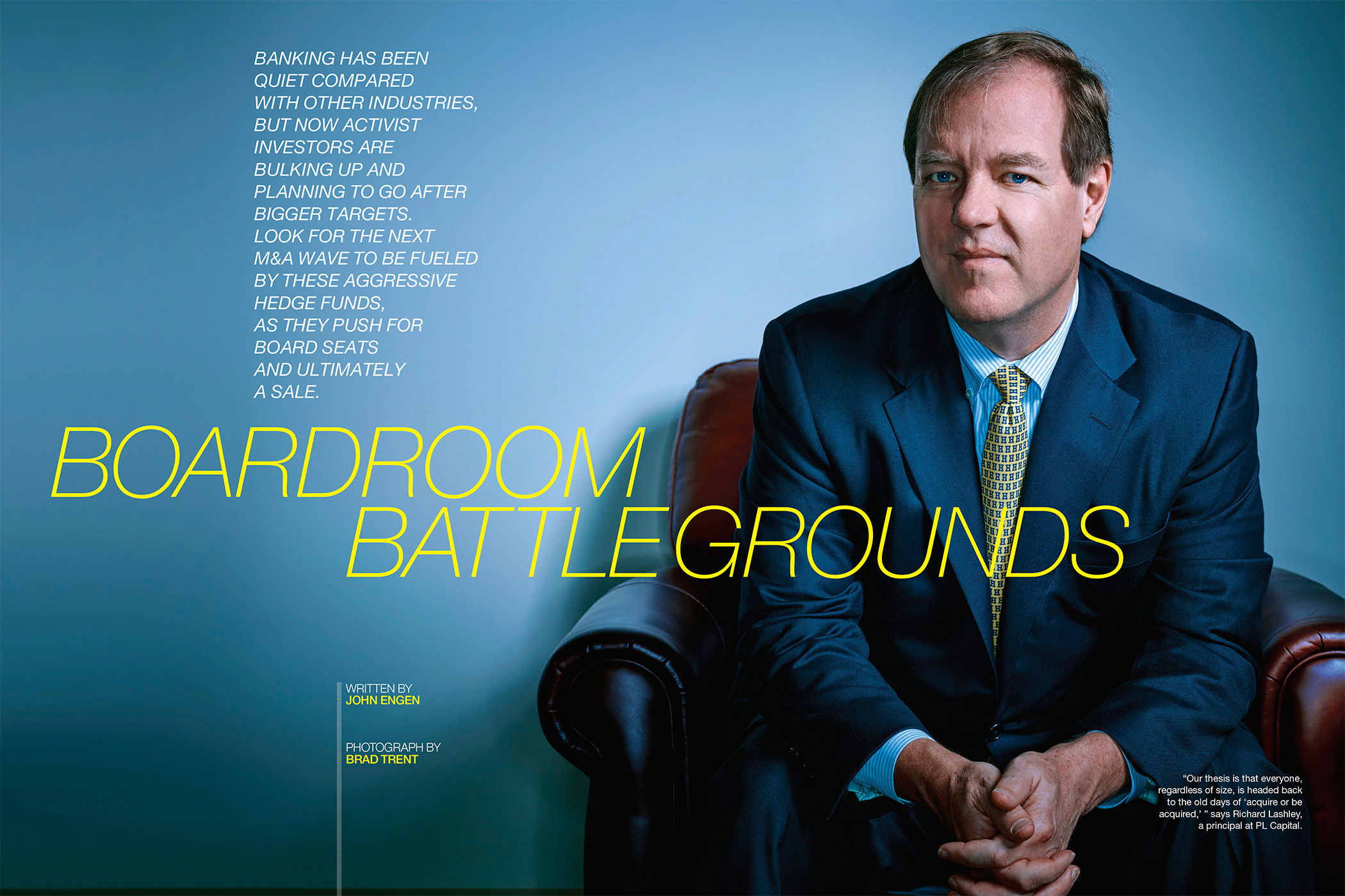
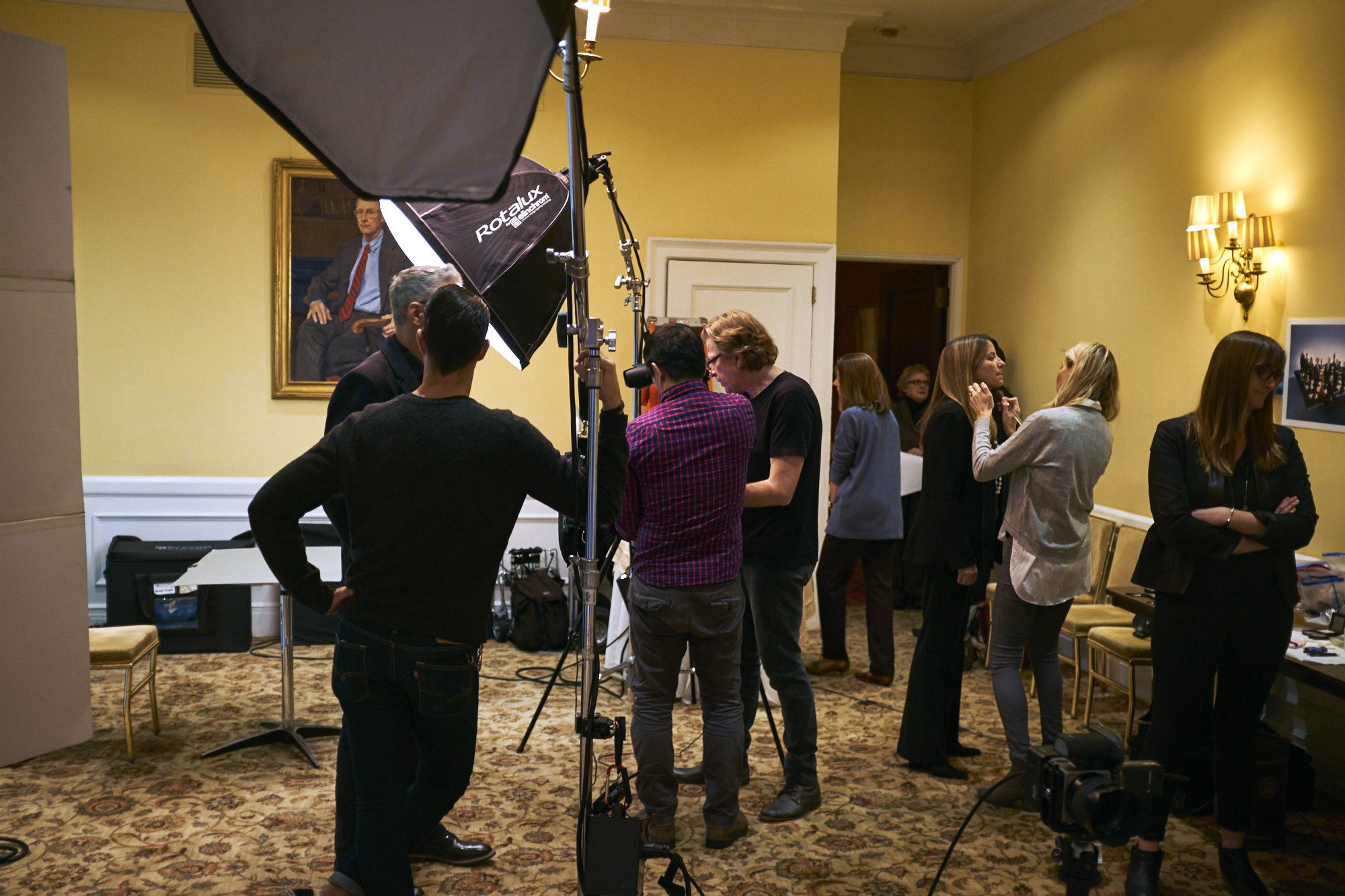
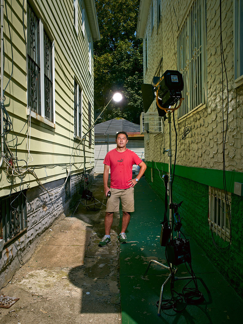
I haven’t done a real how-to blog post in a while, but the shoot we did last week of Hot fashion designer of the moment, Joseph Altuzarra, for the Wall Street Journal ‘Weekend Confidential’ feature sort of lent itself to that sort of thing. Both portraits we did look ridiculously simple, but it’s the little details that go into shoots like this where I get asked the most amount of questions. Questions about my lighting choices, color balance and post processing. I kinda take all this stuff for granted, but I’ll pull back the curtain and try to break them down for you…
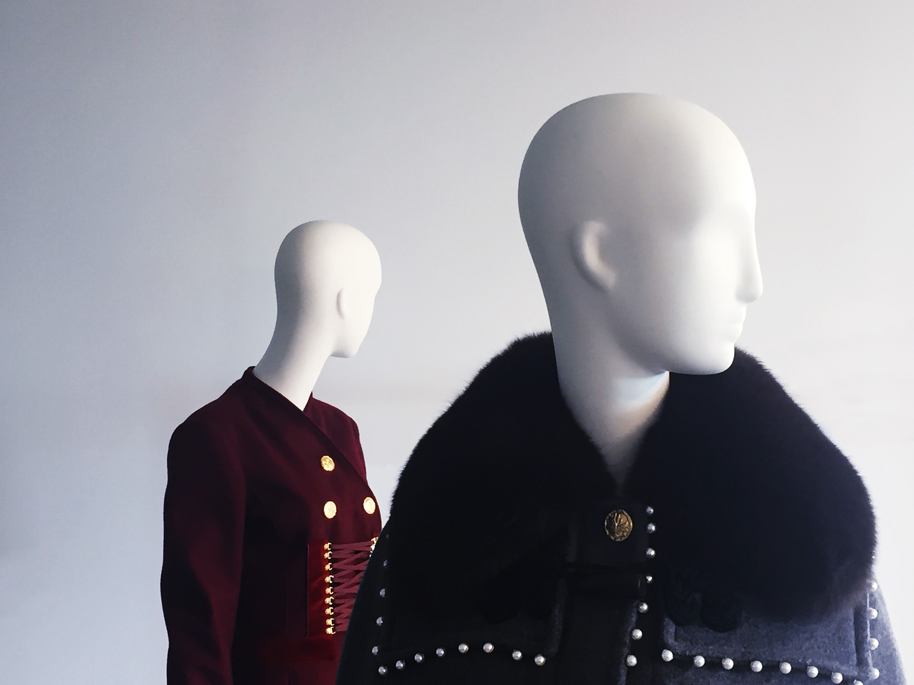
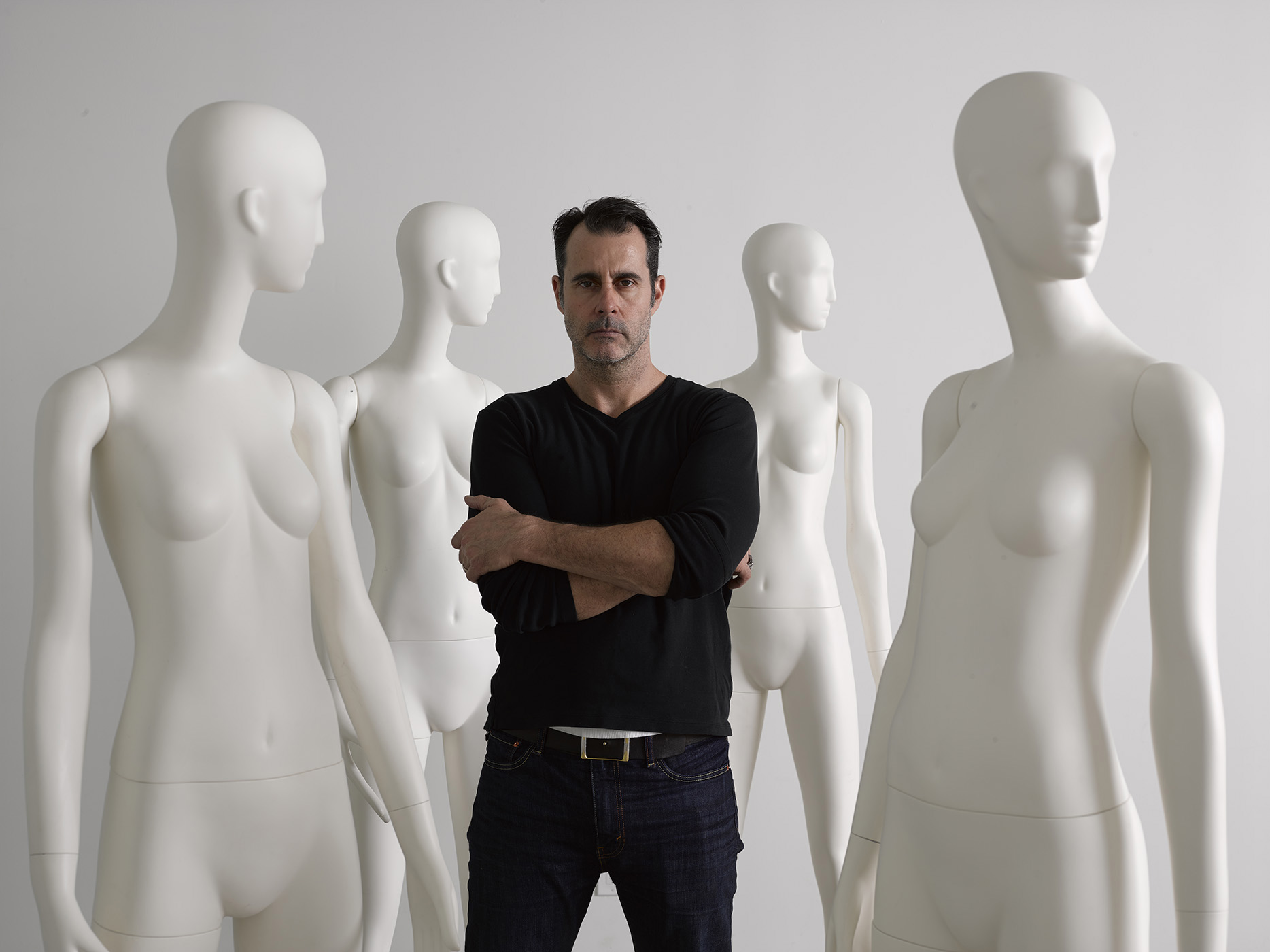
The inspiration for our first portrait sort of hit me right away when I checked out Joseph’s showroom and saw these two mannequins…

I was immediately struck by both the starkness of their design and the beautiful way the soft light from a wall of windows in the studio wrapped around the faces against the white walls. But as beautiful as Joseph’s designs were, I sort of want to simplify things even more…and that meant getting rid of the clothes…

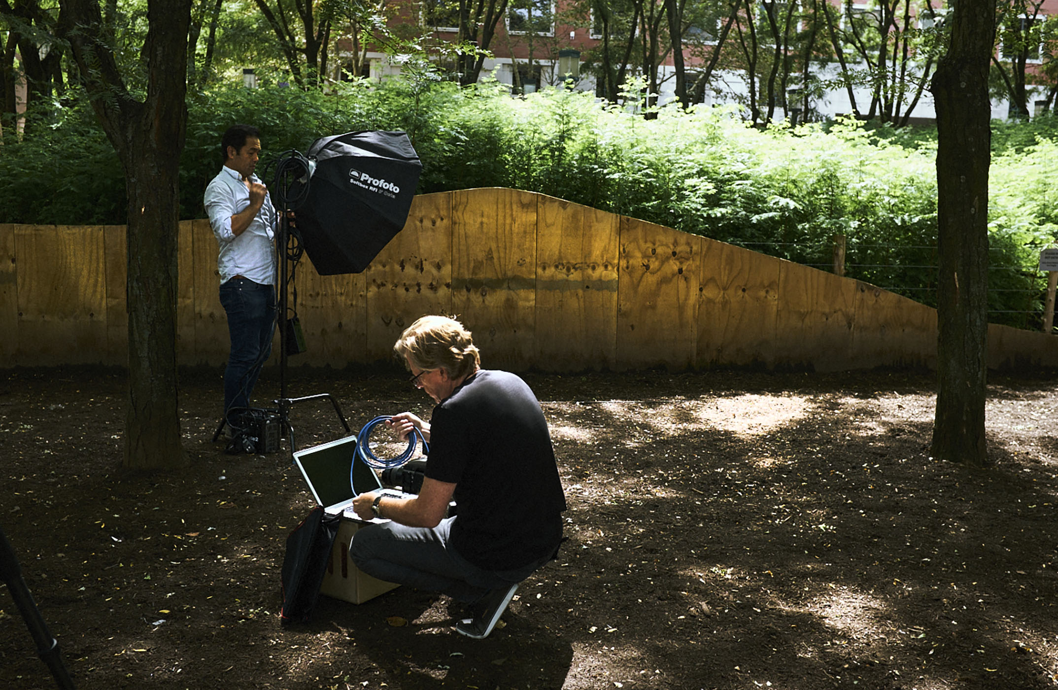
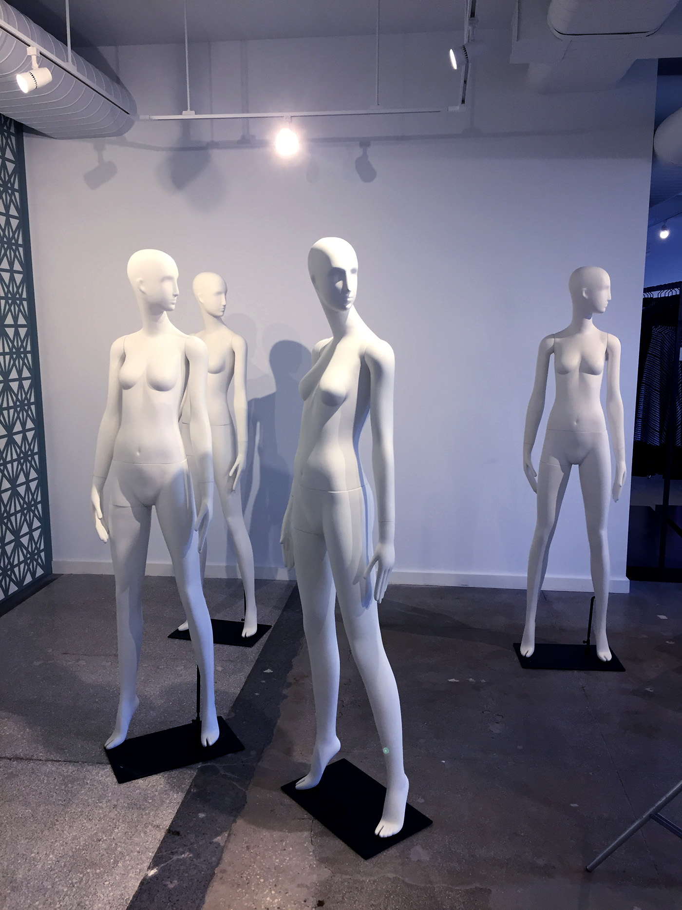
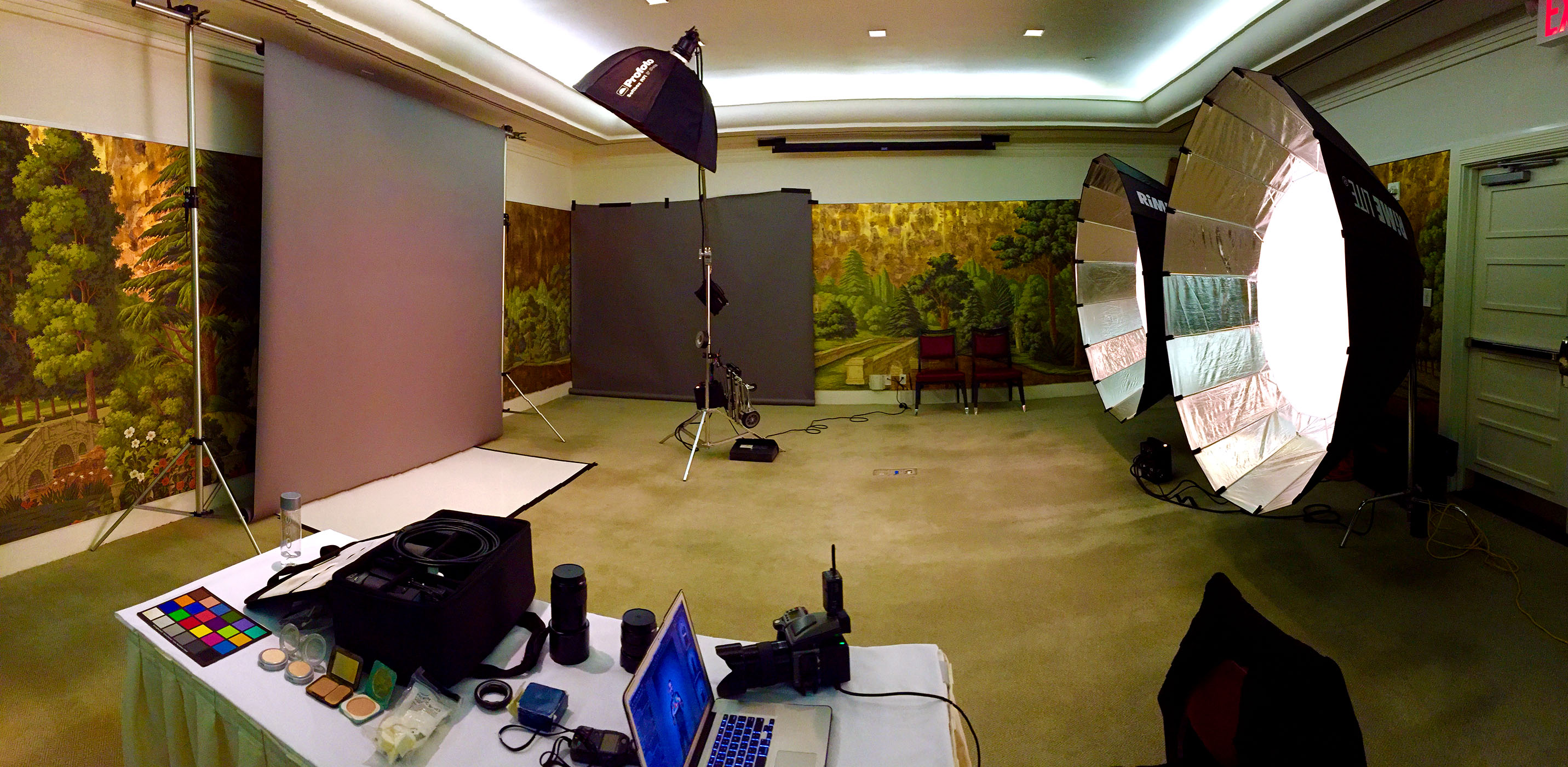
We positioned the mannequins in the largest open space in the showroom…

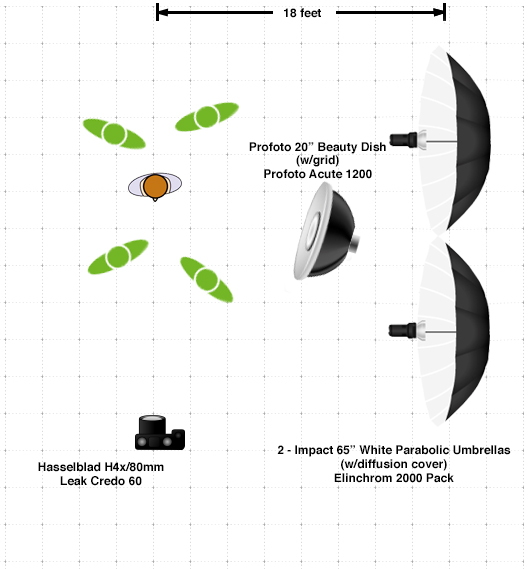
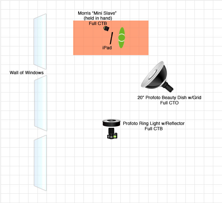
…and to mimic that soft wall of light from the windows, I decided to light the set with two 65″ white umbrellas plugged into 2000 w/s Elinchrom packs, set up 90 degrees to the camera (and almost 20 feet from the subject) for a split-light effect…

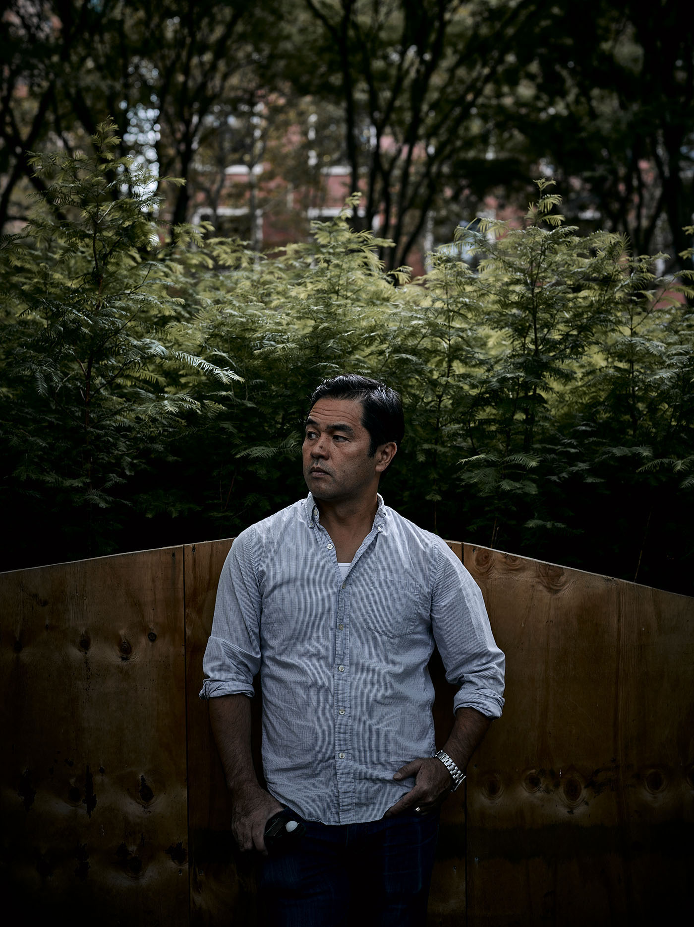
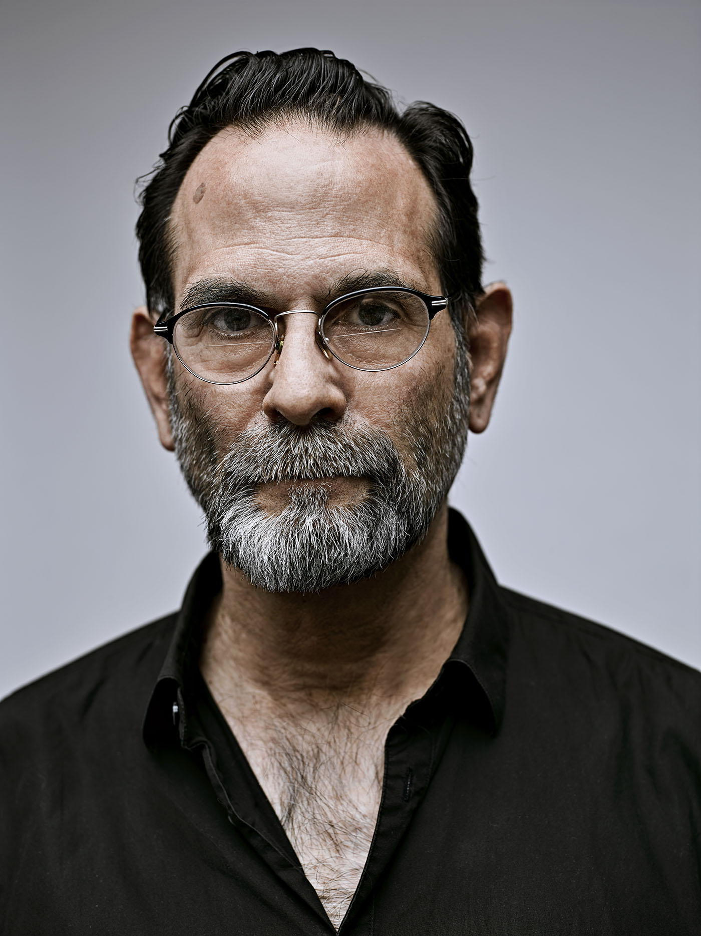
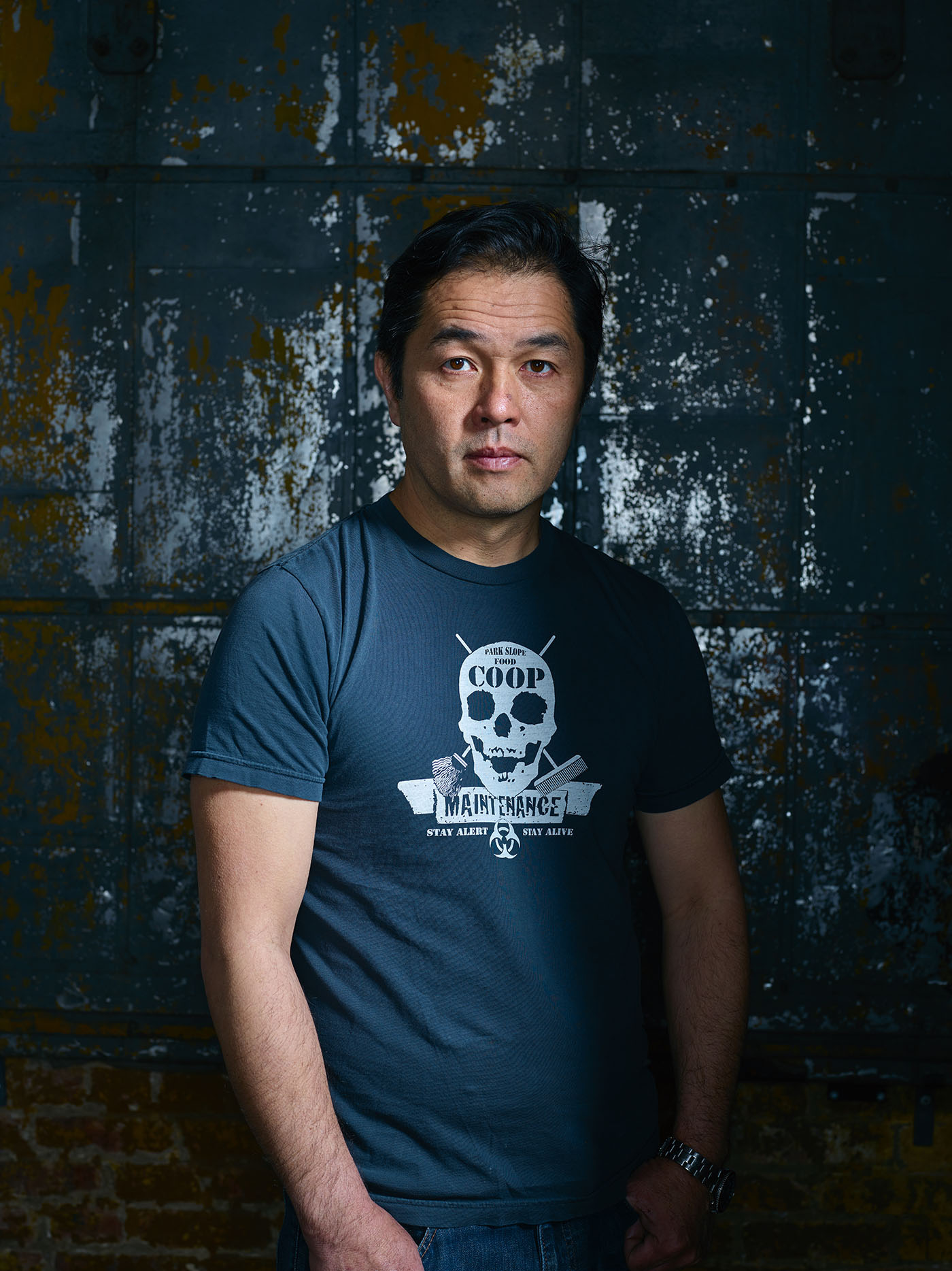
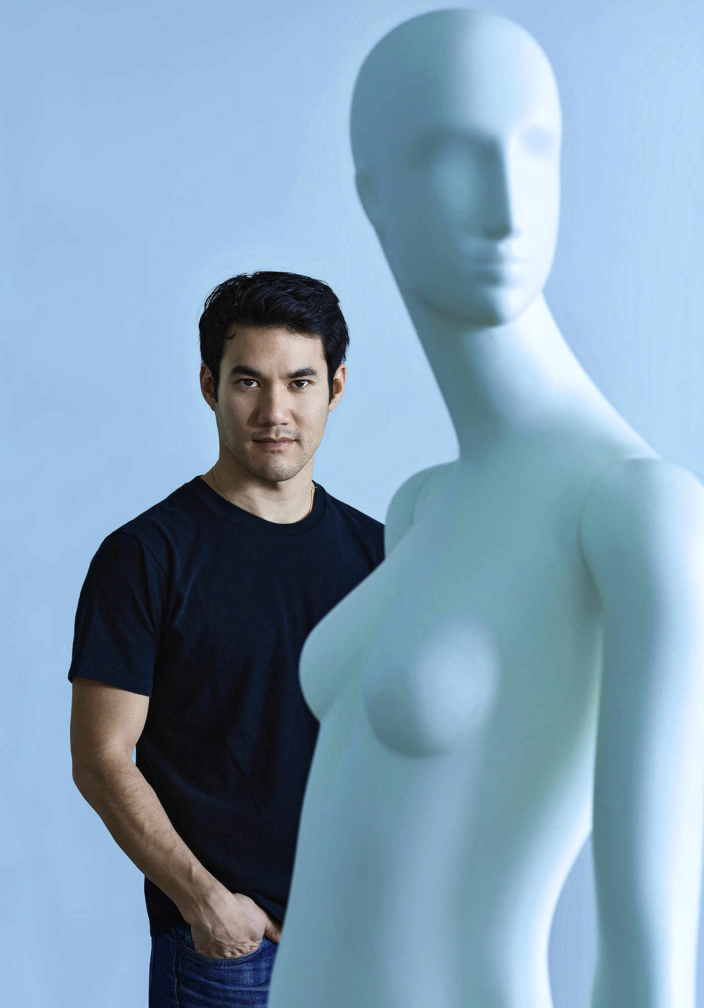
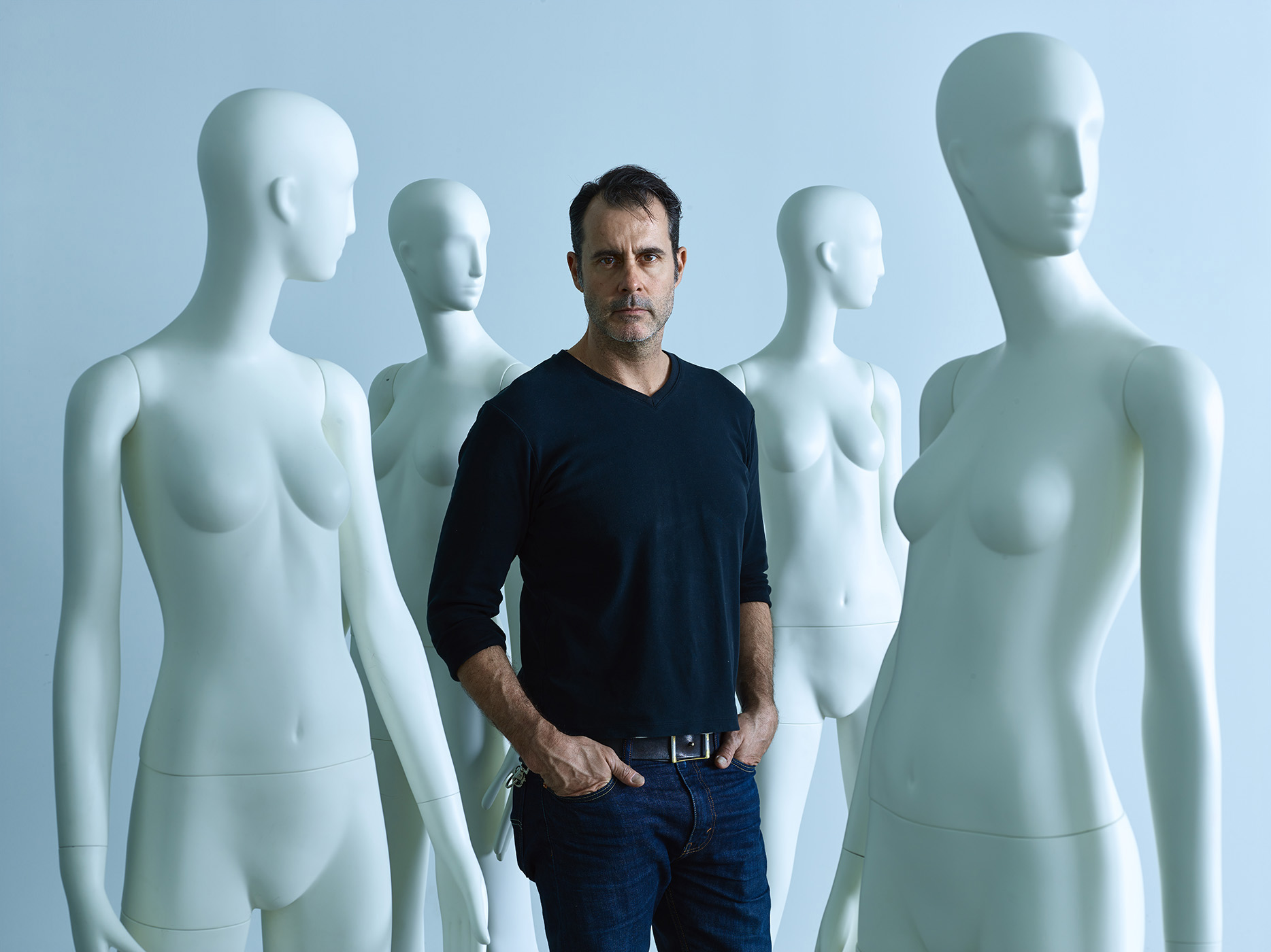
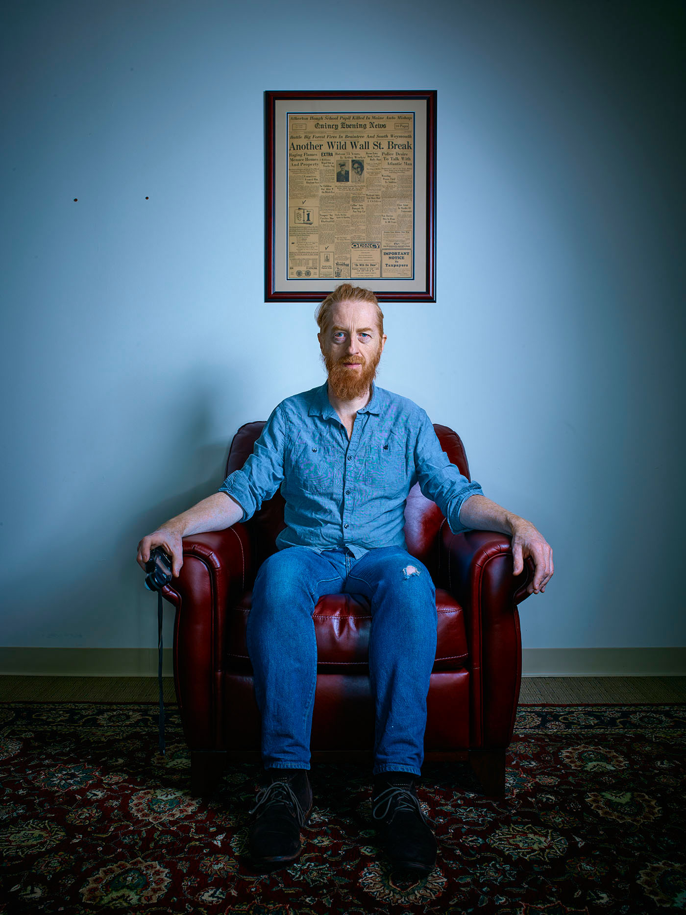
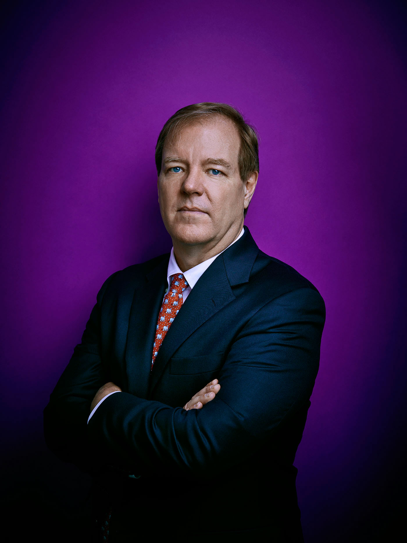
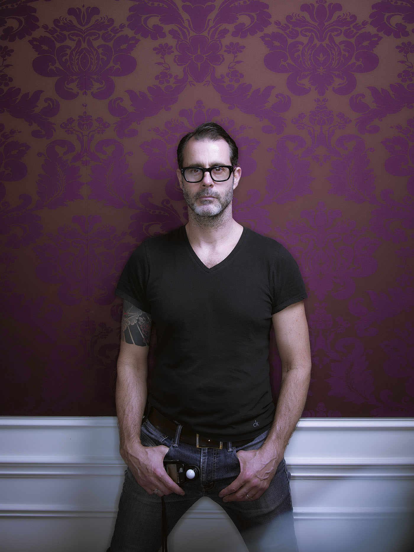
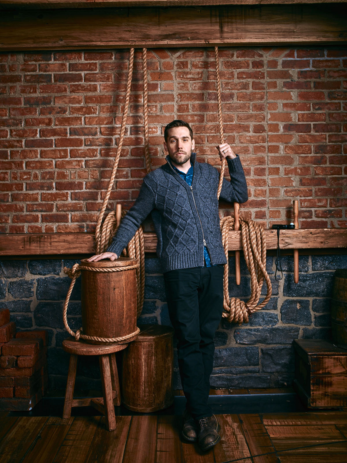
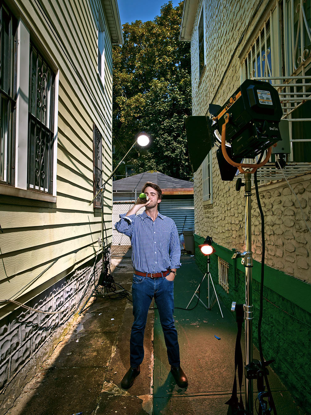
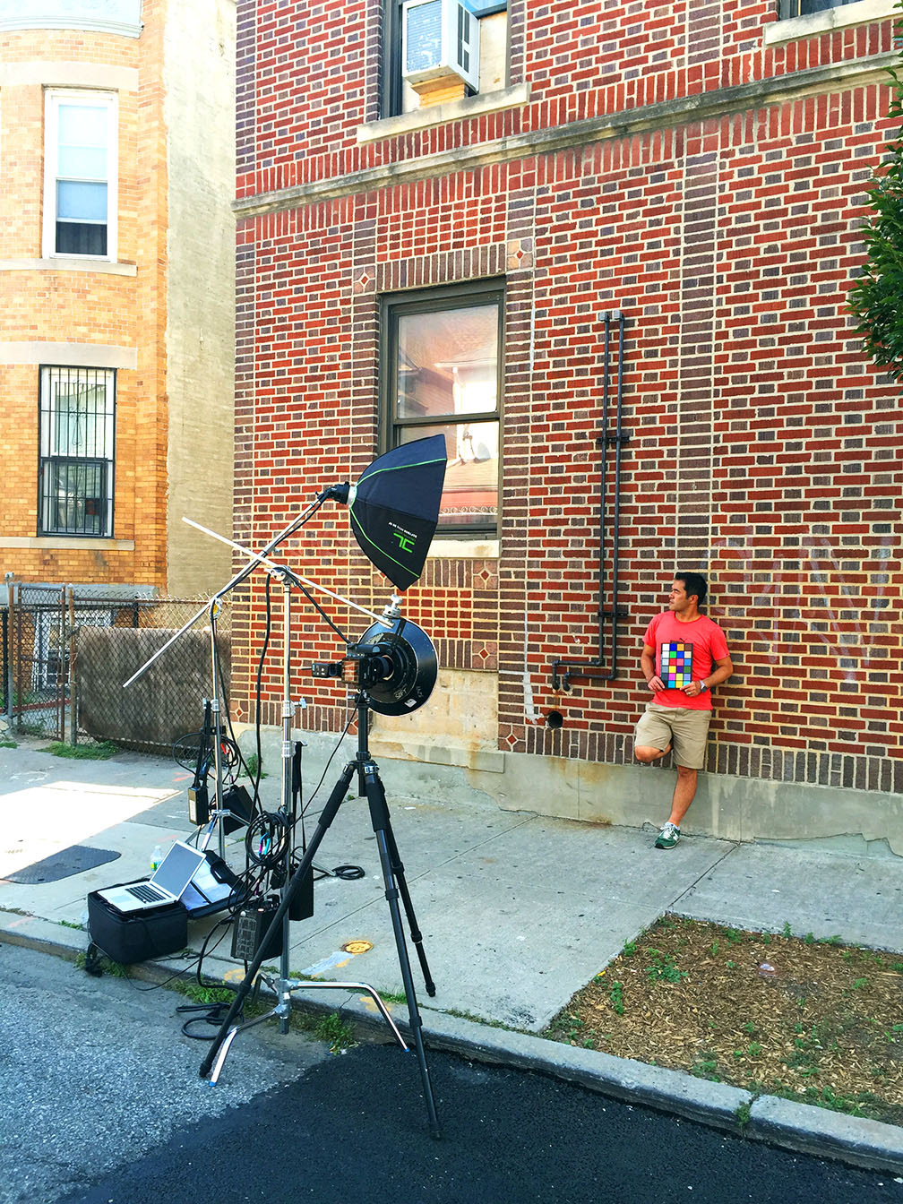
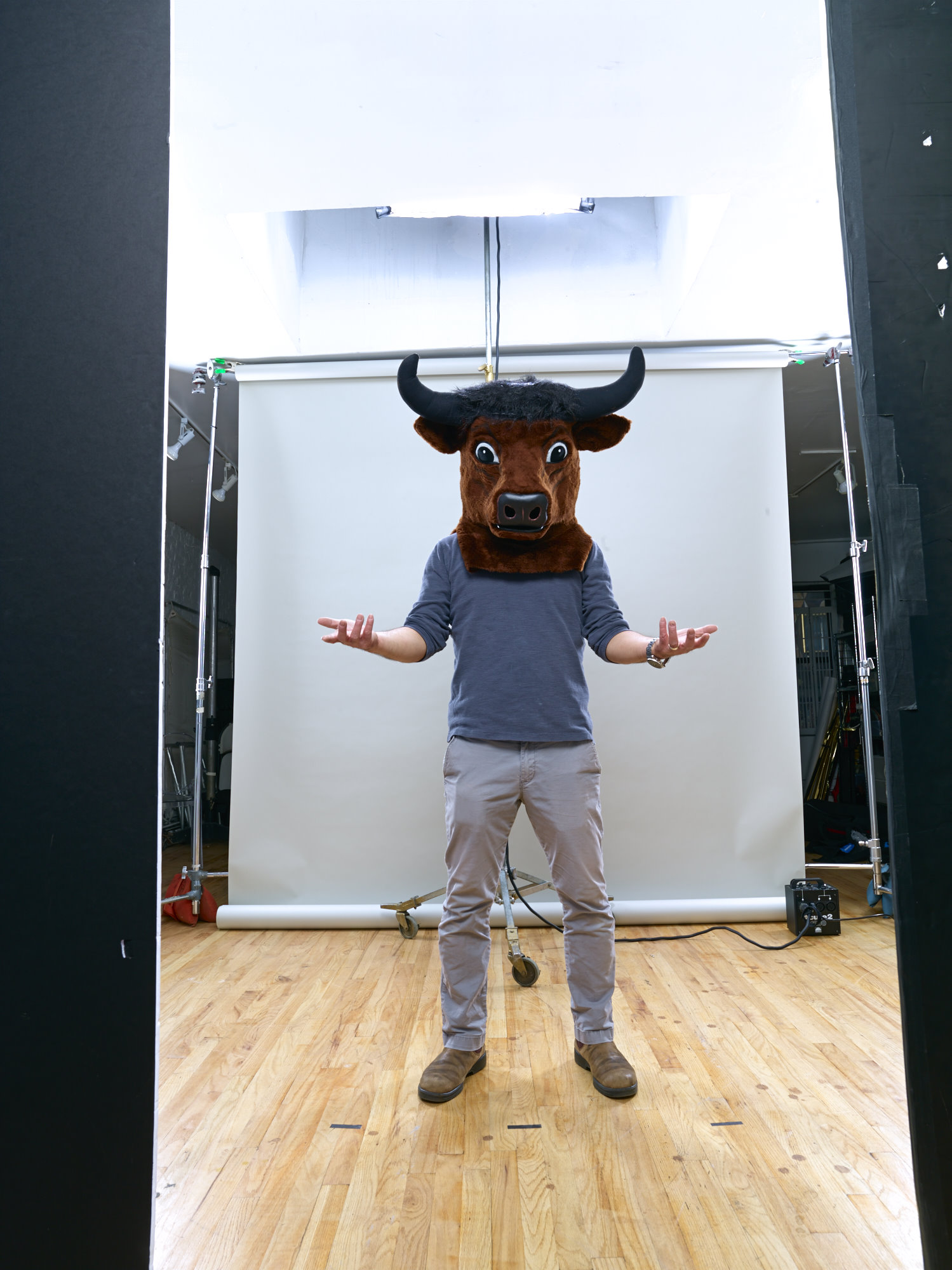
This was our first test shot (with Robert standing in for Joseph) just using the two umbrellas…

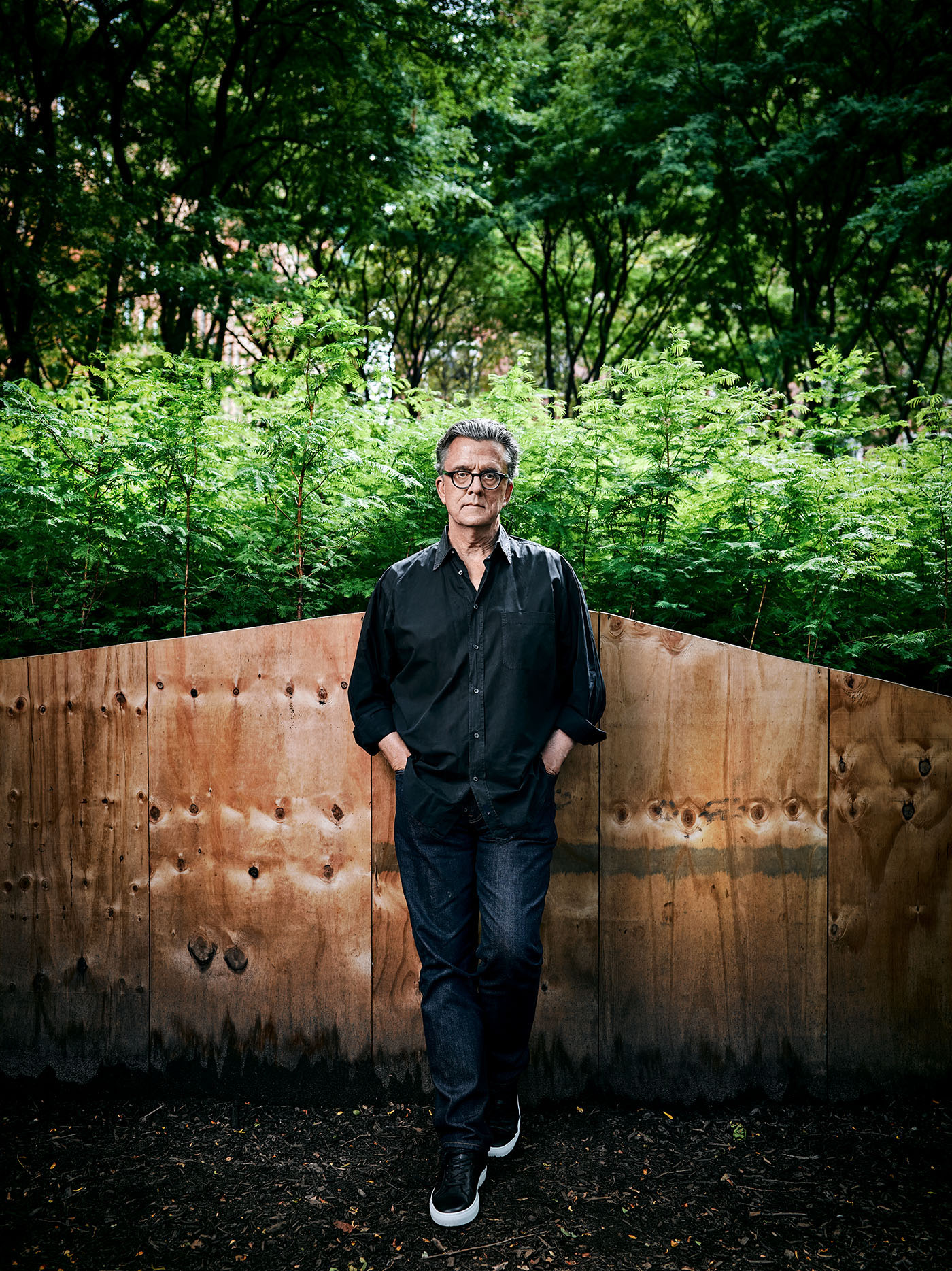
Honestly, for a first test it was very nice. It fit the ‘Weekend Confidential’ requirements of being graphic and powerful, while also immediately telling the story. This was exactly how I wanted to portray Joseph. But technically it just a little too soft, flat and monochromatic for my liking. Those two umbrellas essentially made one big, even light source, but although Joseph and the mannequins would be exposed properly, the brightness of white mannequins was too much. I needed to bring up the light on the subject without affecting the mannequin’s light. So I added a 20″ Profoto Beauty Dish on a Profoto Acute 1200 pack, with a 30 degree grid, for just a little more light at the center of the scene…

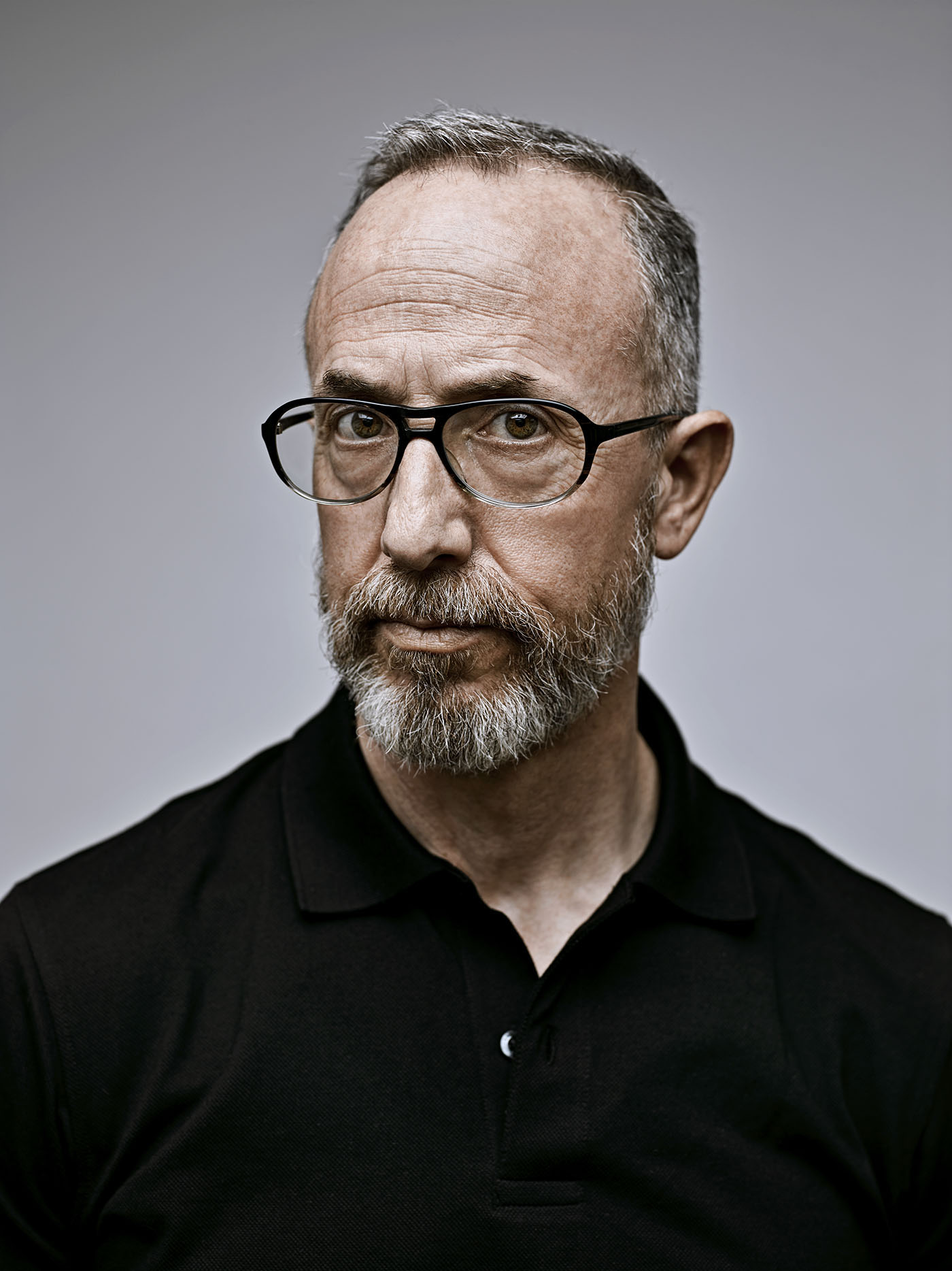
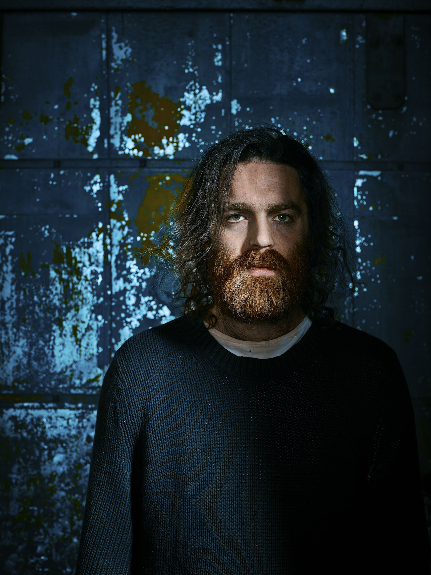
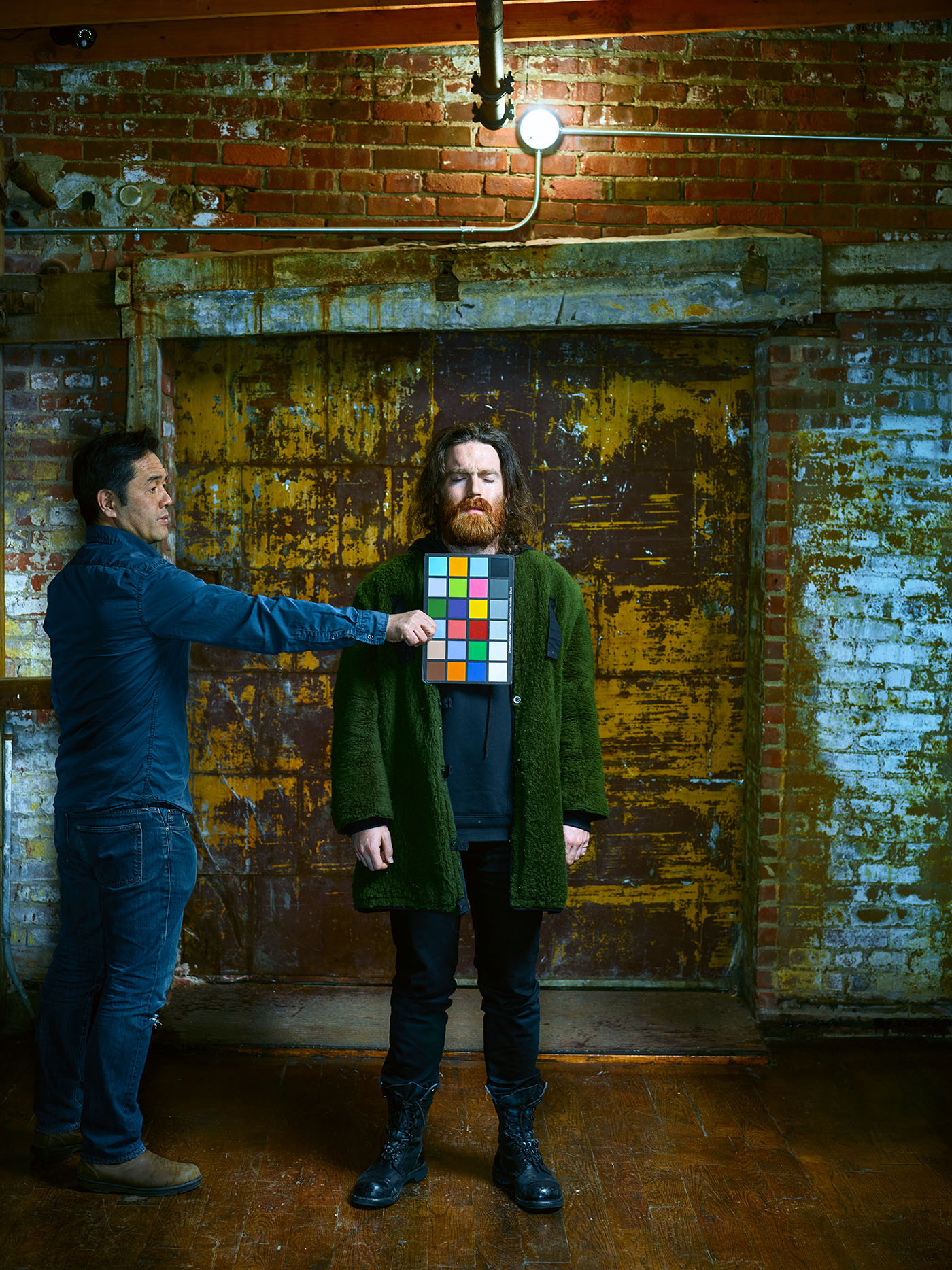
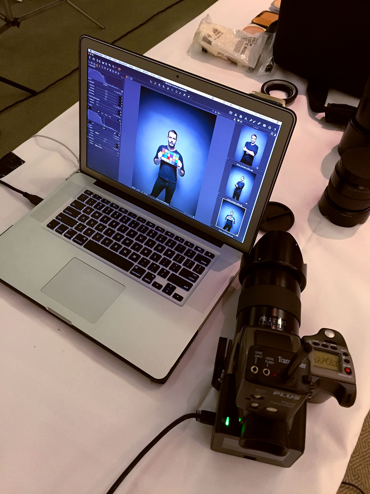
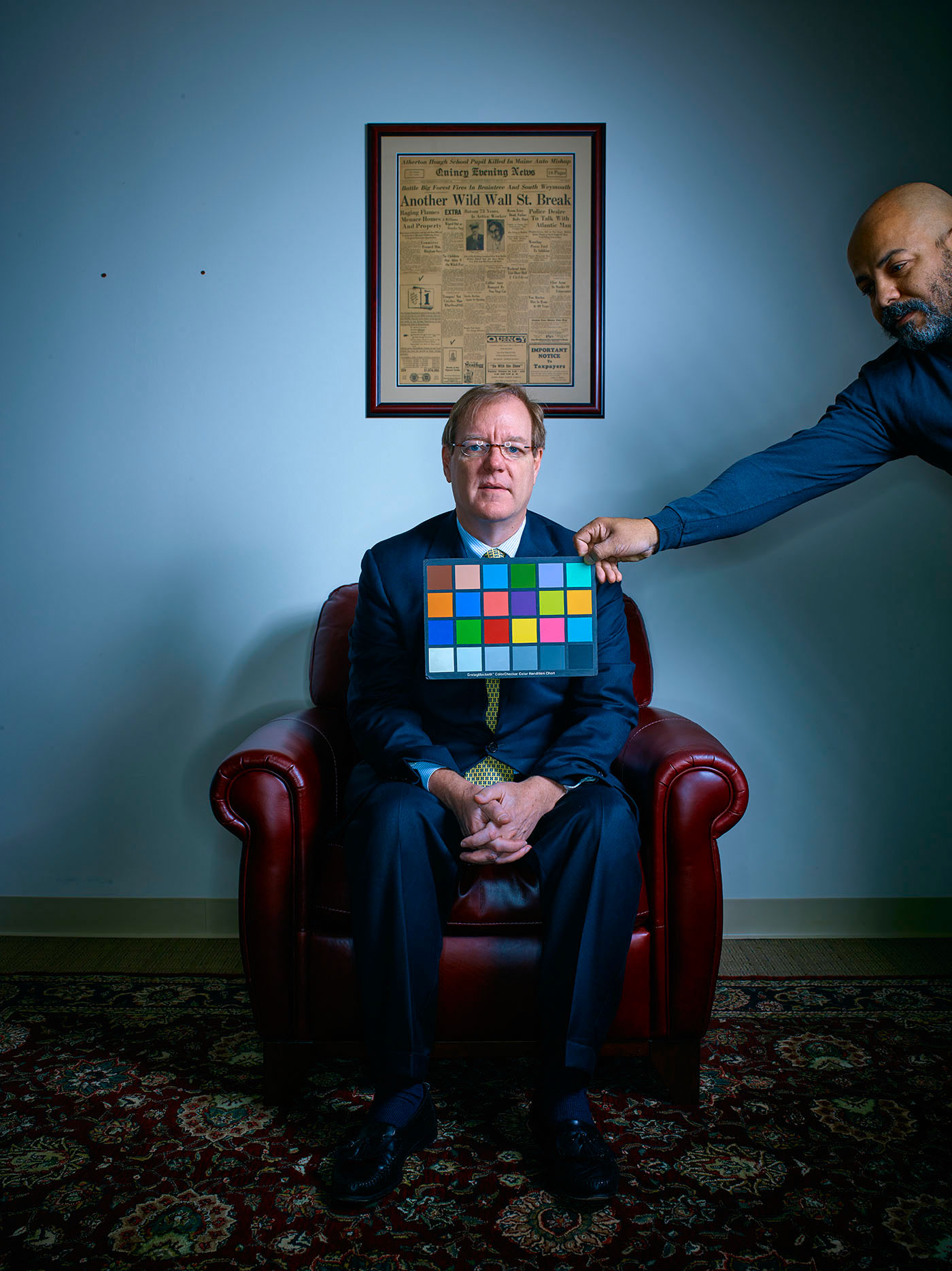
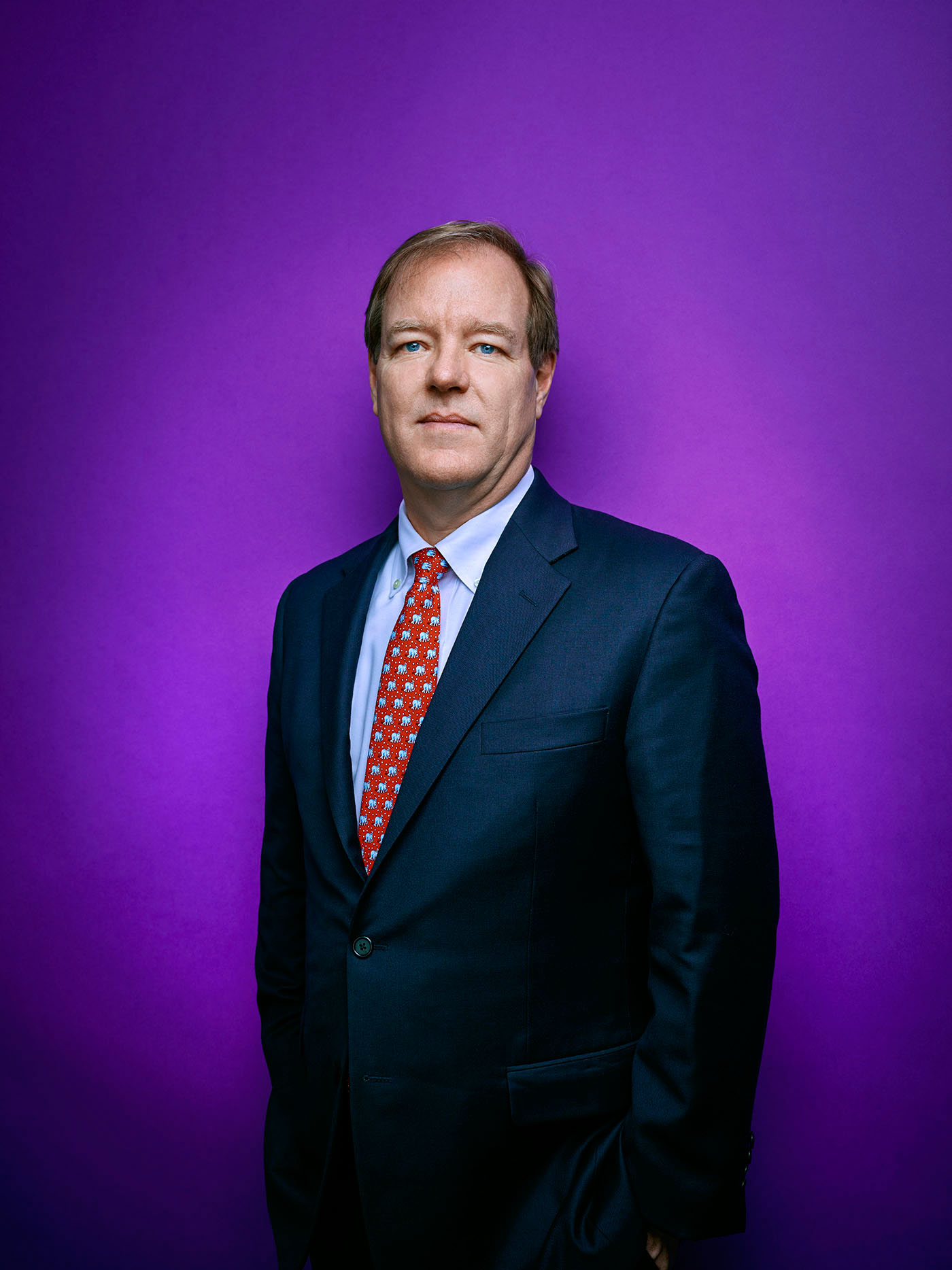
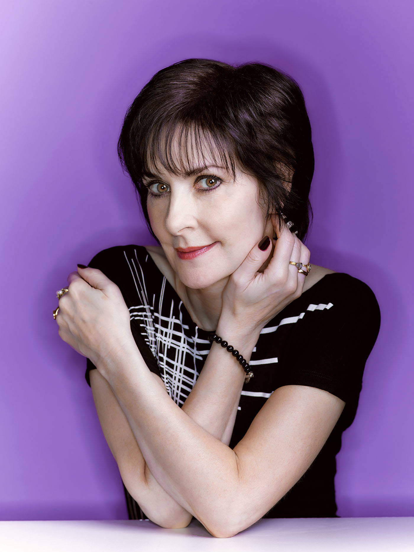
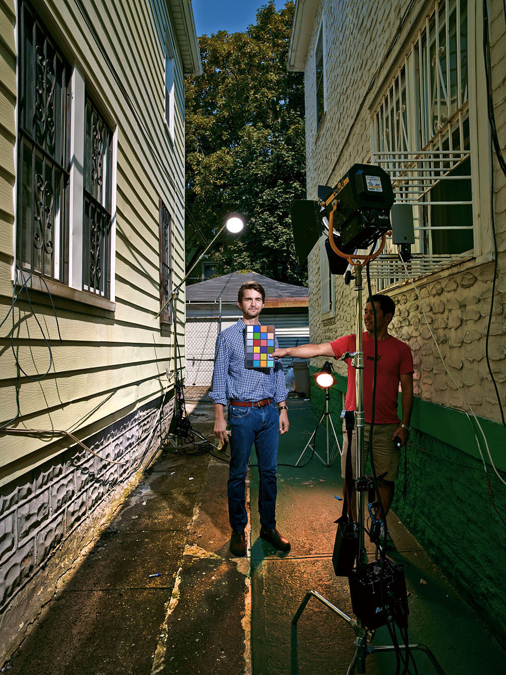
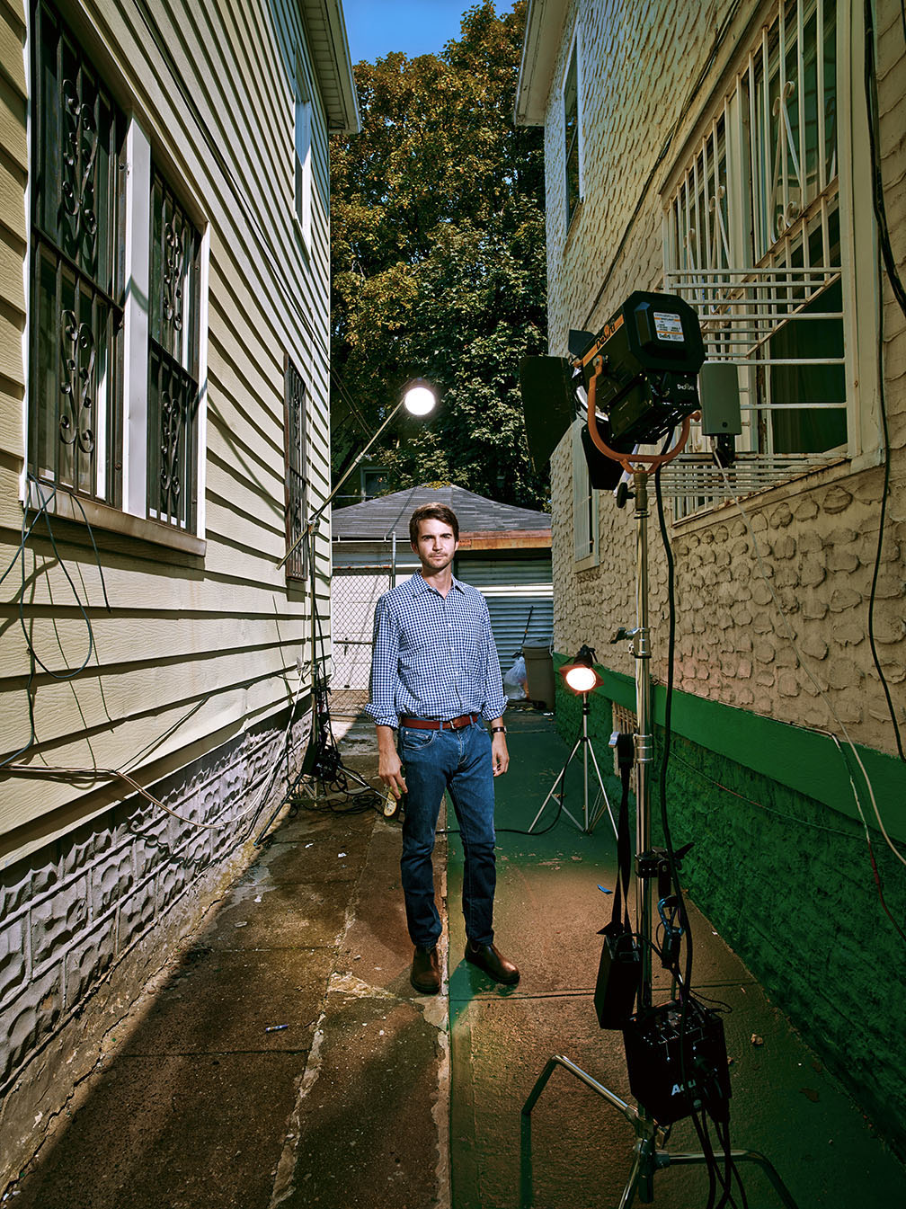
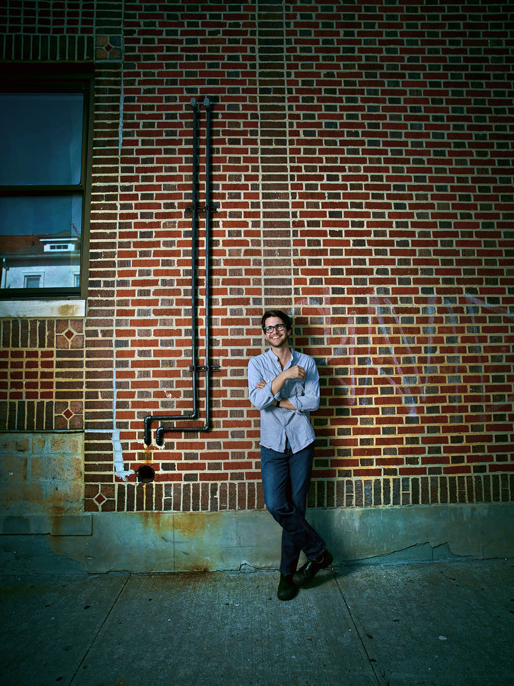
As you see in the lighting diagram, by positioning the Beauty Dish in front of the umbrellas and feathering it so that it hits my subject but stays off the mannequins, it brings up the light on the subject just enough to separate him from the rest of the set. But I also wanted to shift the overall color palate because ‘normal’ just wasn’t cutting it! Since I always shoot tethered to Capture One Pro with the Hasselblad/Leaf back, I have a lot of options when it comes to selecting ICC input profiles. Leaf has always had the best designed input profiles that allow me to do what I did next. I switched from the basic ‘LF3 Portrait 5’ profile (very neutral, very normal) to my favorite profile…’LF3 Portrait Warm 5′. Warm 5 heightens the contrast and saturates colors, and because of that, our next test looked like this…

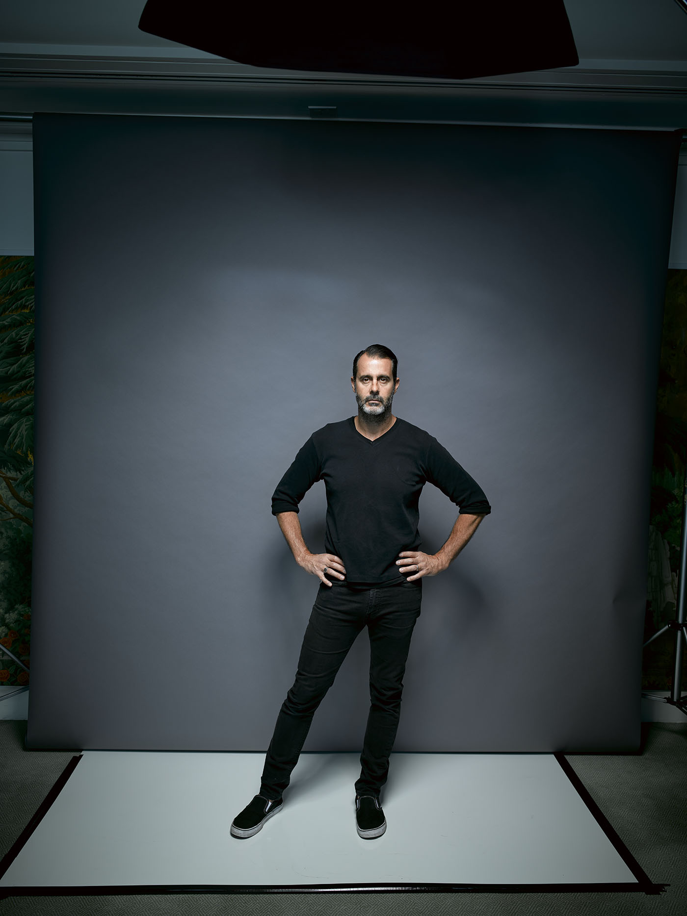
The new input profile allowed me to lower my white balance from 5100K down to 4150K which gave me a cool, blue overall look, but the skin tones remained pleasant without me having to add a warming gel to the Beauty Dish. Next, using the Capture One ‘Color Editor’ control panel, I was able to further adjust the blue and cyan channels to make them even more saturated, and also was able to improve on the skin tone in the red and yellow channels. Now it’s certainly possible to do this kind of thing in post using Photoshop, but with the Leaf input profiles and adjustment panels, I’m not only able to see the effect as I’m shooting, but it cuts down on my post processing a ton! You can also see how the addition of the Beauty Dish brings up the light on my subject so that he stands out better.
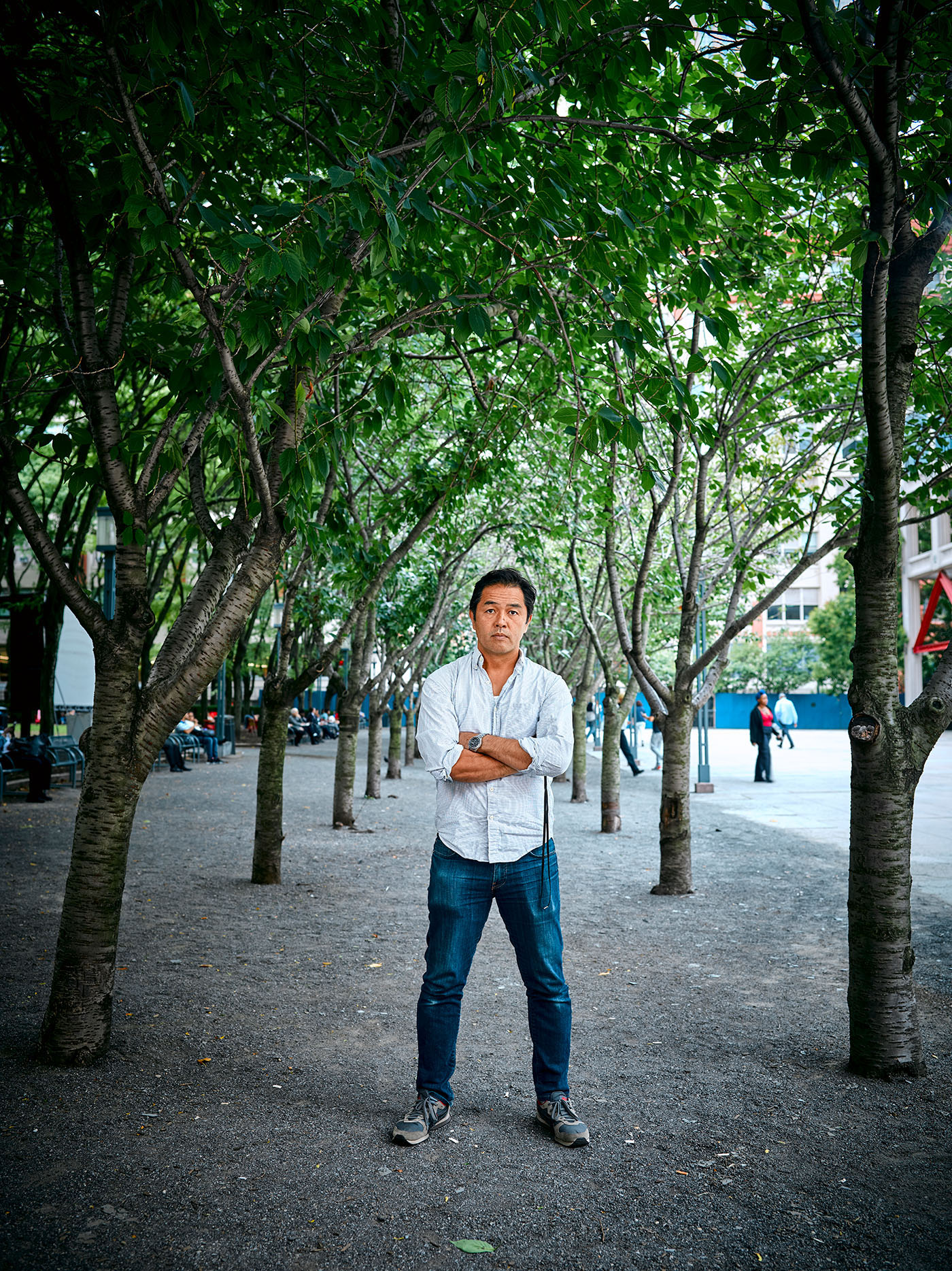
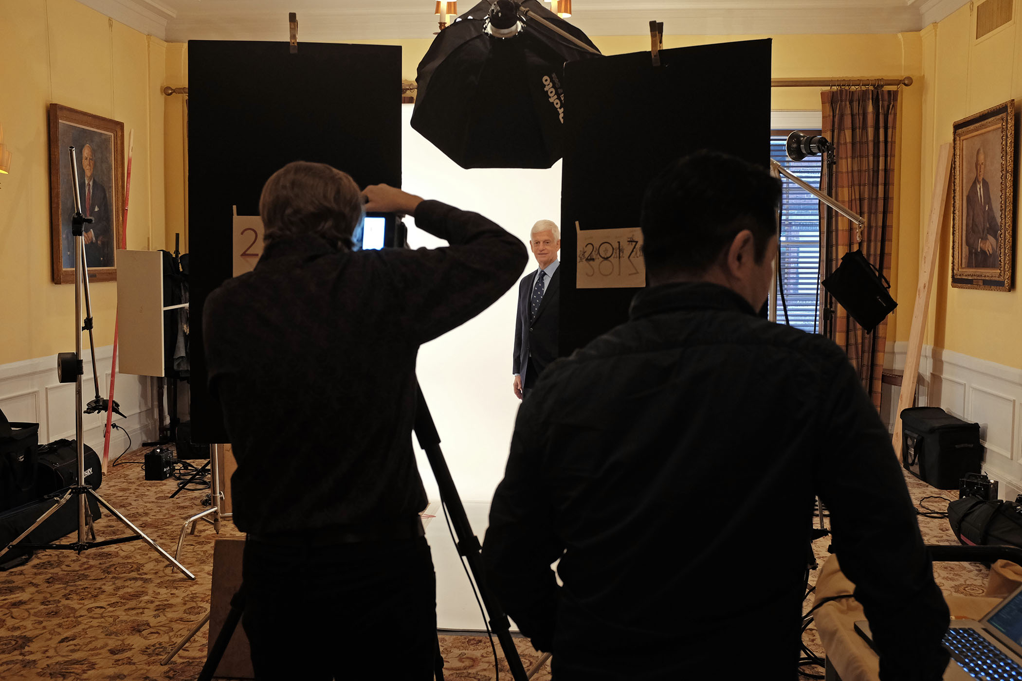
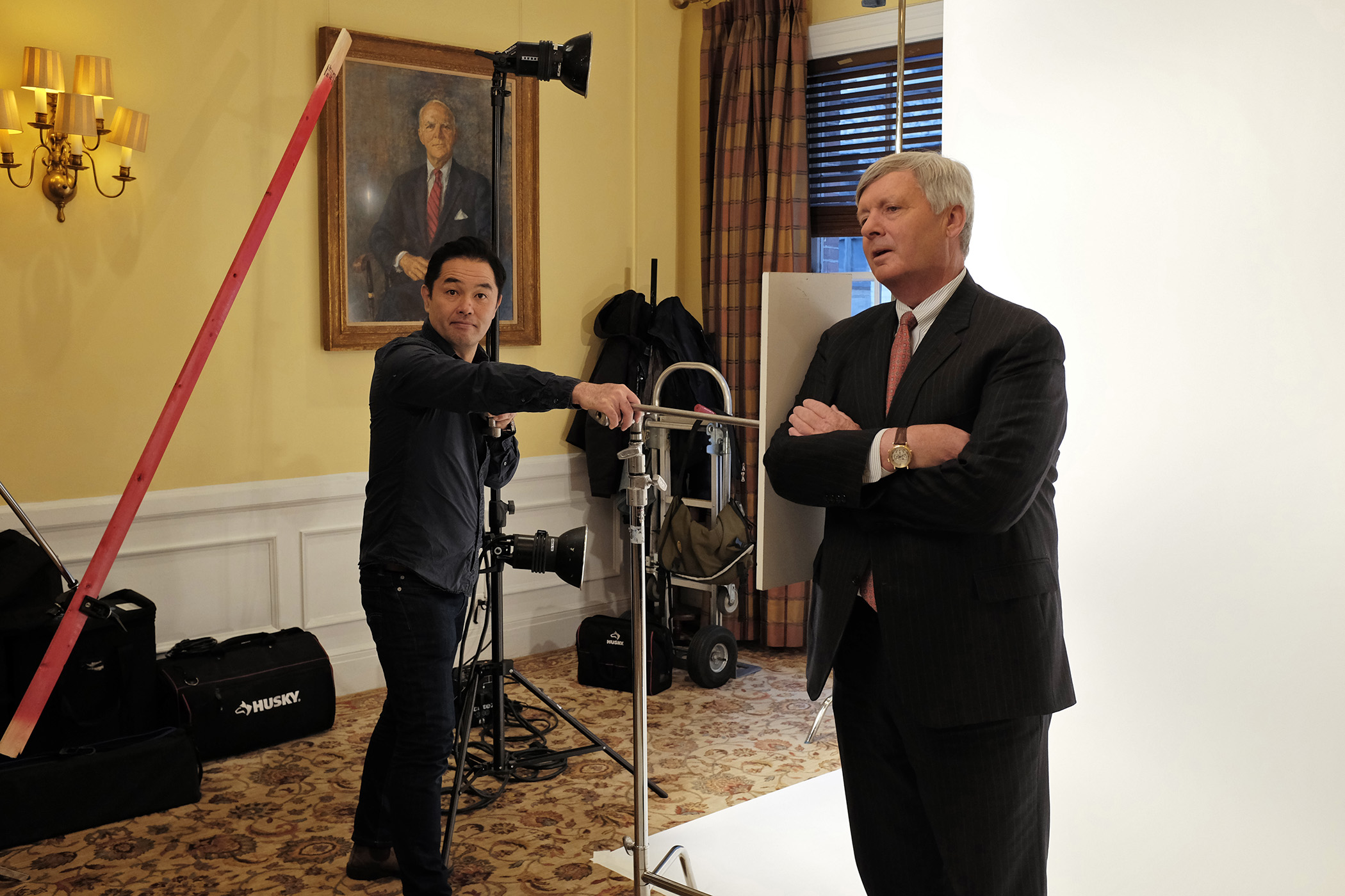
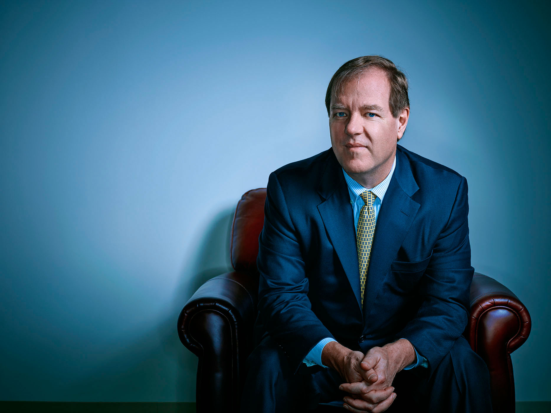
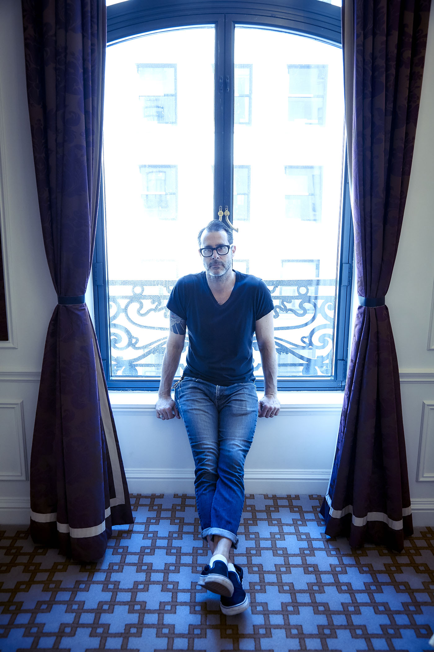
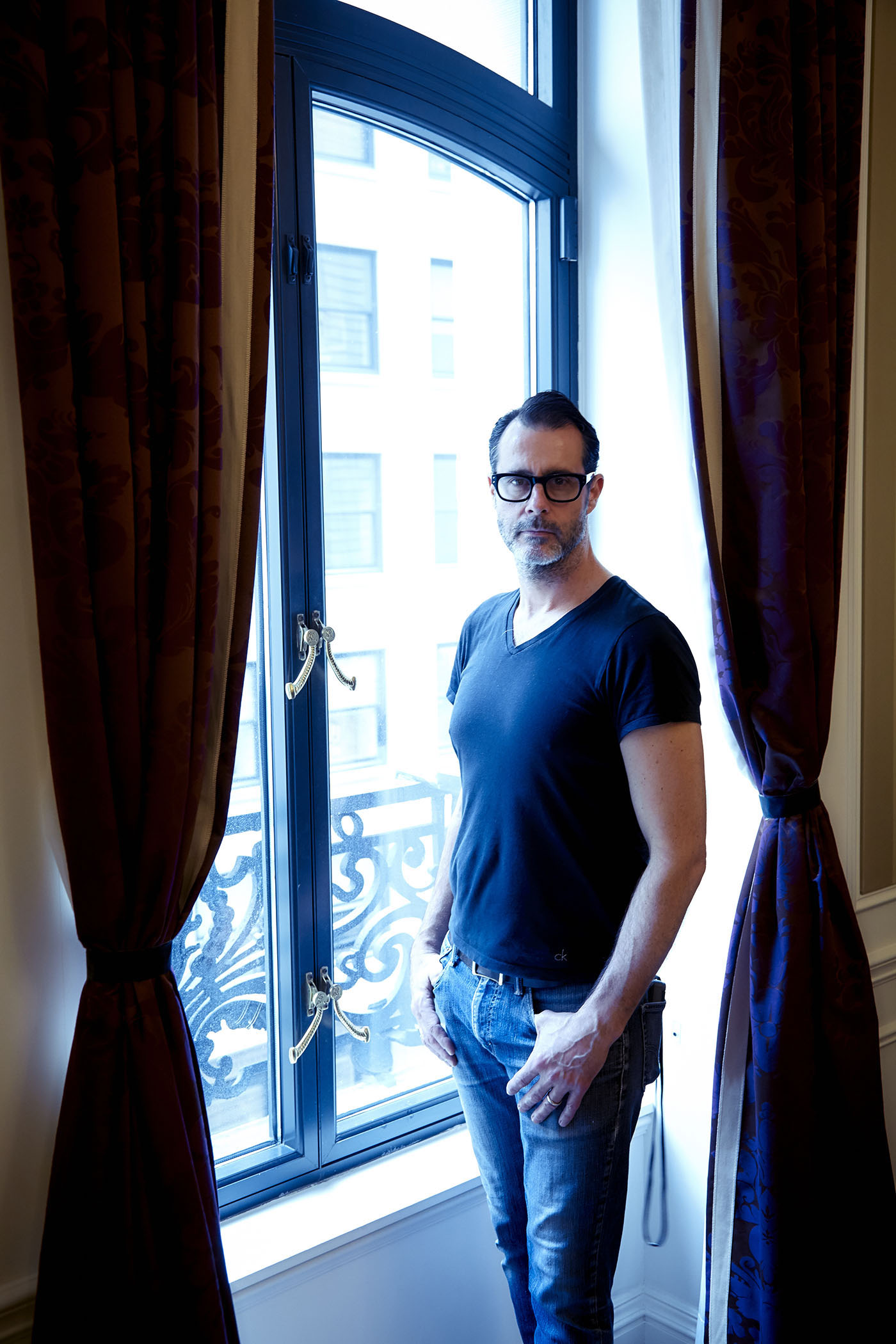
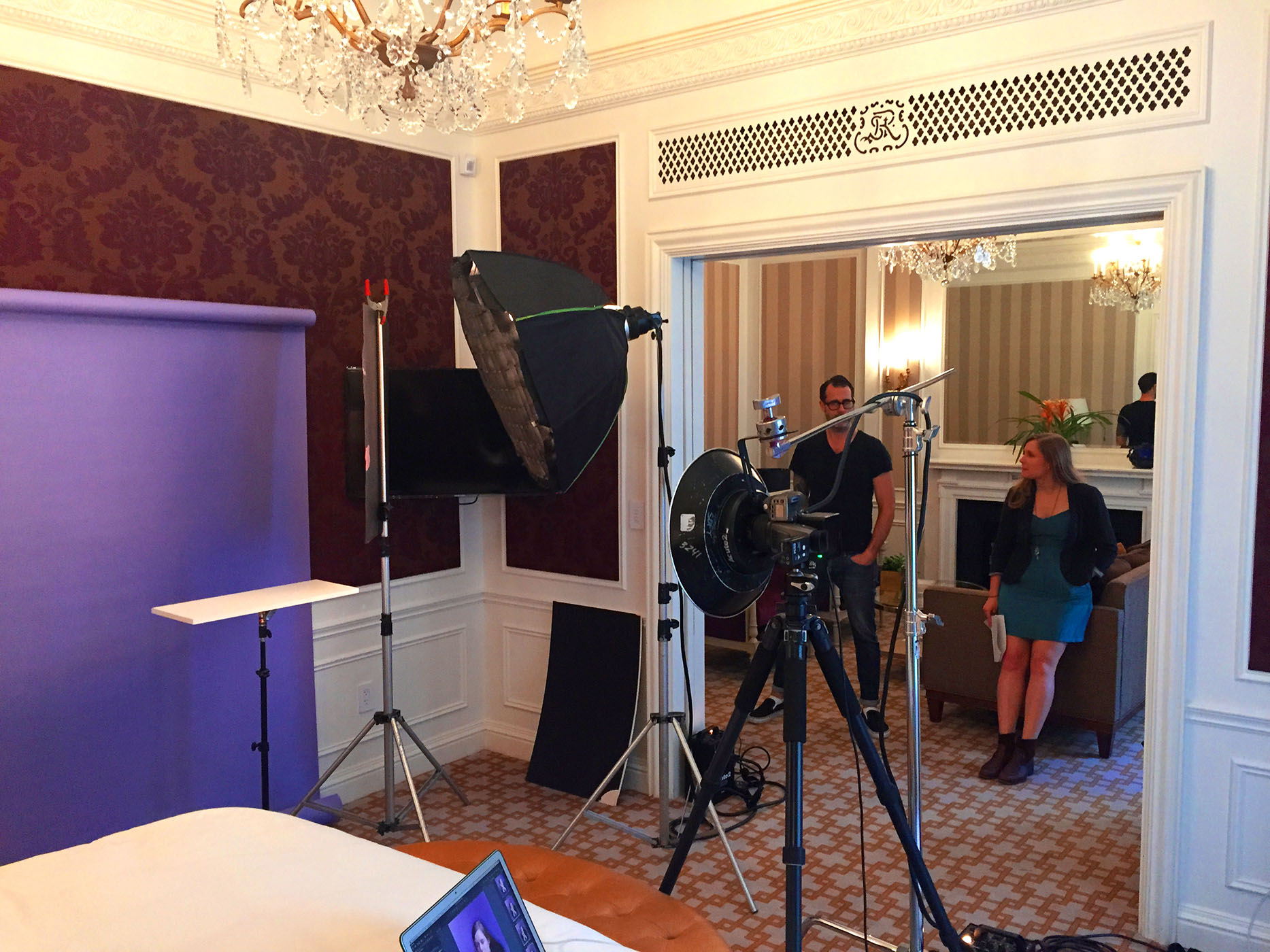
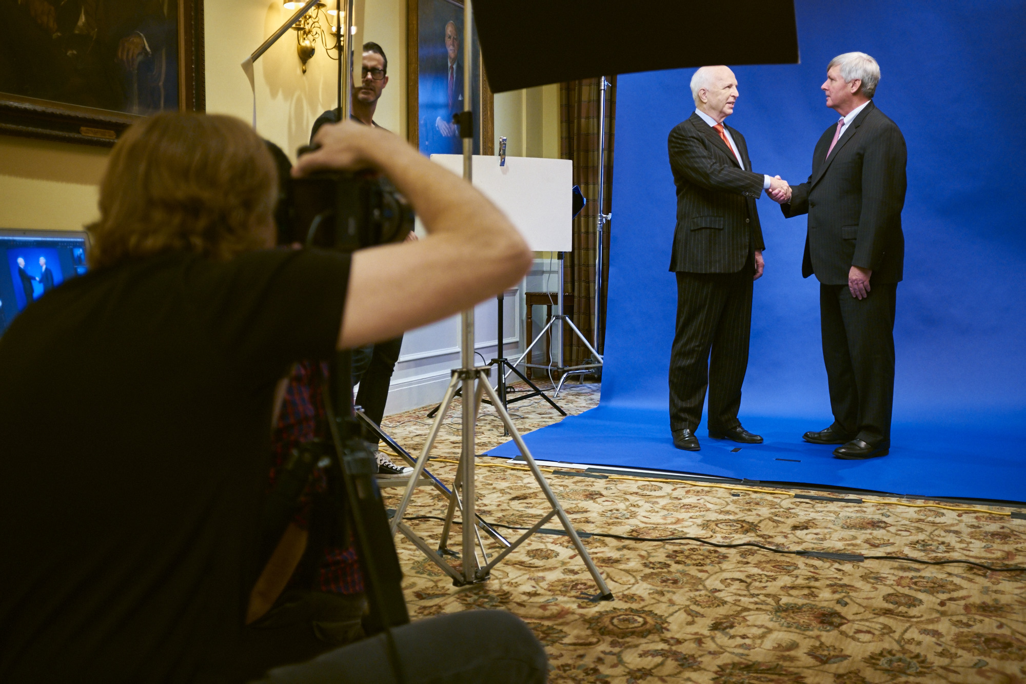
With my prelight & Capture One setup nailed, I think we’re ready to get Joseph on set…


Before we finished, I switched from the 80mm to the 150mm lens that compressed the perspective further and lowered the output on the umbrellas by about half a stop that slightly darkened the mannequins and allowed Joseph to stand out even more…

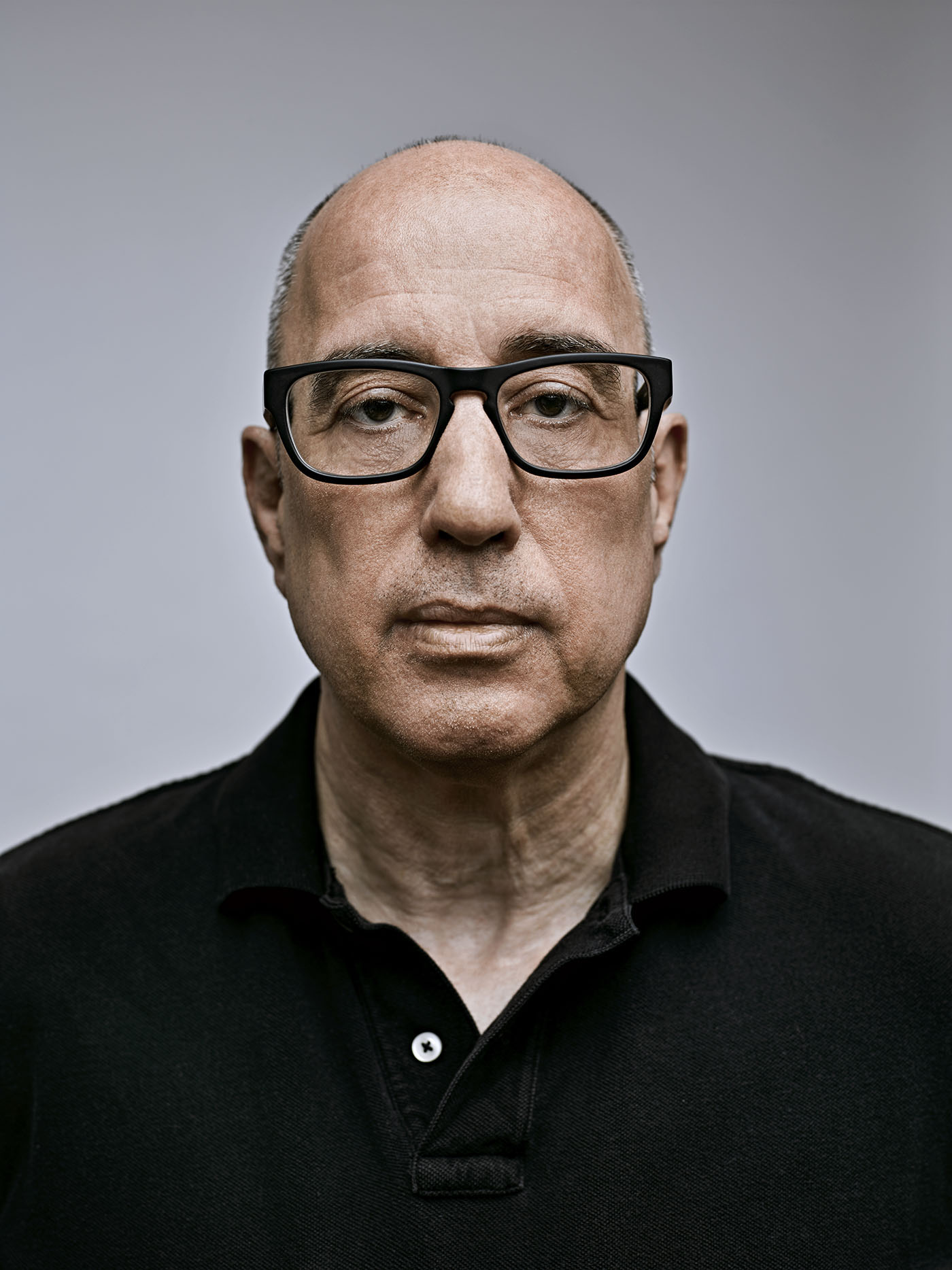
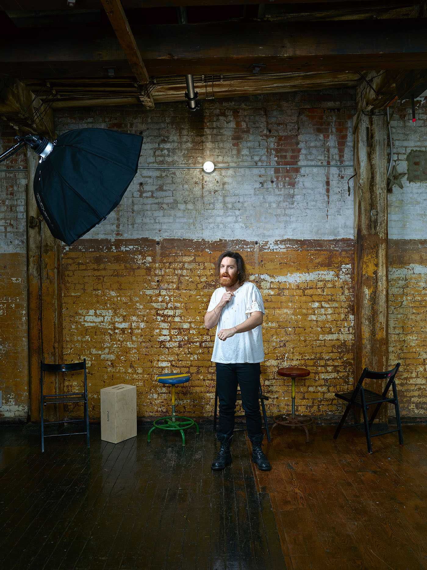
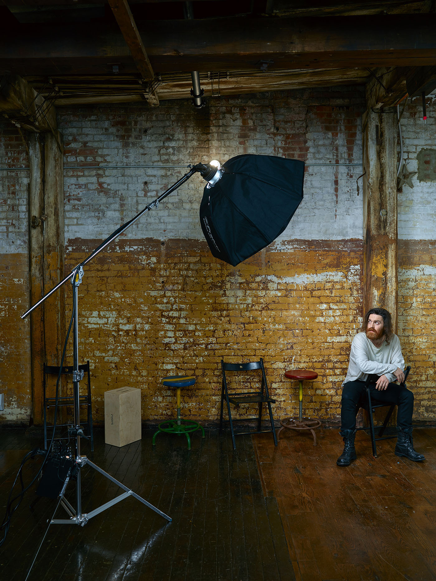
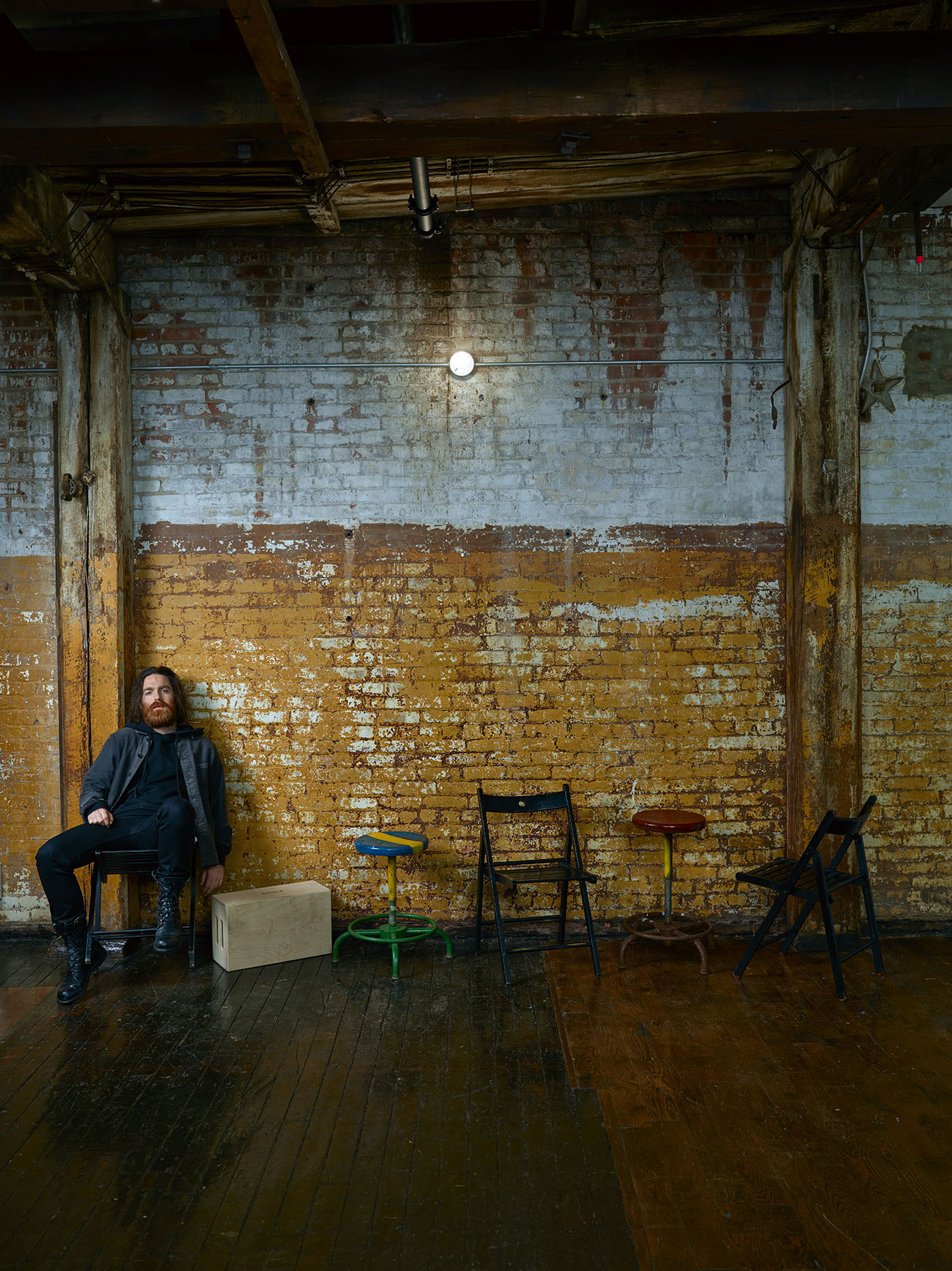
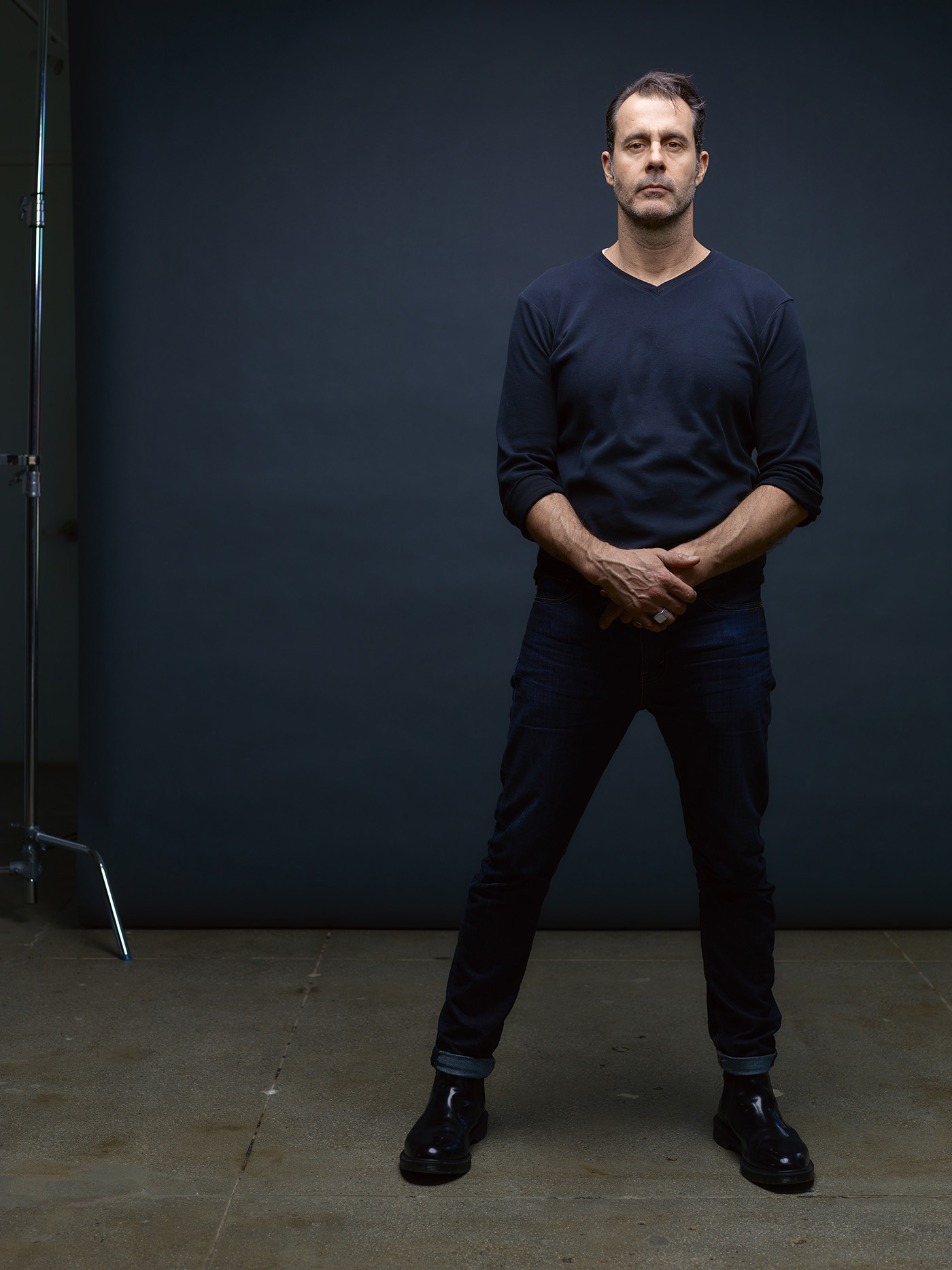
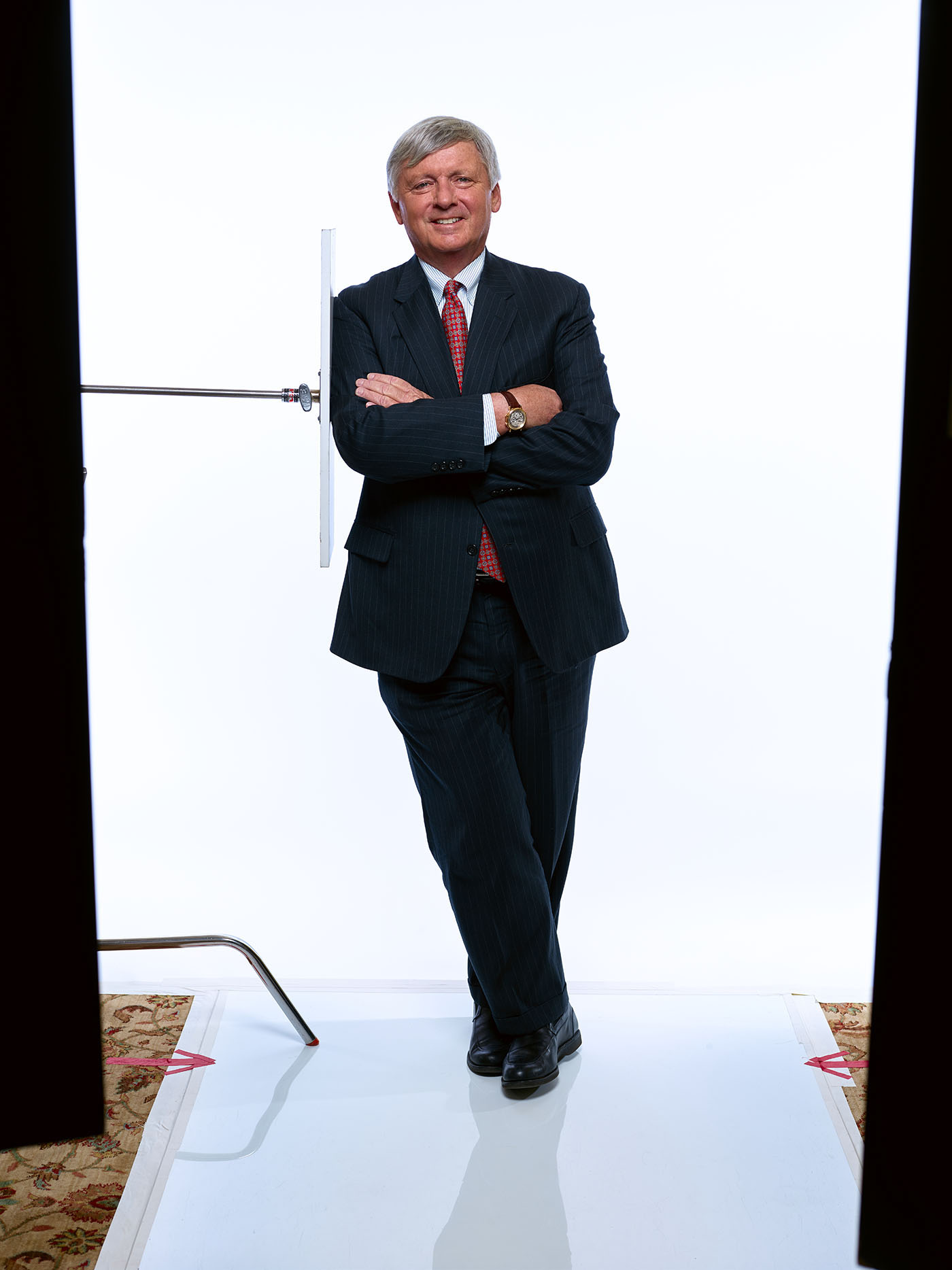
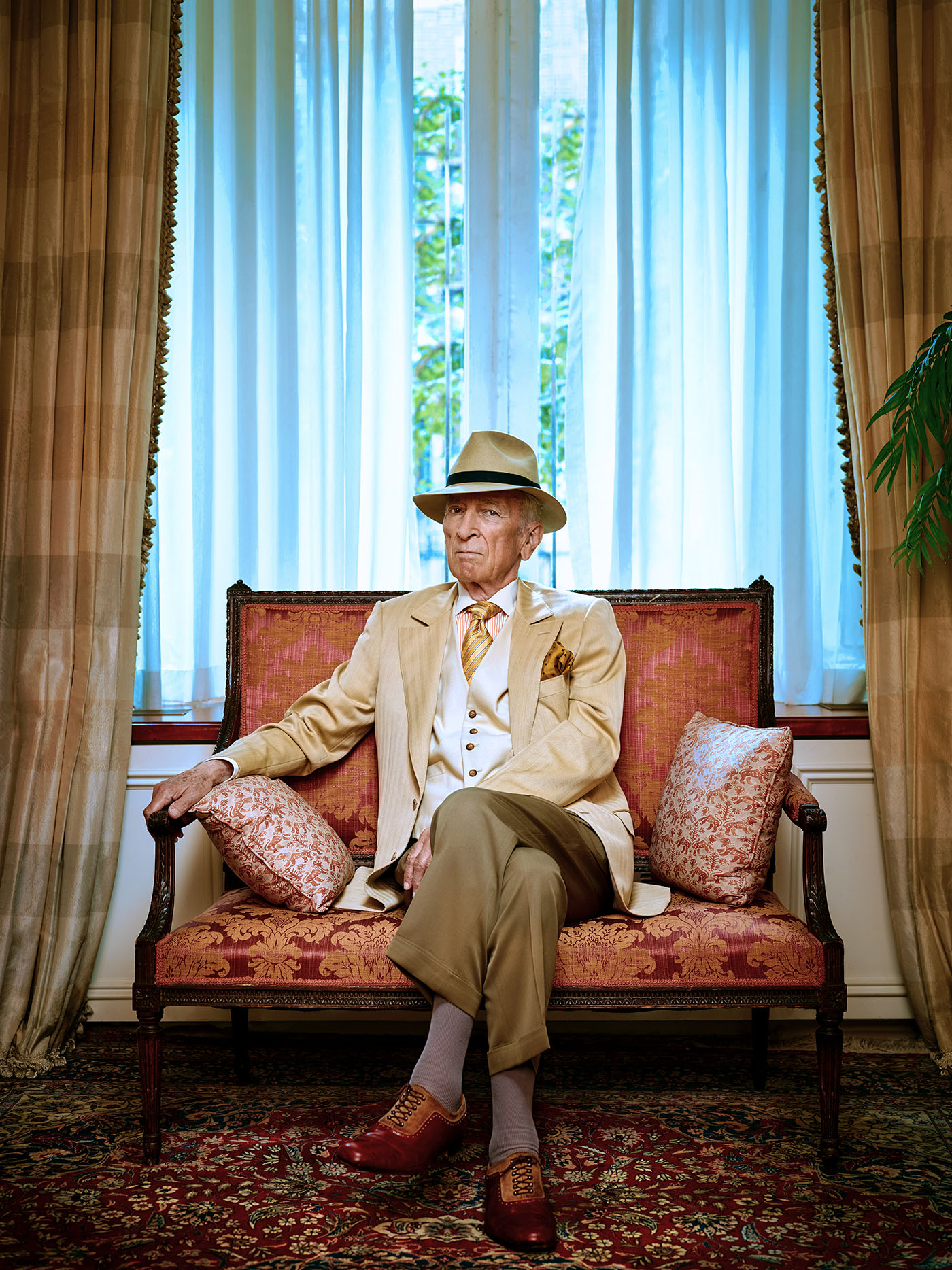
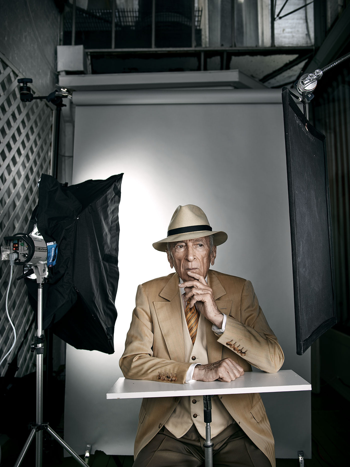
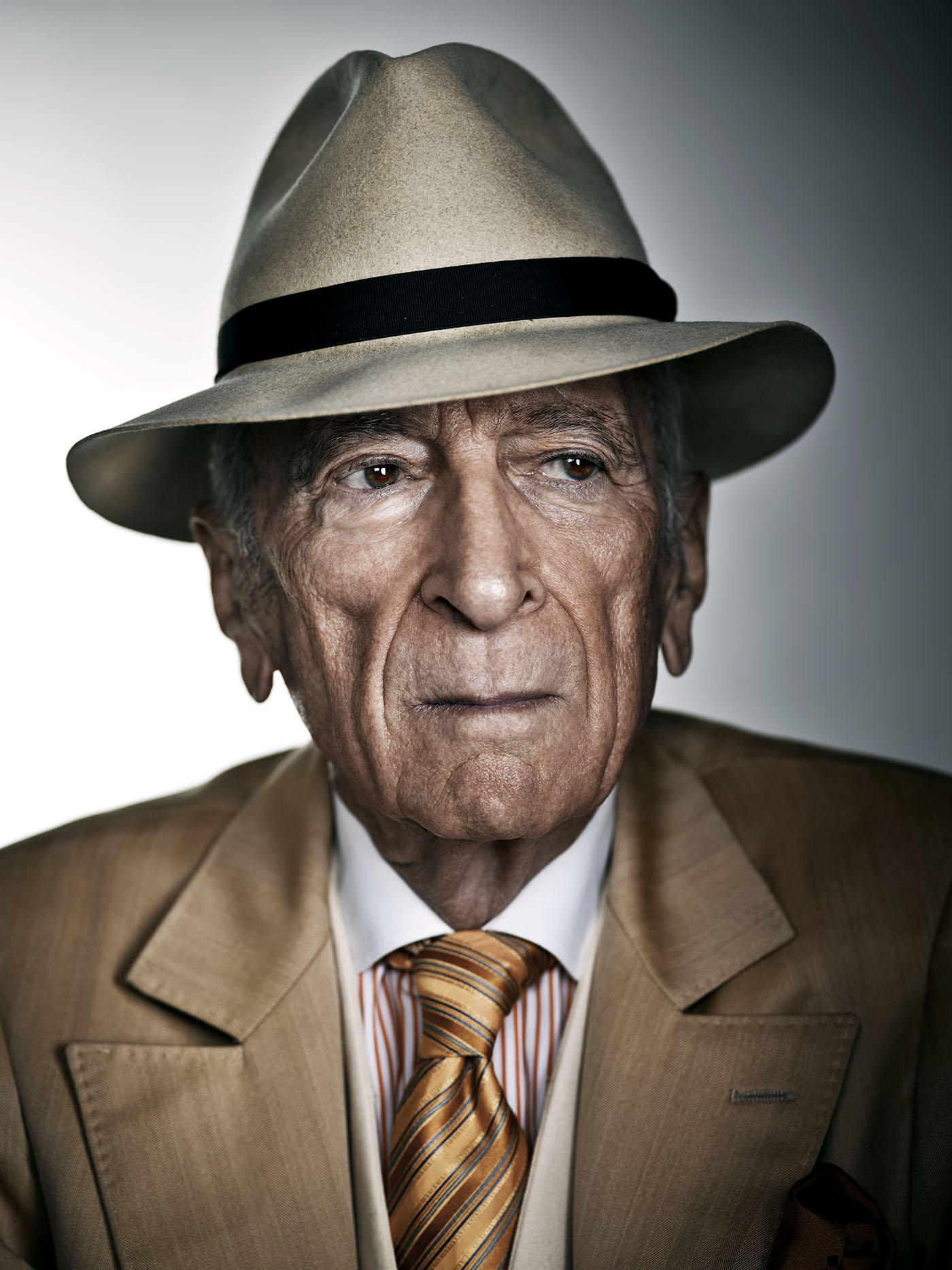
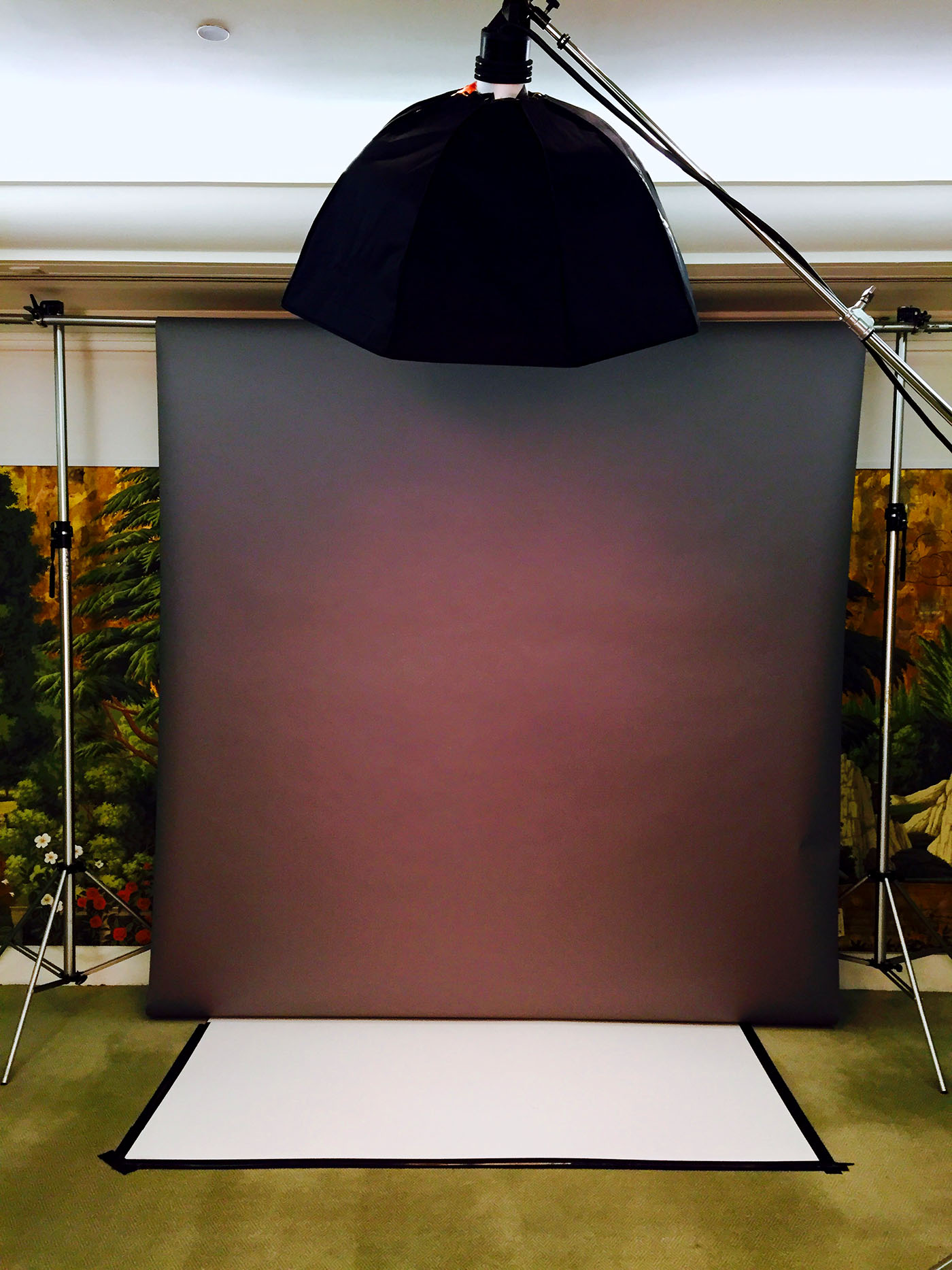
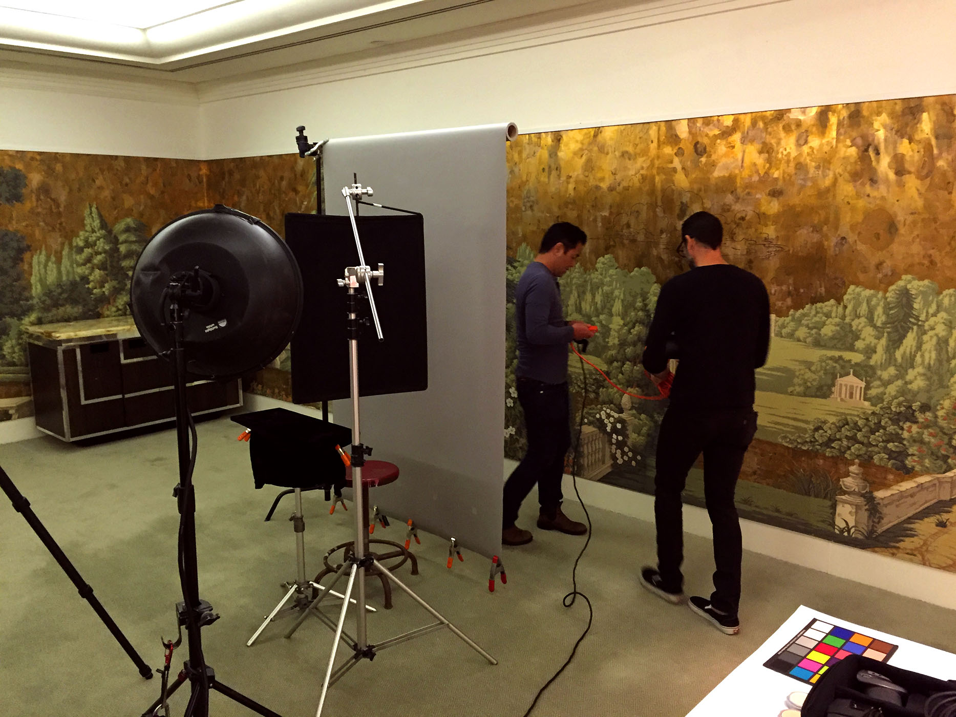
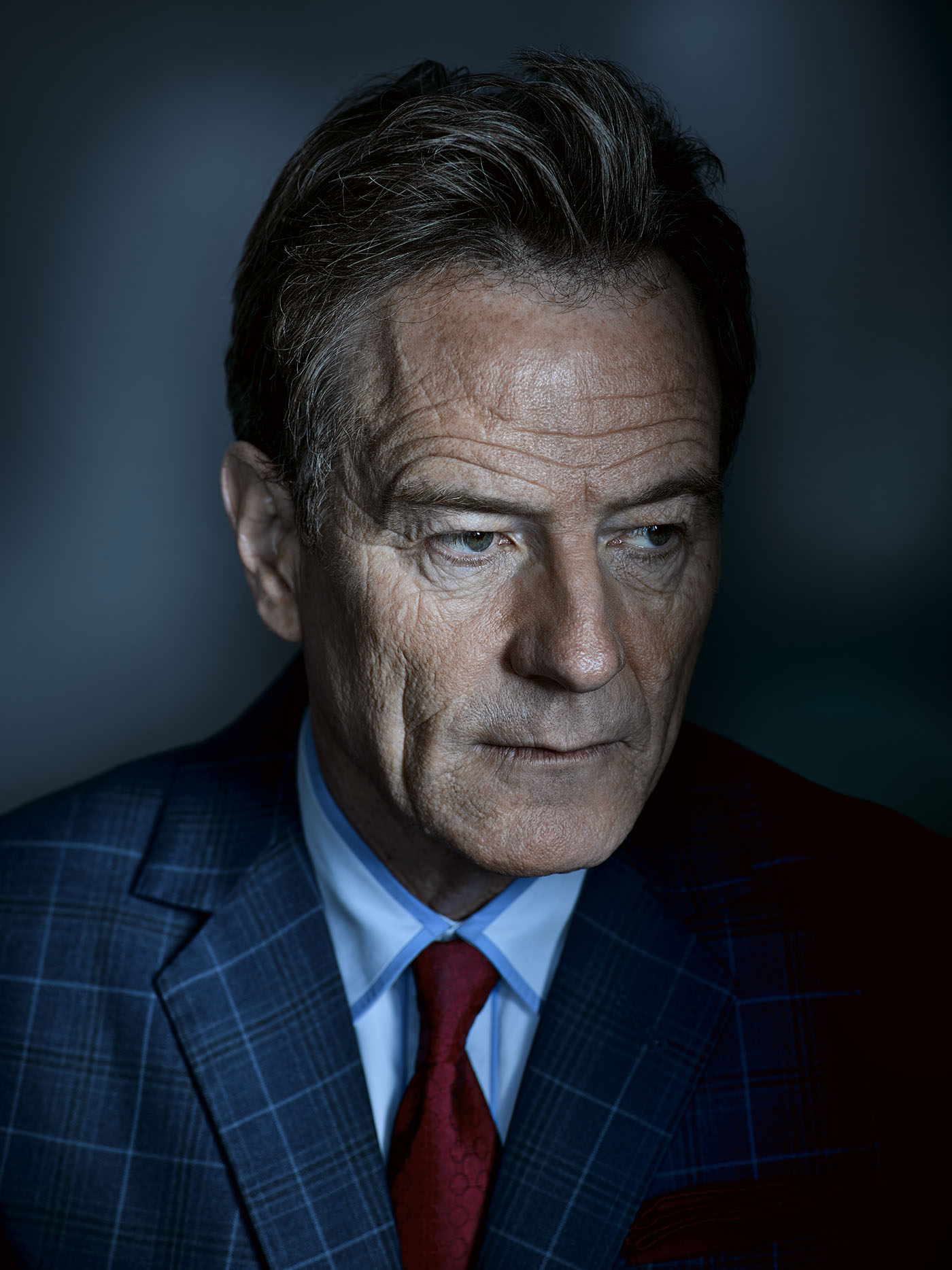
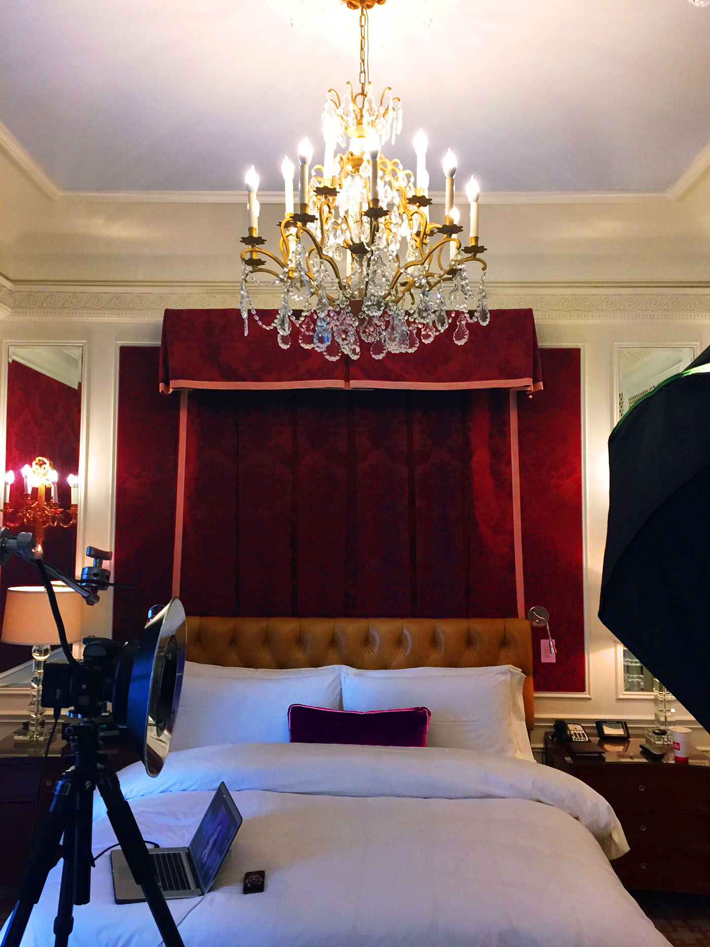
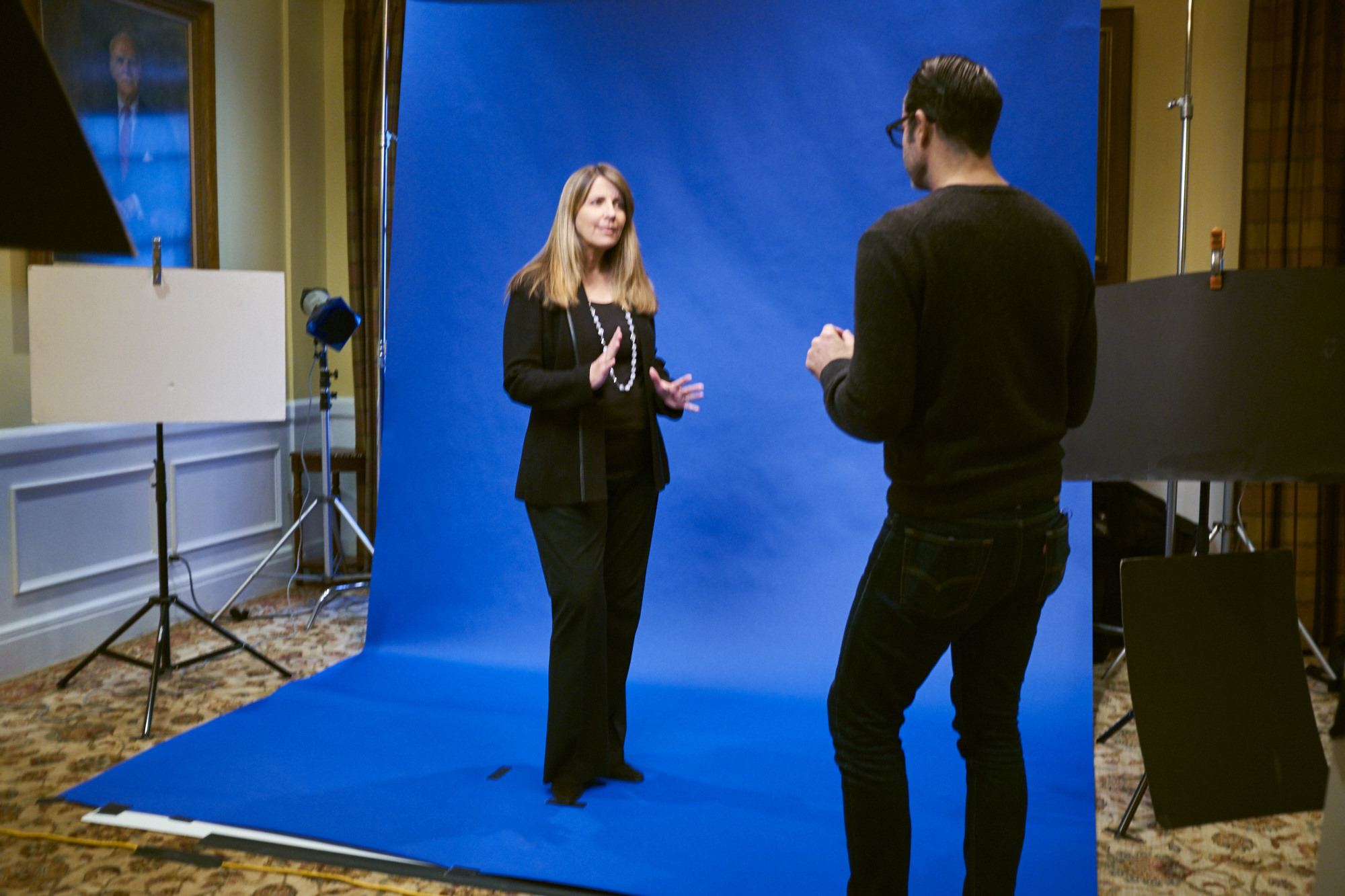
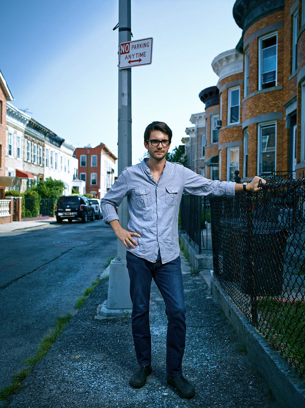
Next, we had set up a thunder grey backdrop for some seamless portraits…

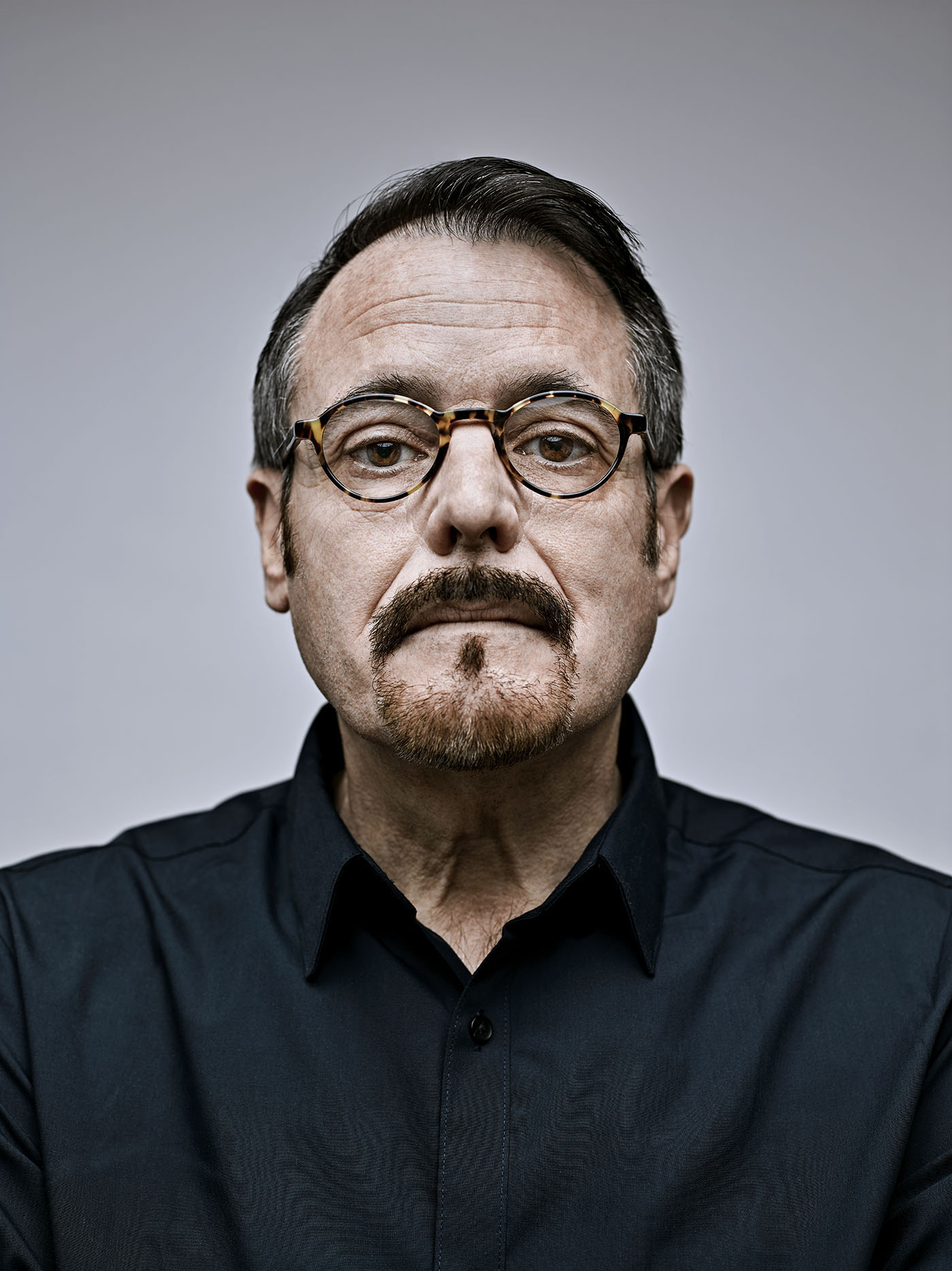
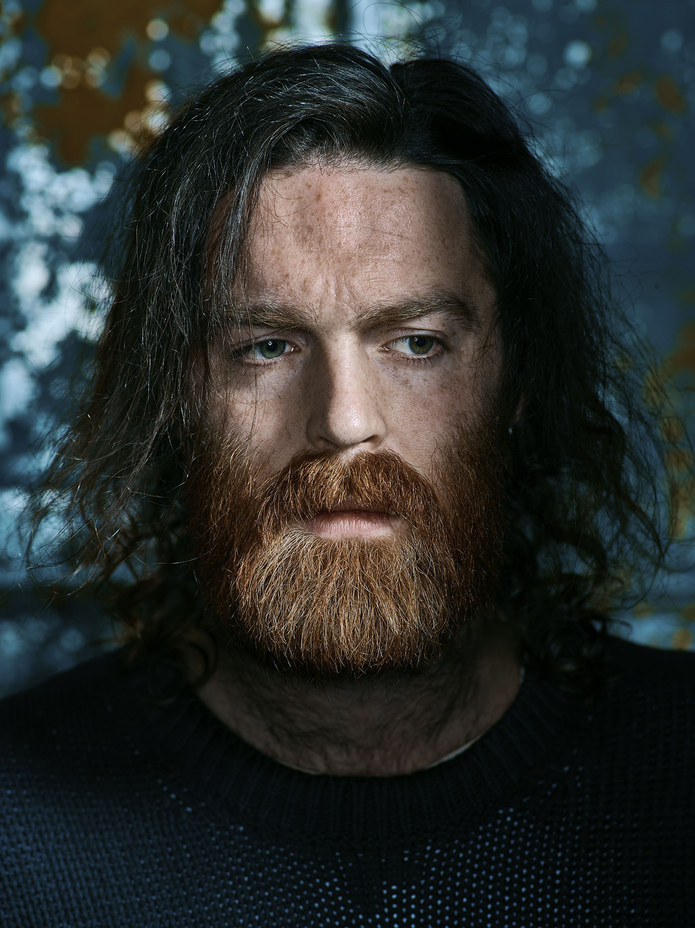
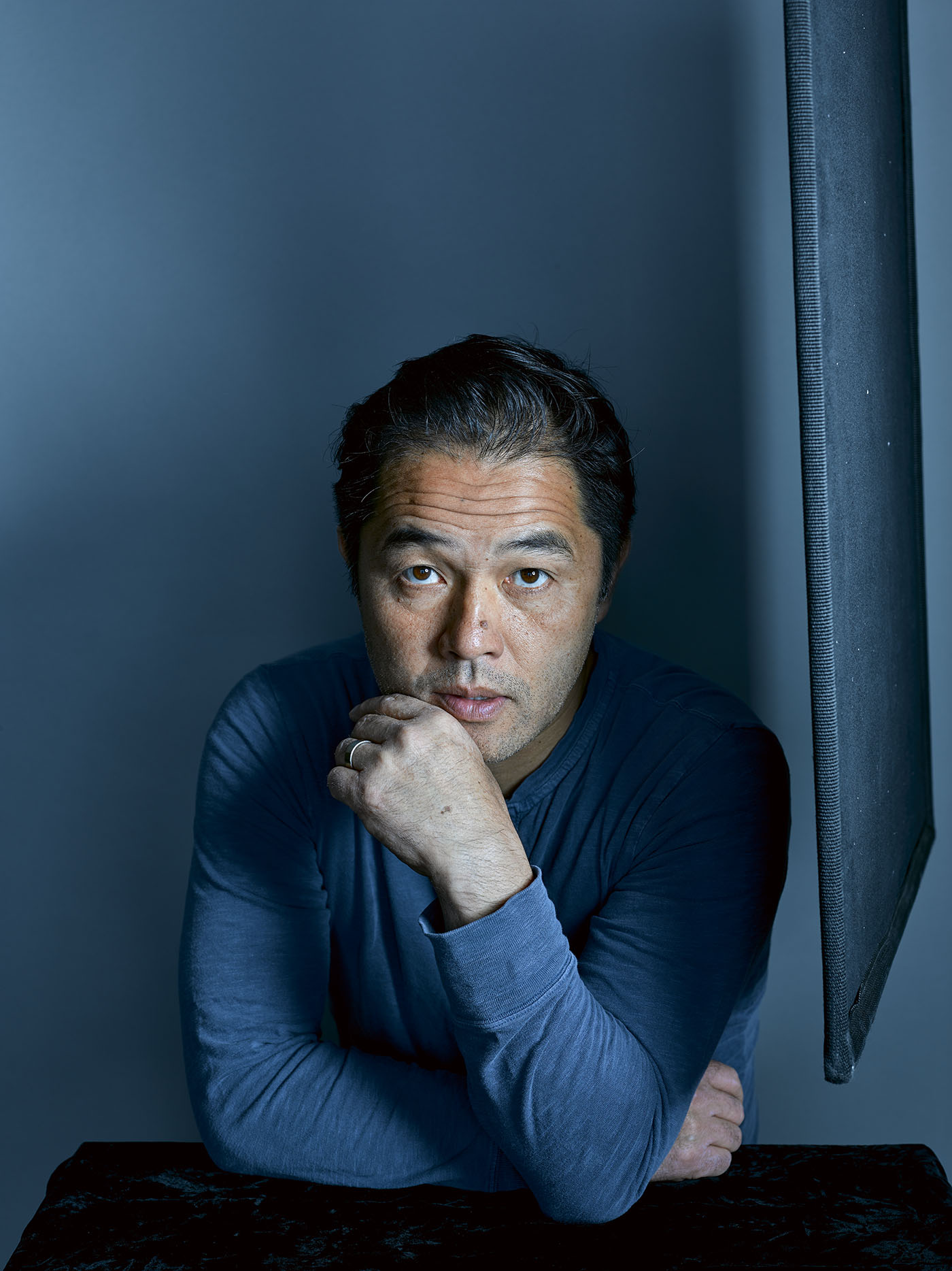
It doesn’t get any simpler than this…one big, soft light source (a 47″ Rime Lite Grand Box) placed on a boom stand about 2.5 feet above his head. No fill, no tricks. Here’s how it looked on Robert…

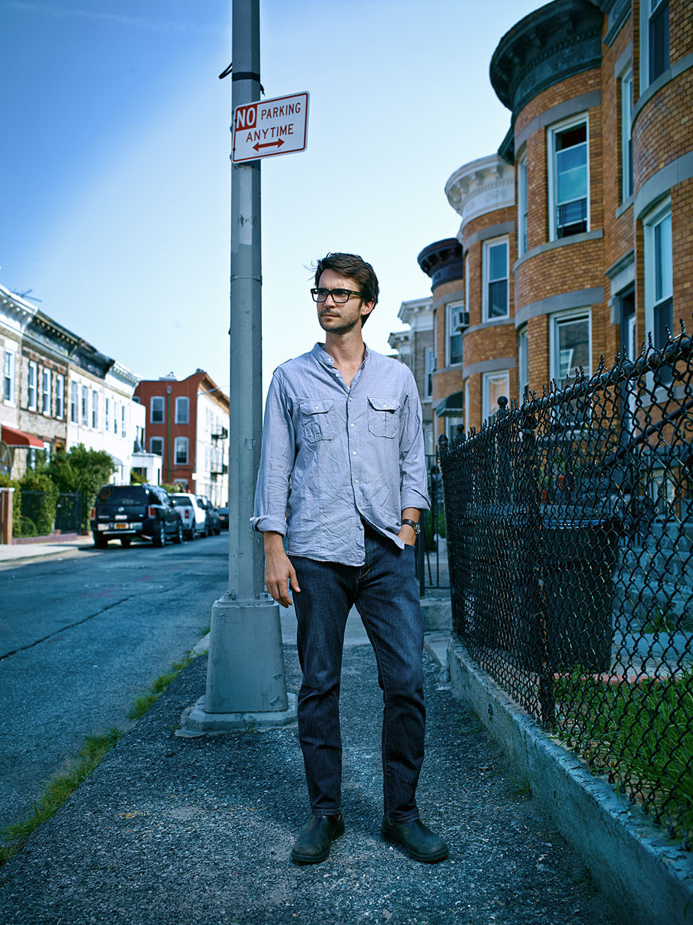
Again, that first test shot looks pretty good, but we can still improve on it with a few easy adjustments. All we had to do was lower the white balance from 4650K down to 4150K, tweak the Levels and Curves a bit, add a little shadow detail and pull in a bit of vignetting on the corners and we were ready to go…


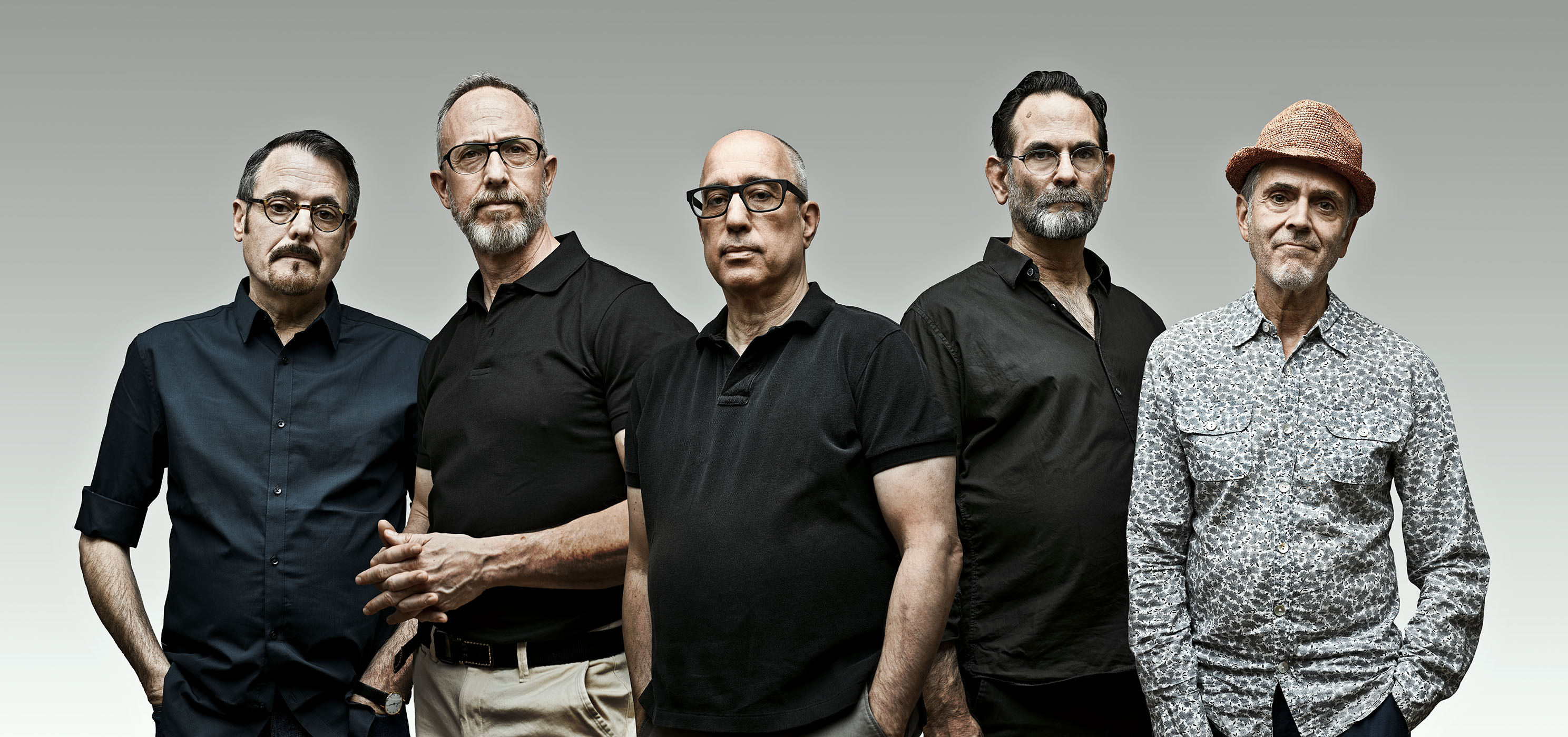
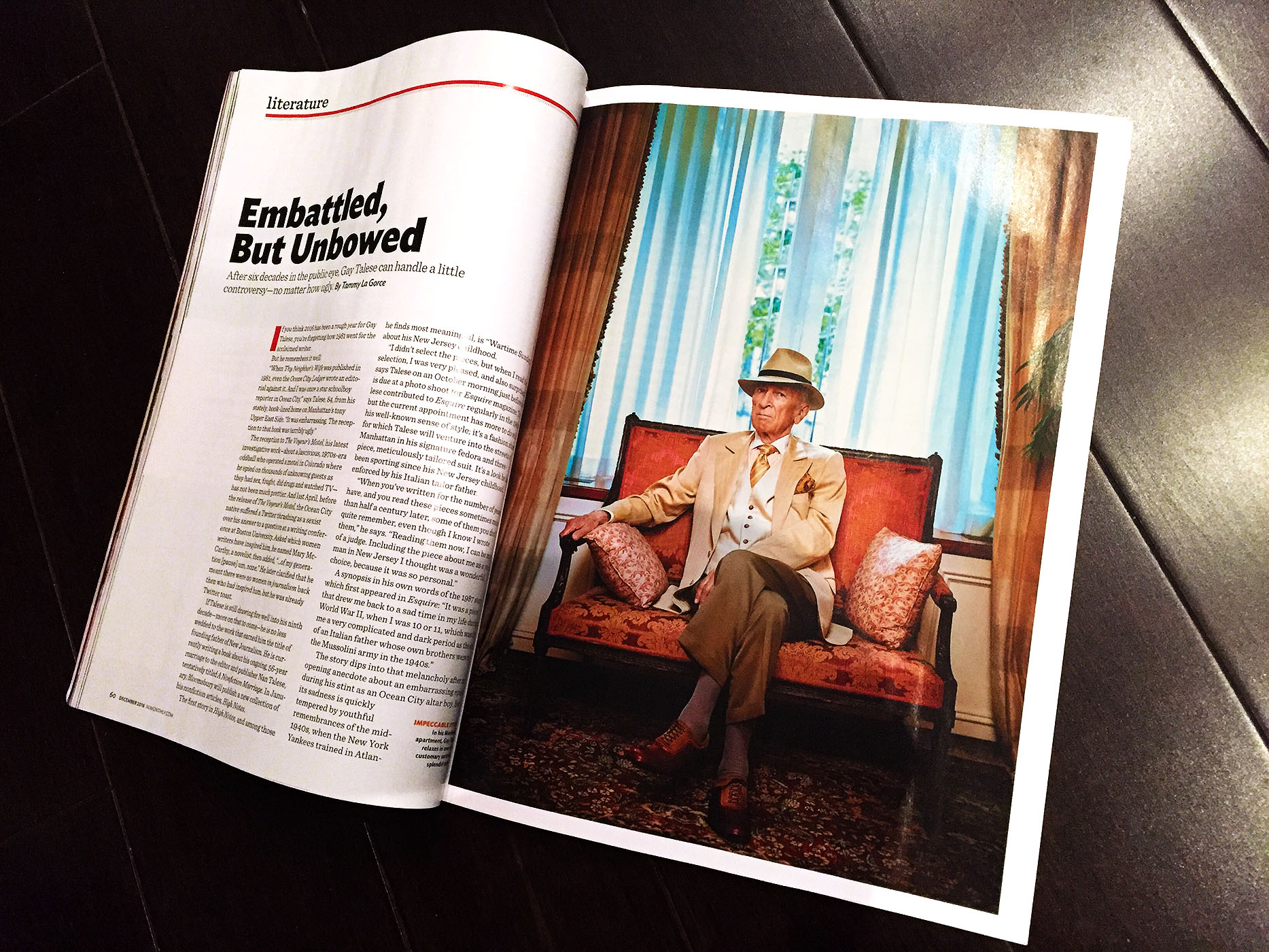
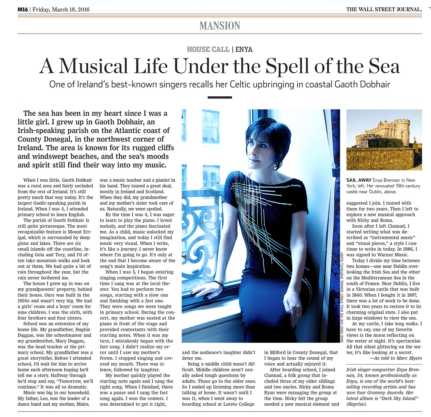
Finally, here is the story as it appeared in last weekend’s Wall Street Journal ‘Review’ Section…