Click on any image for Full-Size
In the last episode of ‘Damn Ugly Photography’, we took a look at the first week of the 2016 Barron’s Roundtable Shoot…but now I’m gonna show you how I convinced our nine financial professionals to act as stand-ins for Tom Cruise in his movie, ‘The Minority Report’. You remember…this one…

Adrian Delucca and I had been tossing ideas around for months on how to make this work. I had to generate the floating graphs and other graphics that would be ‘moved around’, and we also had to come up with the perfect background images to position the people against…


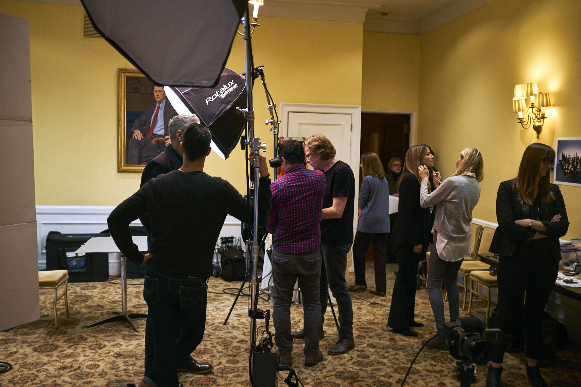
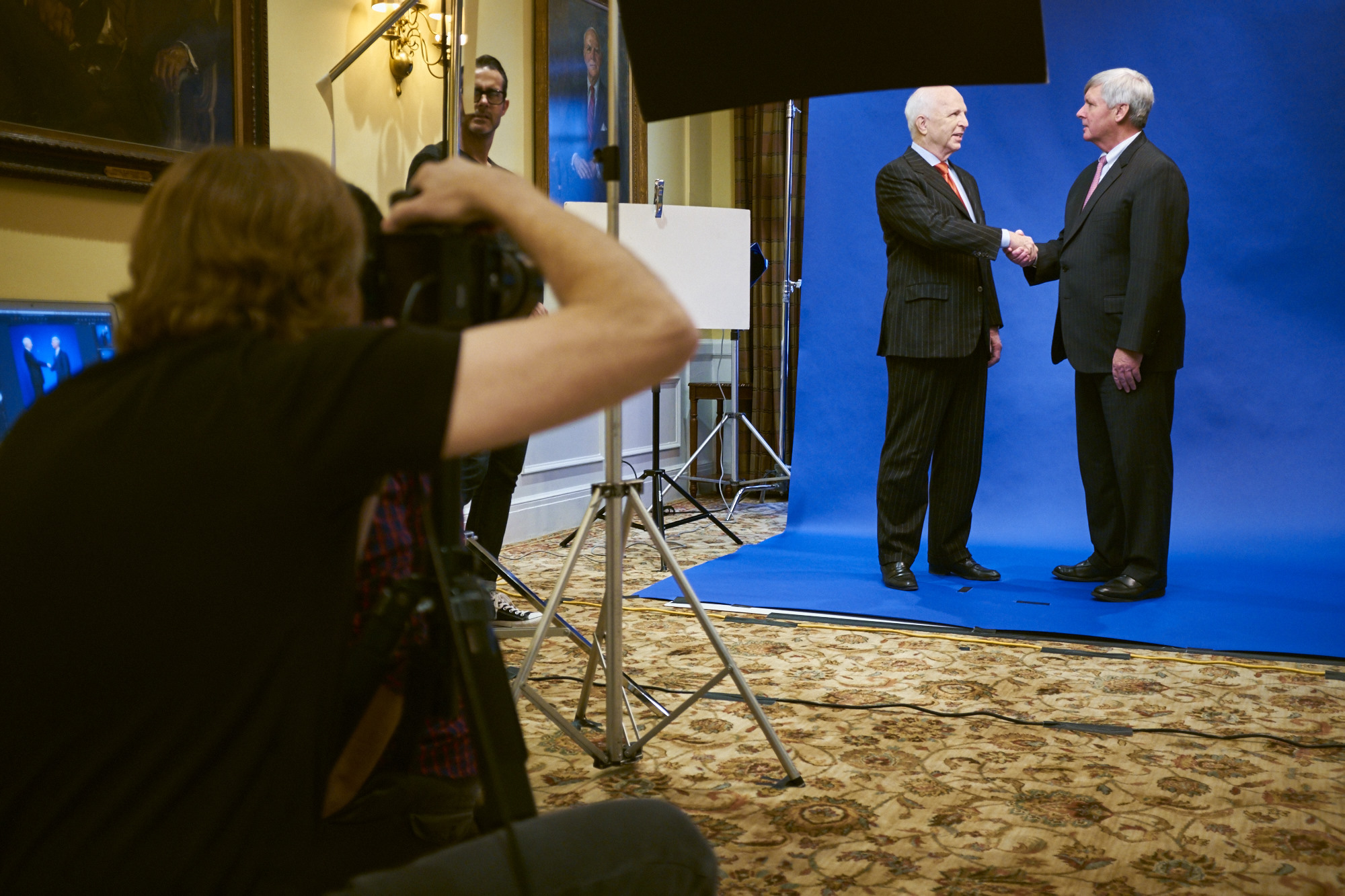
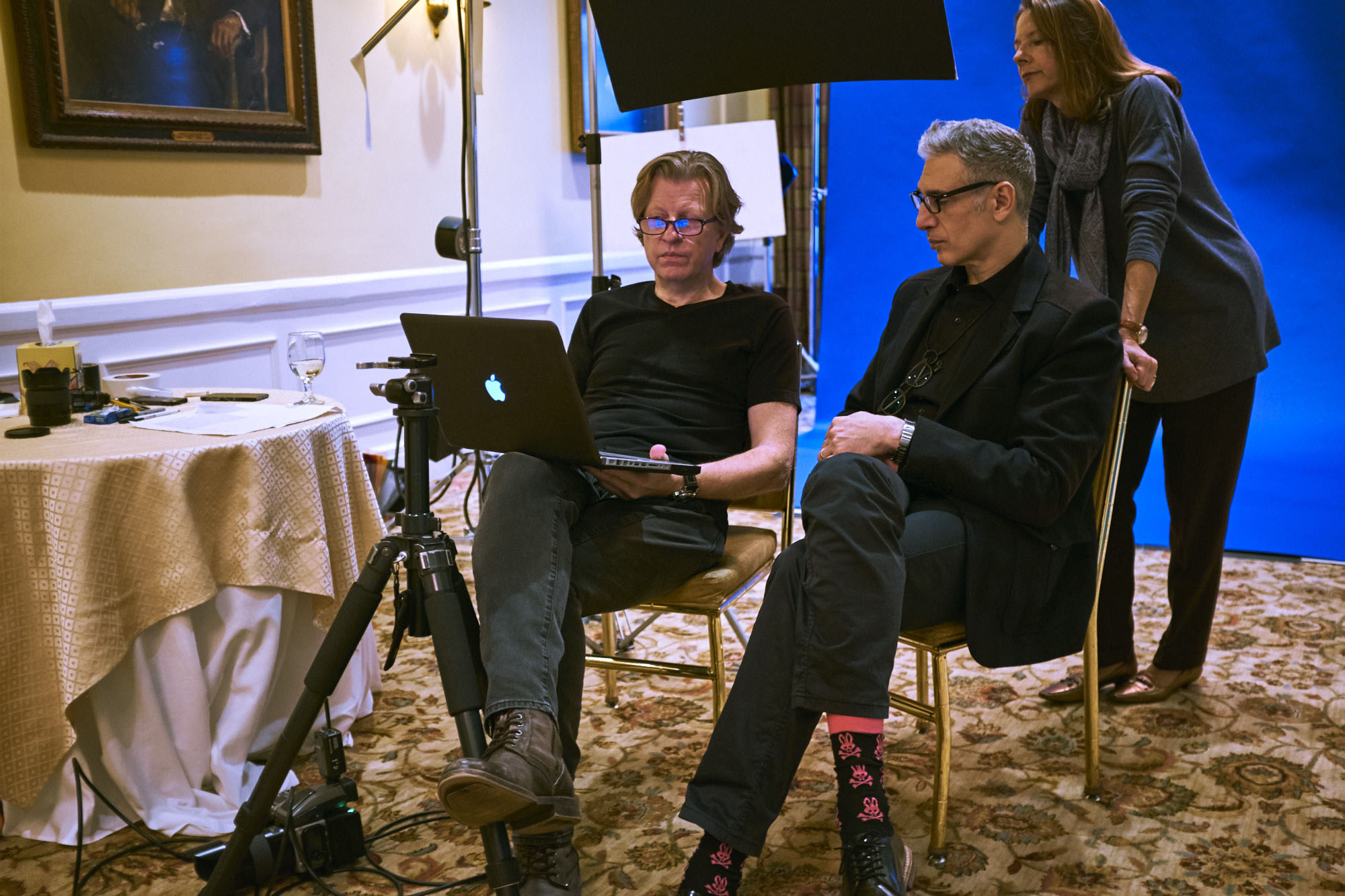
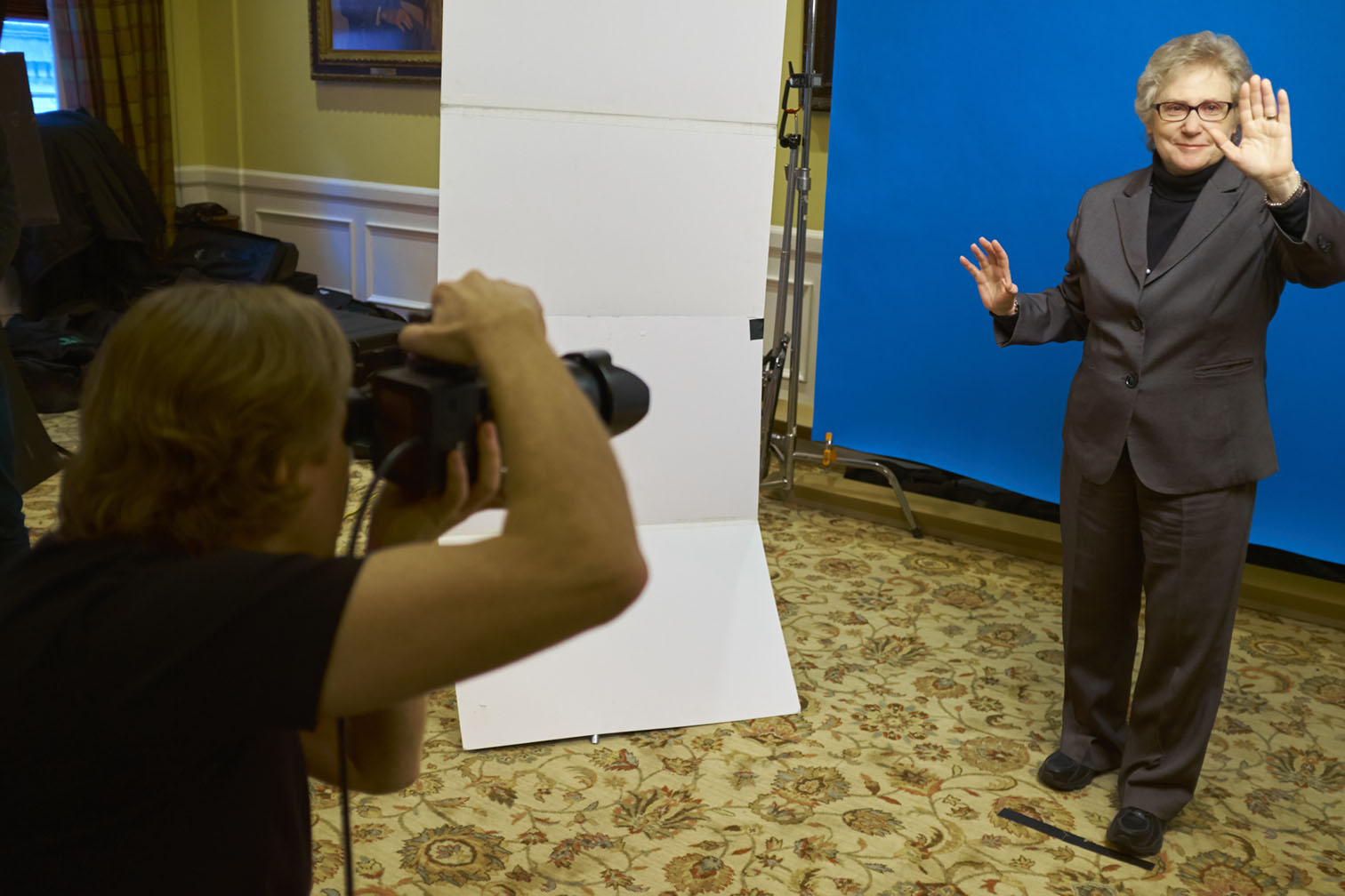
…but probably the hardest thing would be how we could quickly get each Roundtable member to understand exactly what the final image would be and how to get them into position. Remember…I have less than ten minutes with each person and I had to shoot two other setups besides this one! I figured the smartest way around this would be to show them a pretty detailed mockup of our cover ideas with one of my assistants standing in, so on our setup day, I had Robert work his magic…
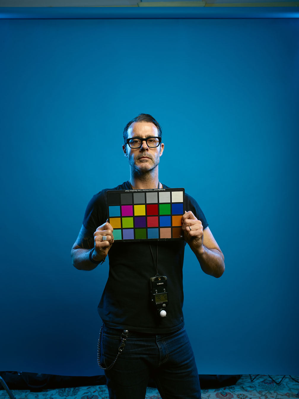
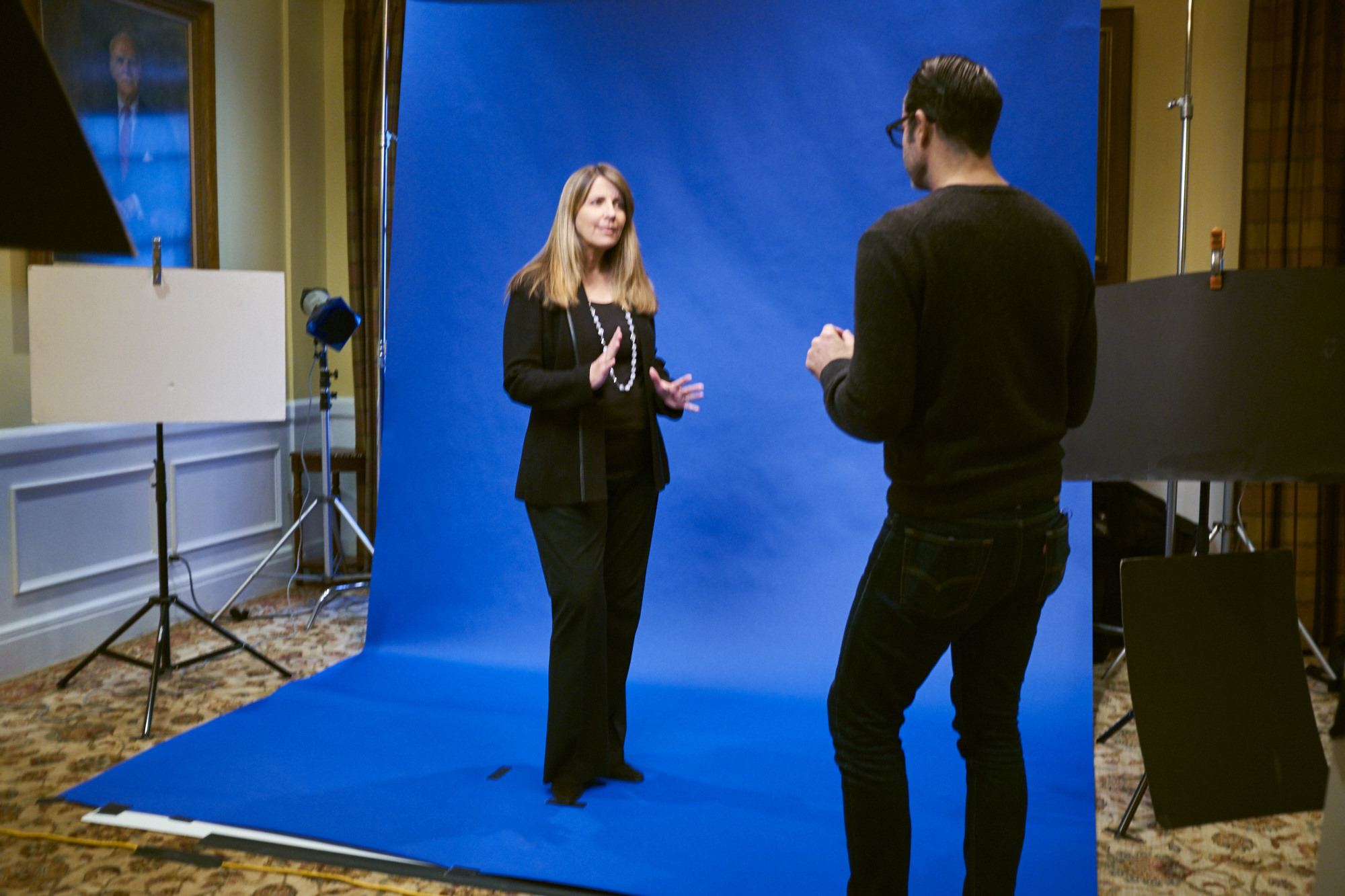
The lighting was super-simple…just a single Profoto 3′ RFI Octa bank way up high on a boom…and a couple of medium strip skim lights with blue gels to mimic the lighting from the background…
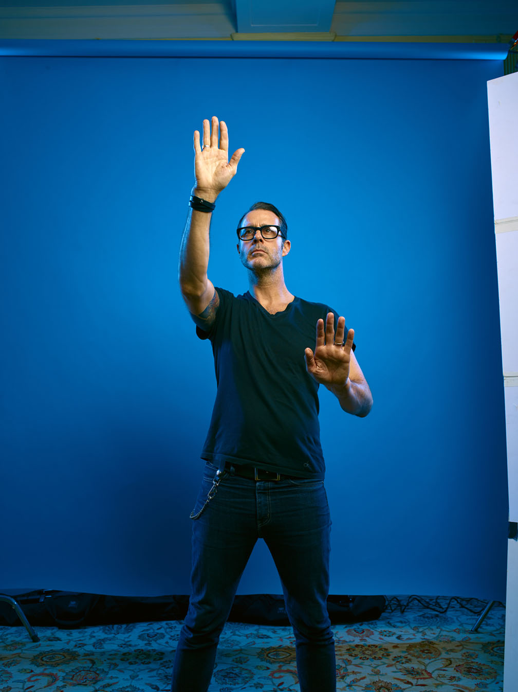
And the night before the shoot, I quickly Photoshopped this together…
Showing each person the print before we got started proved to be the exact thing they needed to illustrate what we wanted them to do…

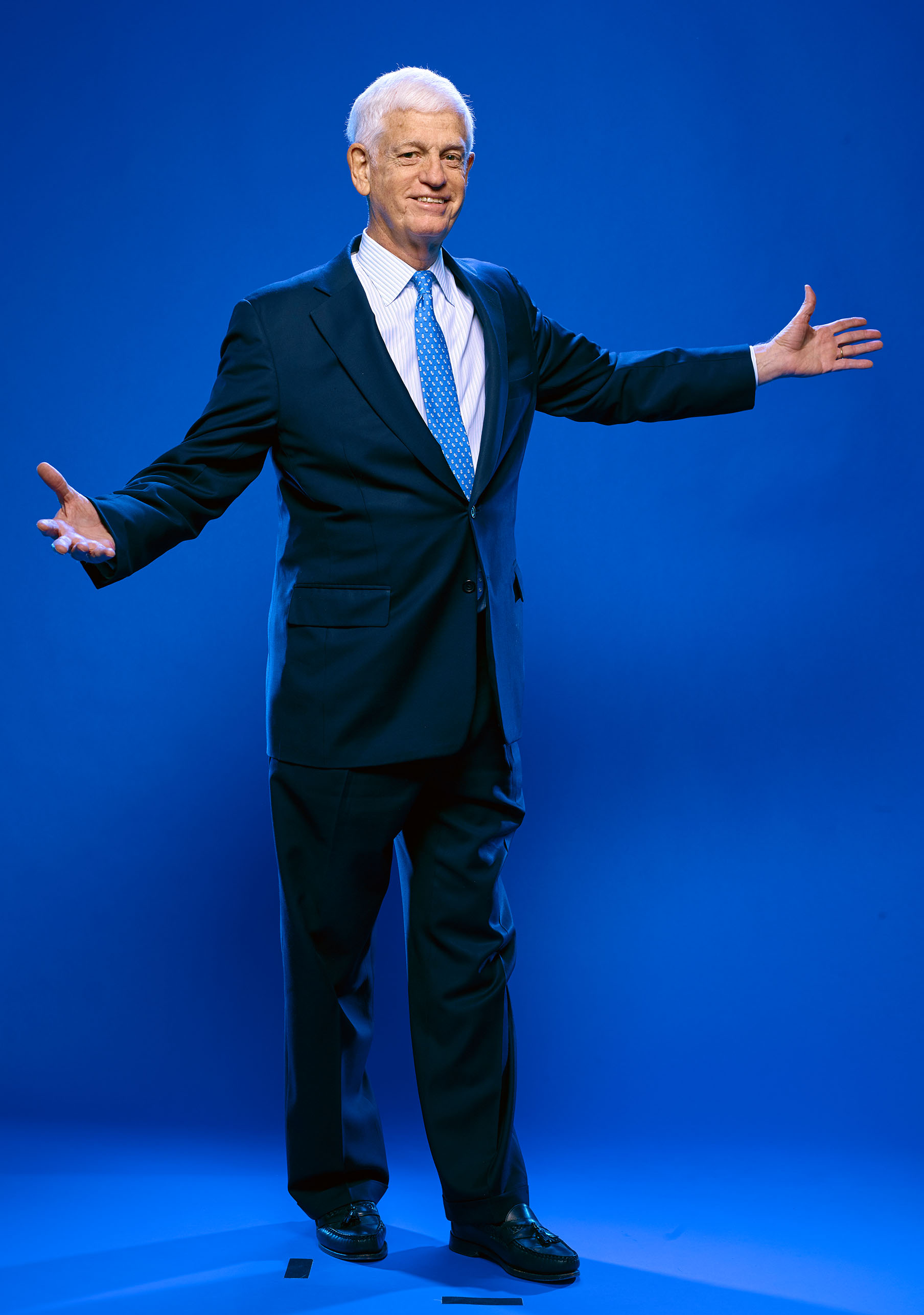
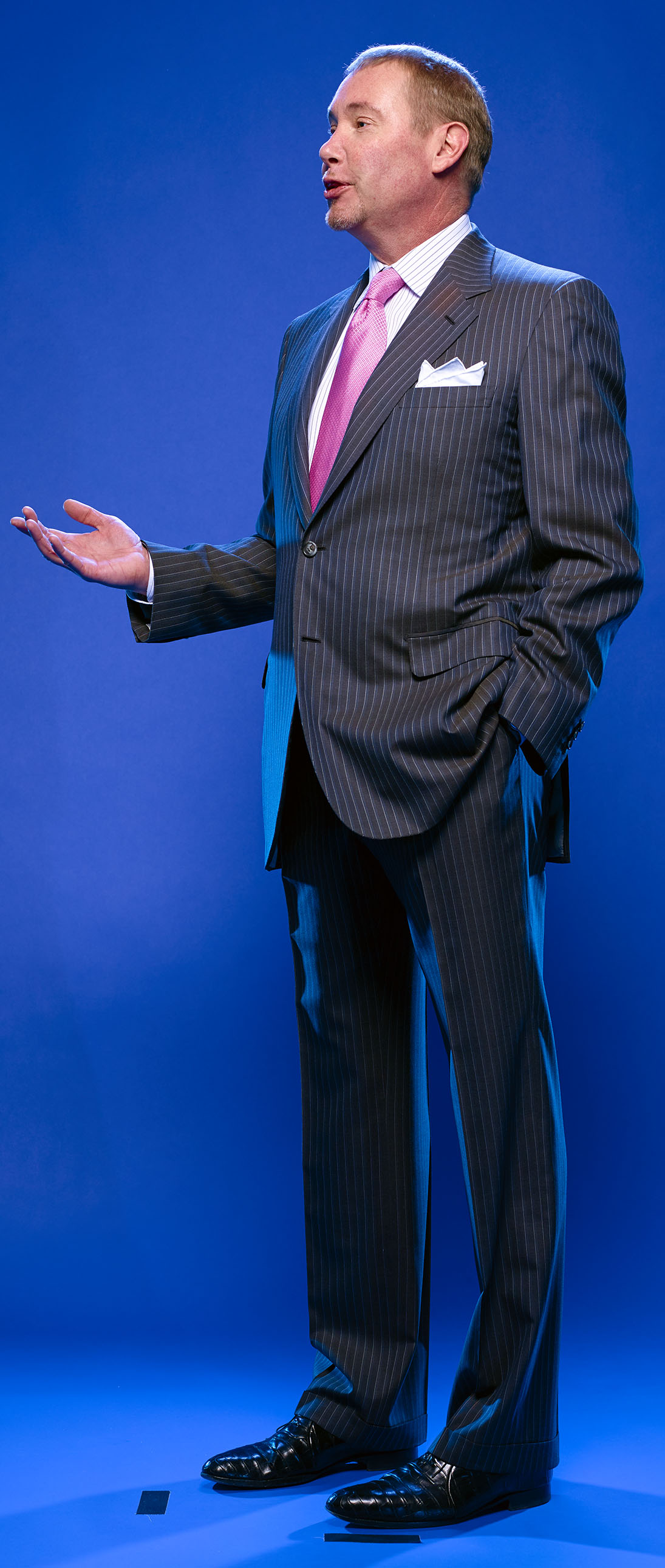
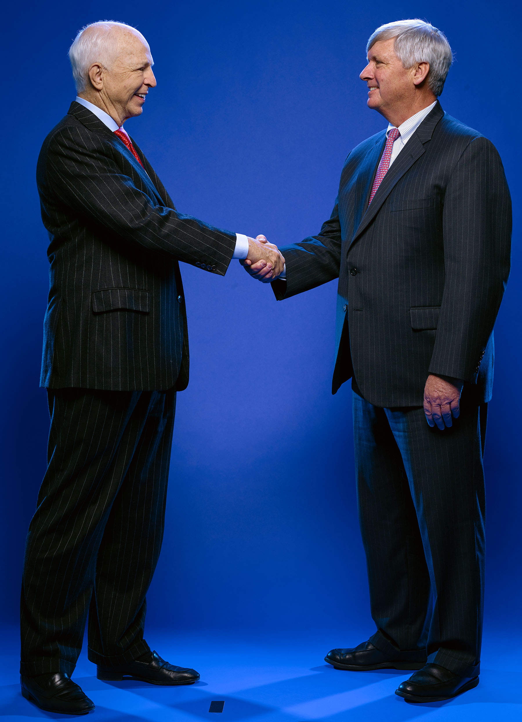
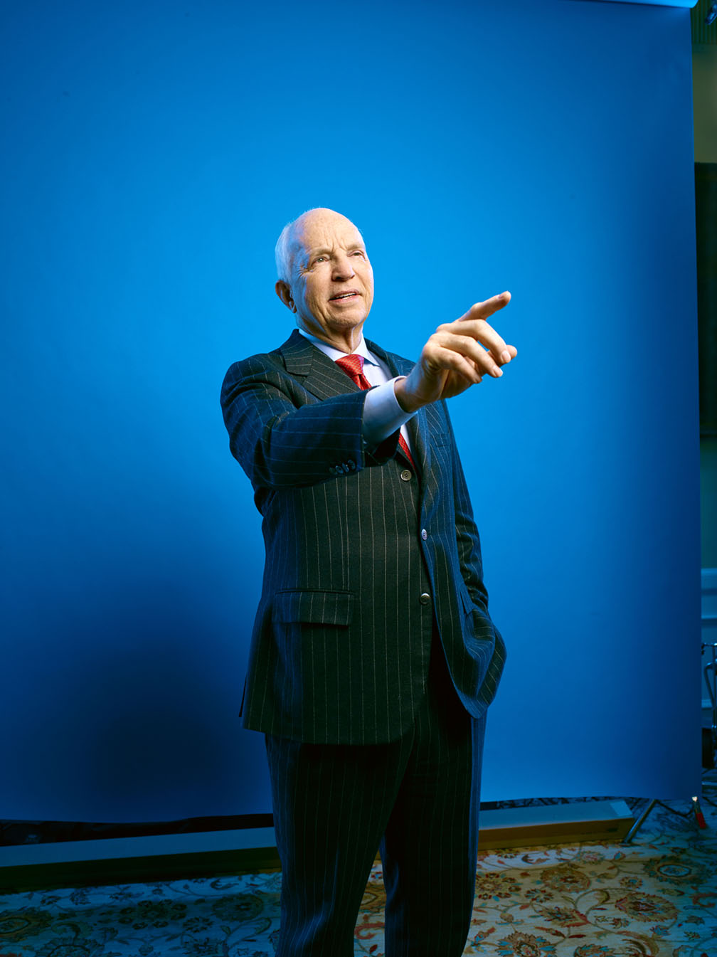
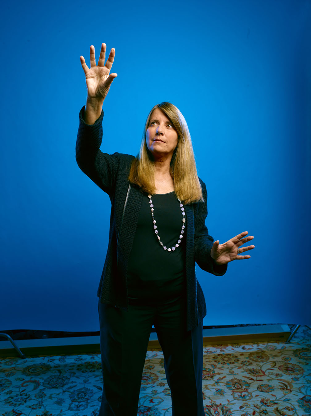
Now we just had to get them to do their best impression of Marcel Marceau without feeling too self conscious…

Point up at the graph…uhhhh….hand…..
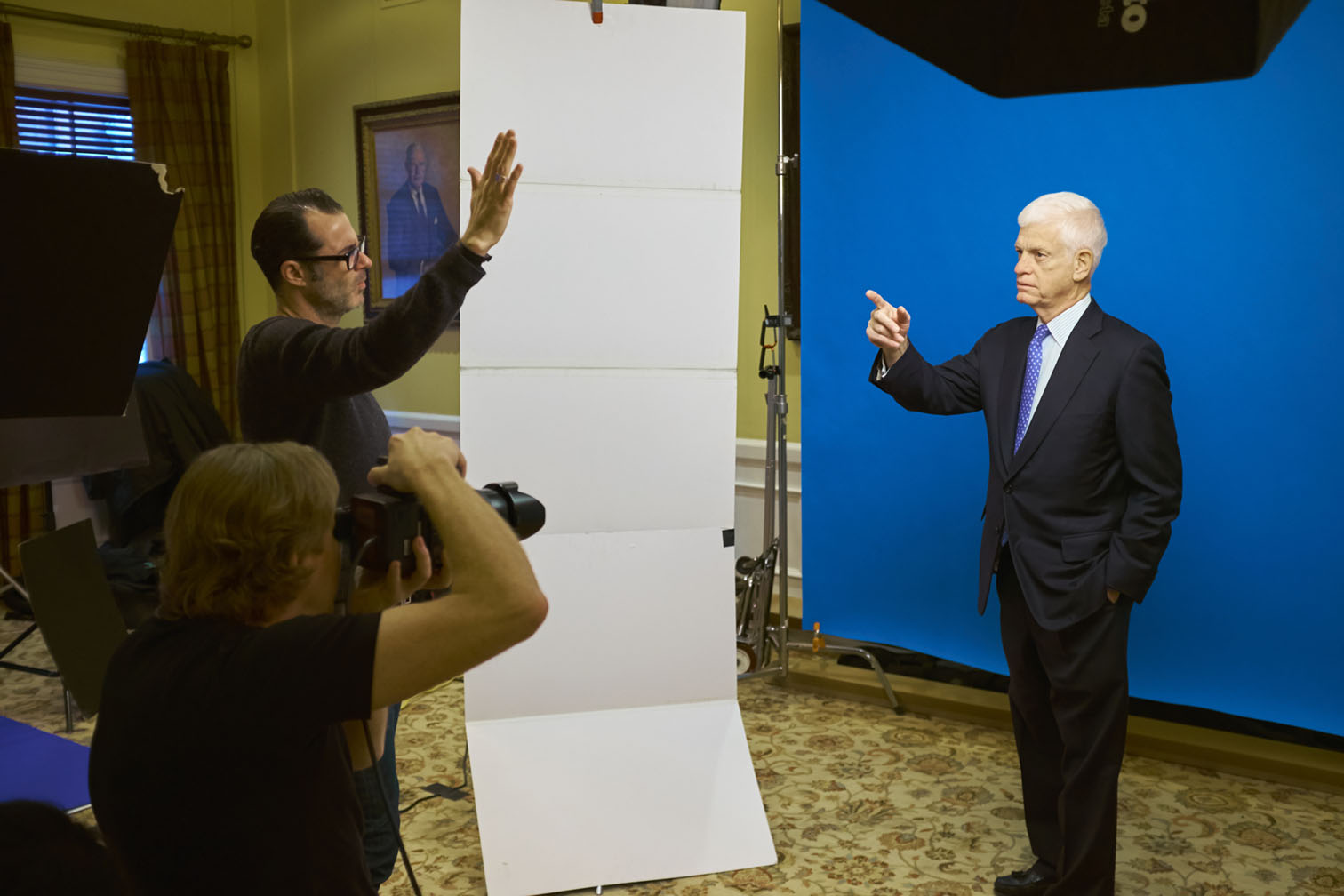
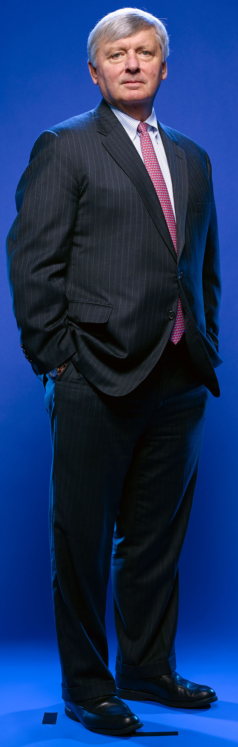
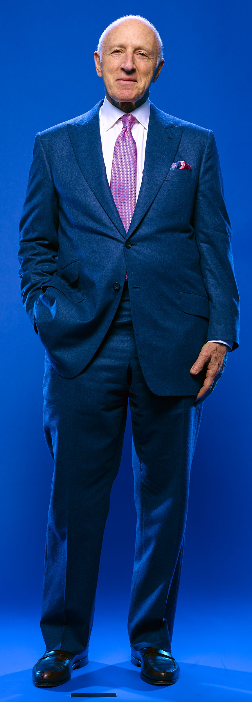
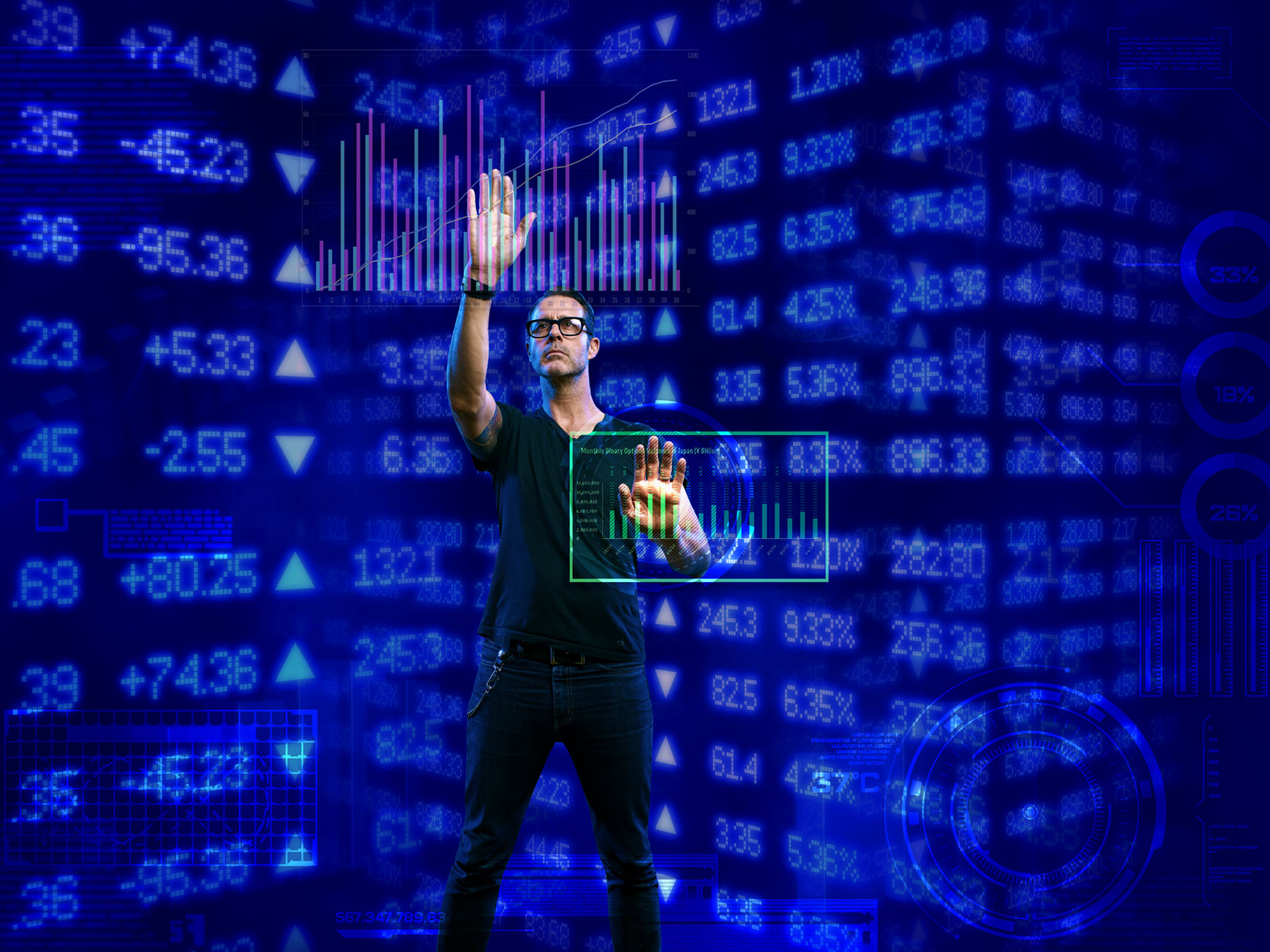
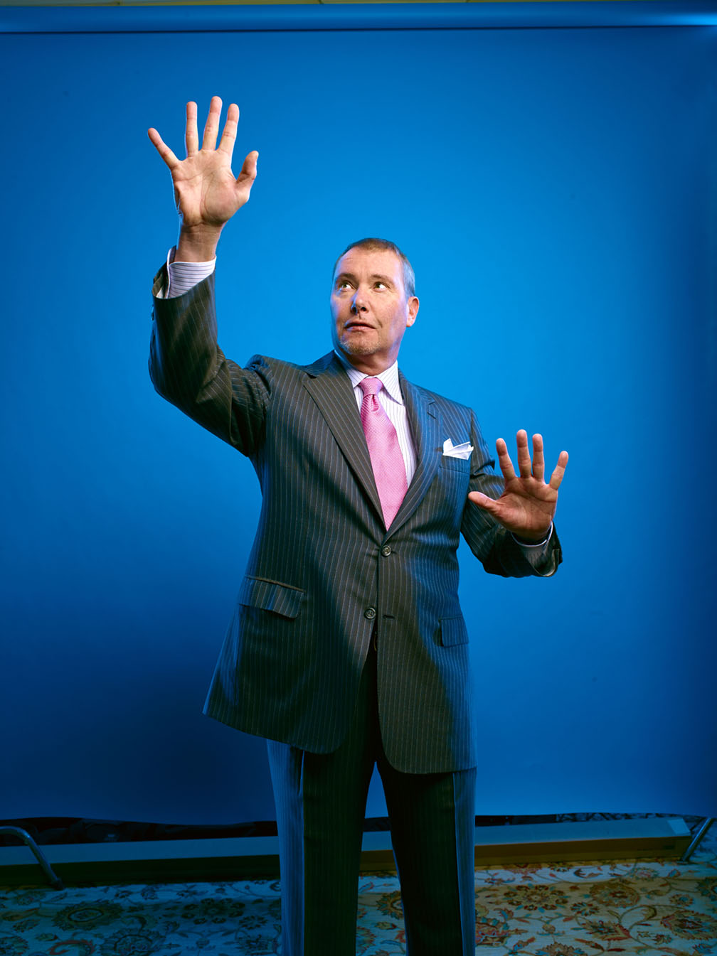
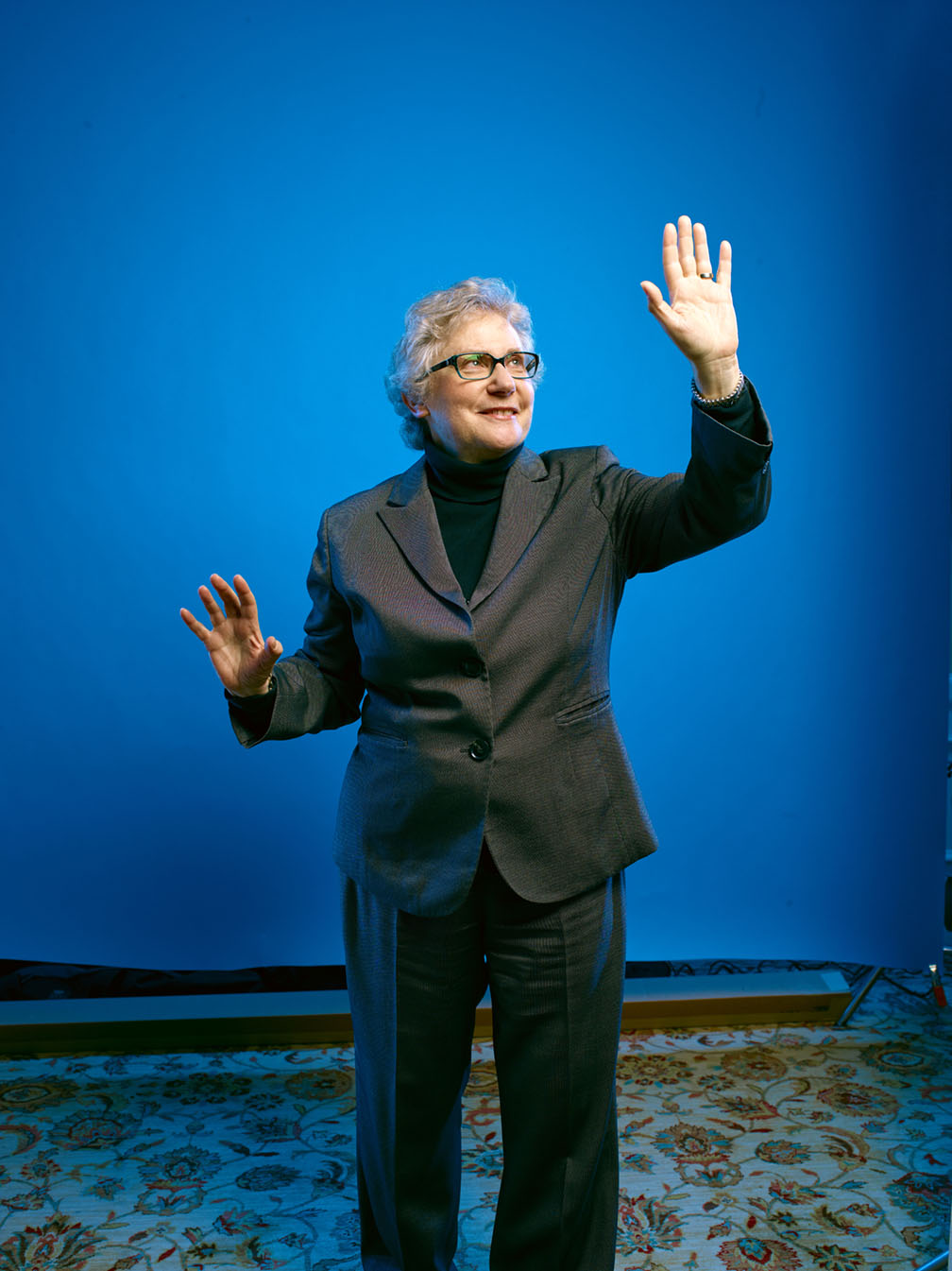
Here are a few of the raw images…
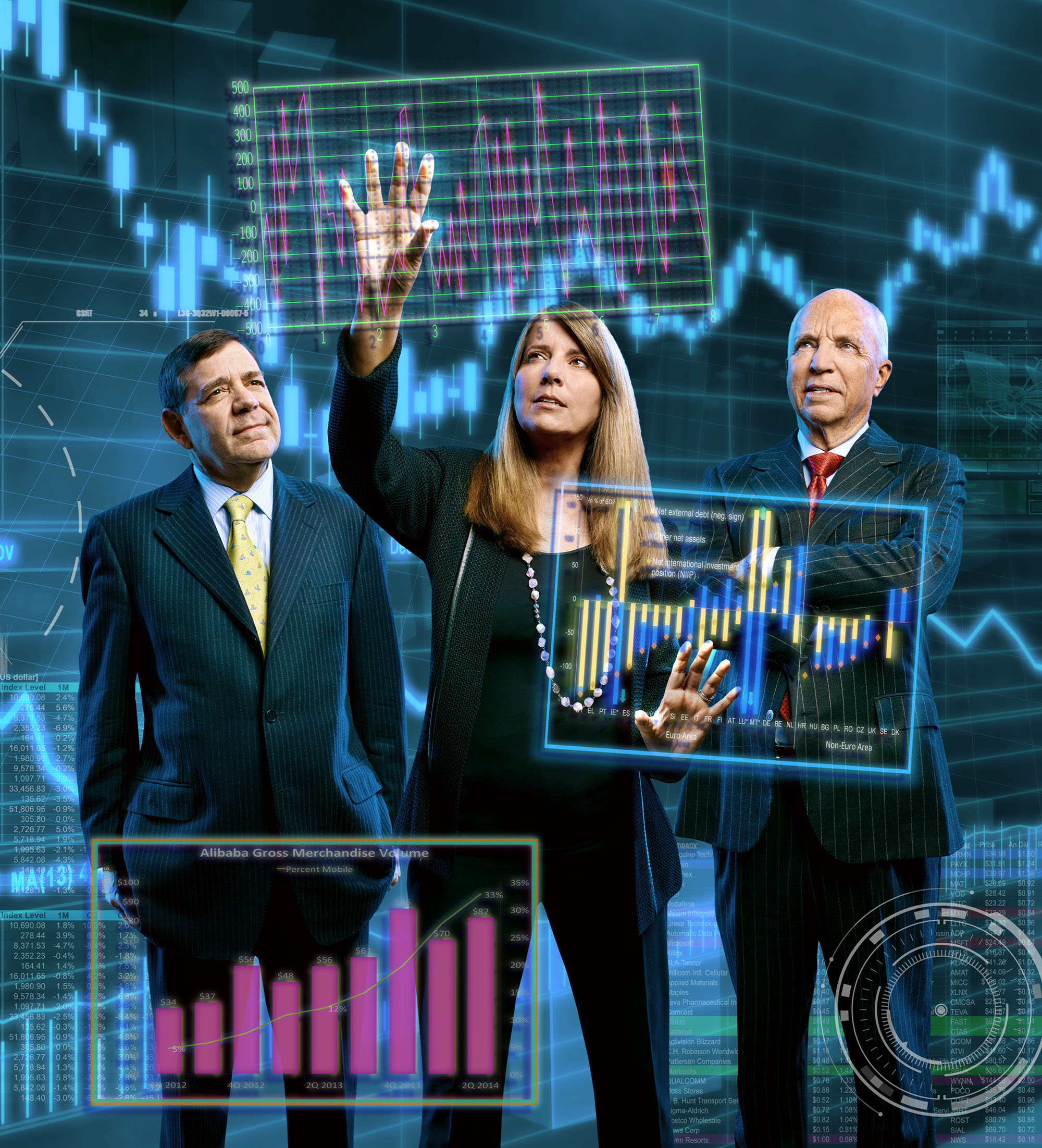
And now comes the fun part…editing through the 1000 images I took to find the few I can use that will actually look like everyone was in the same place at the same time. Then, floating all the graphs in place while remembering I had to save lotsa room for cover headlines. Here’s how the Week Two cover came together…
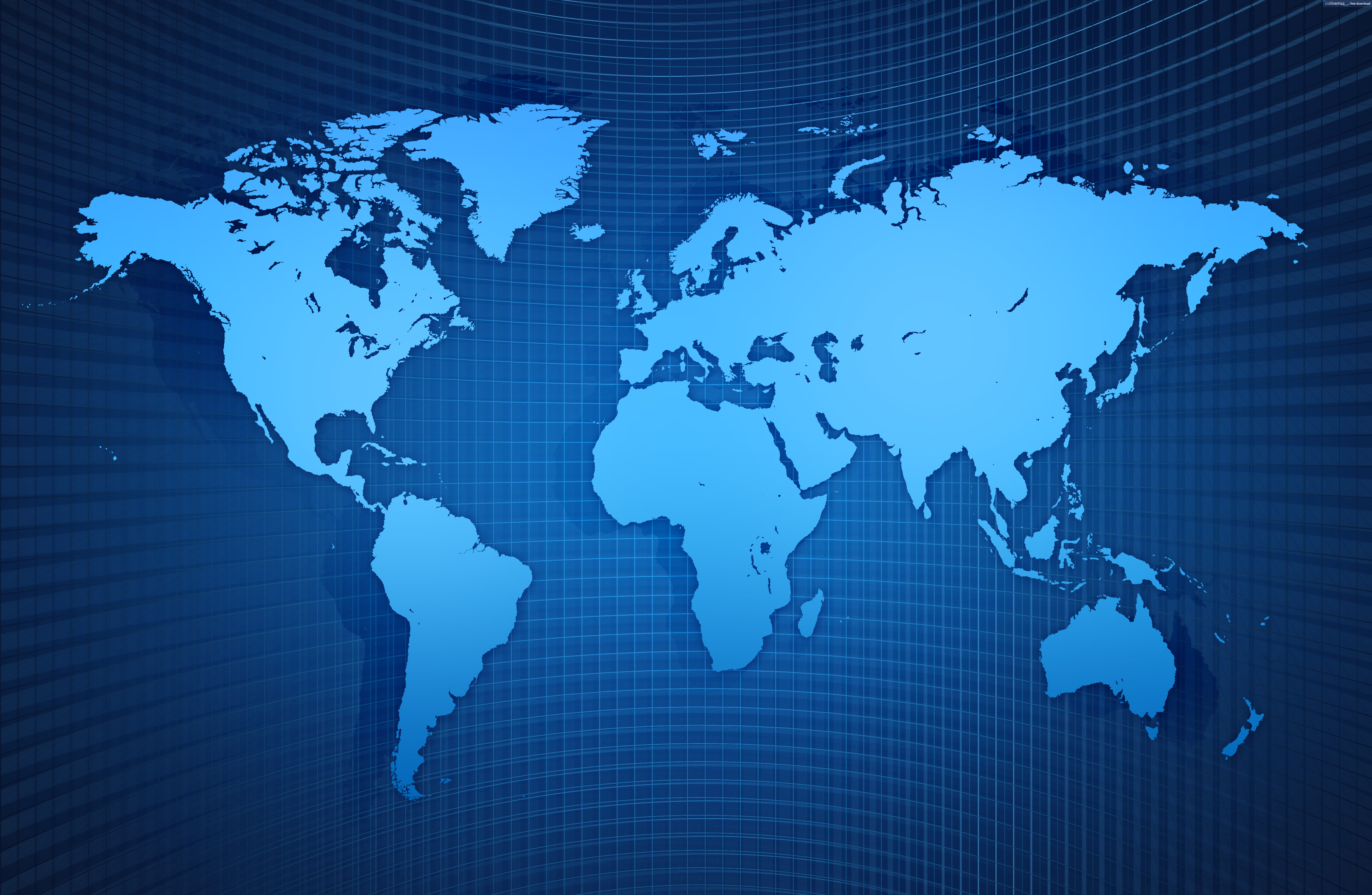
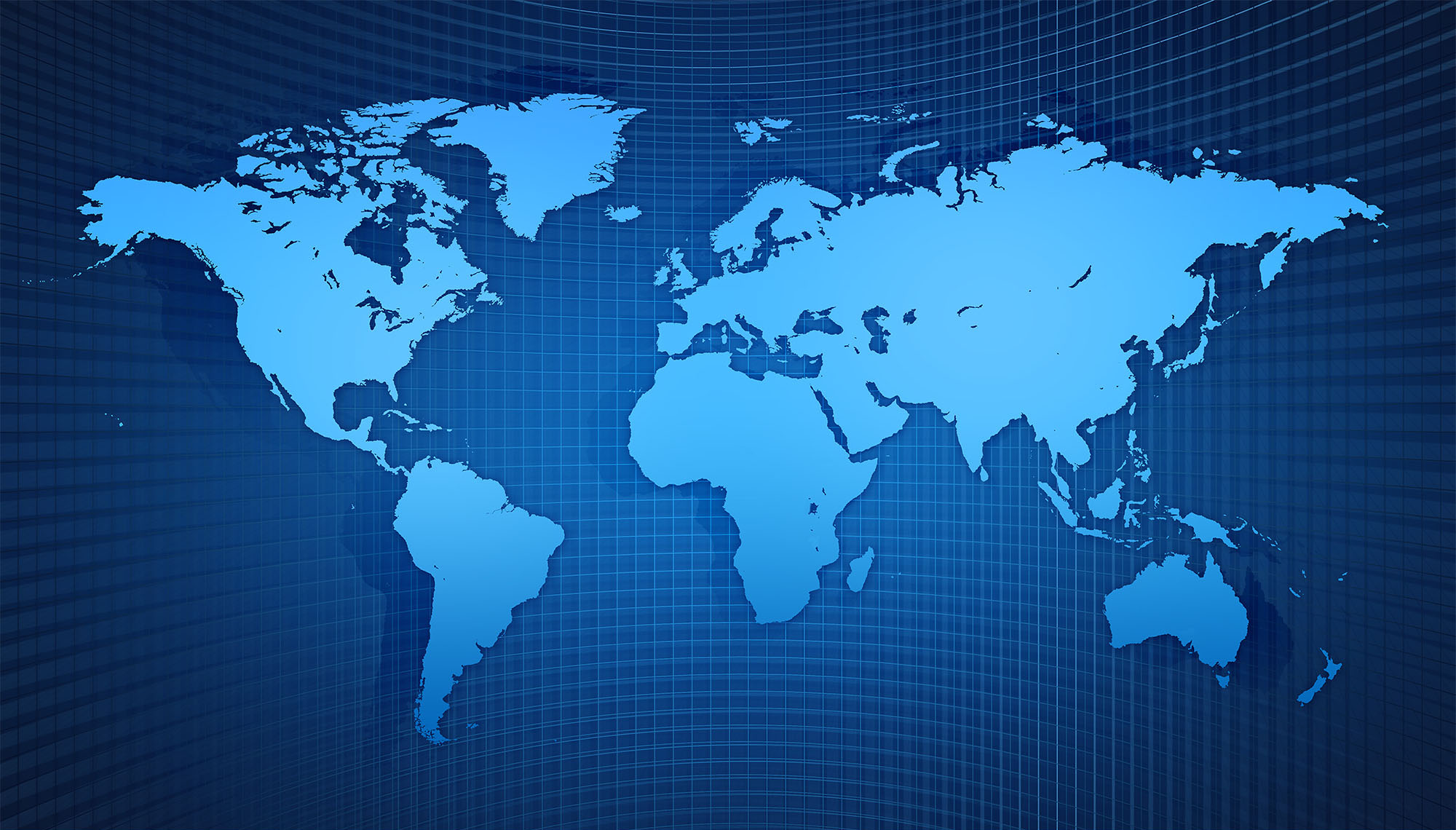
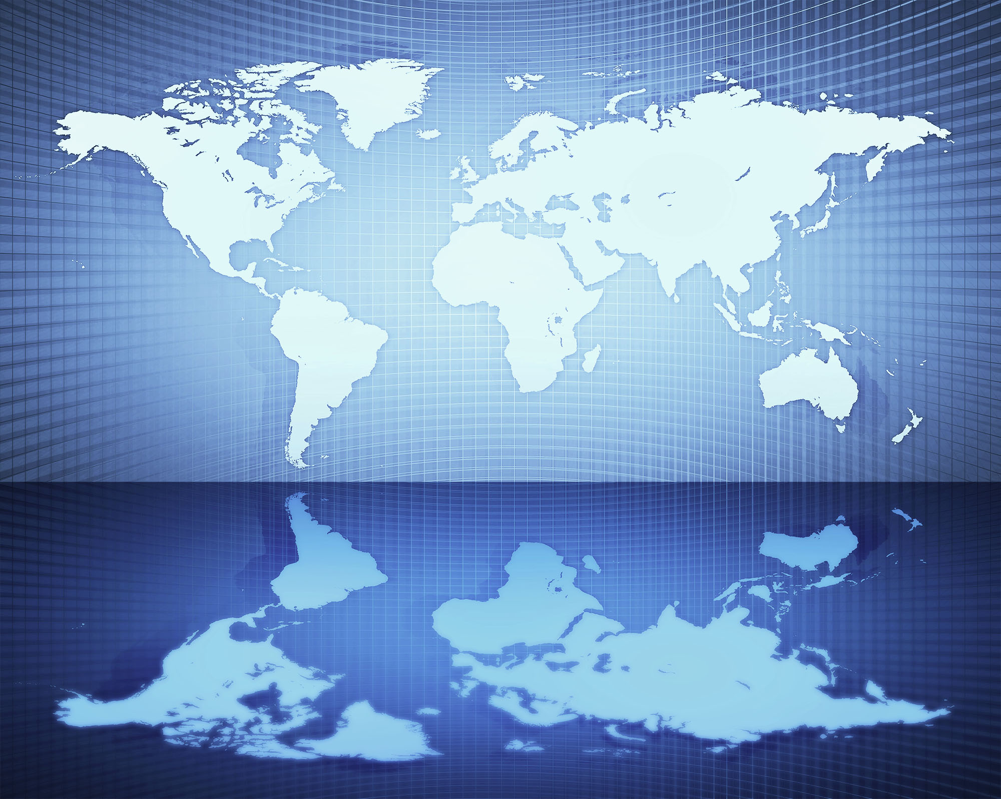
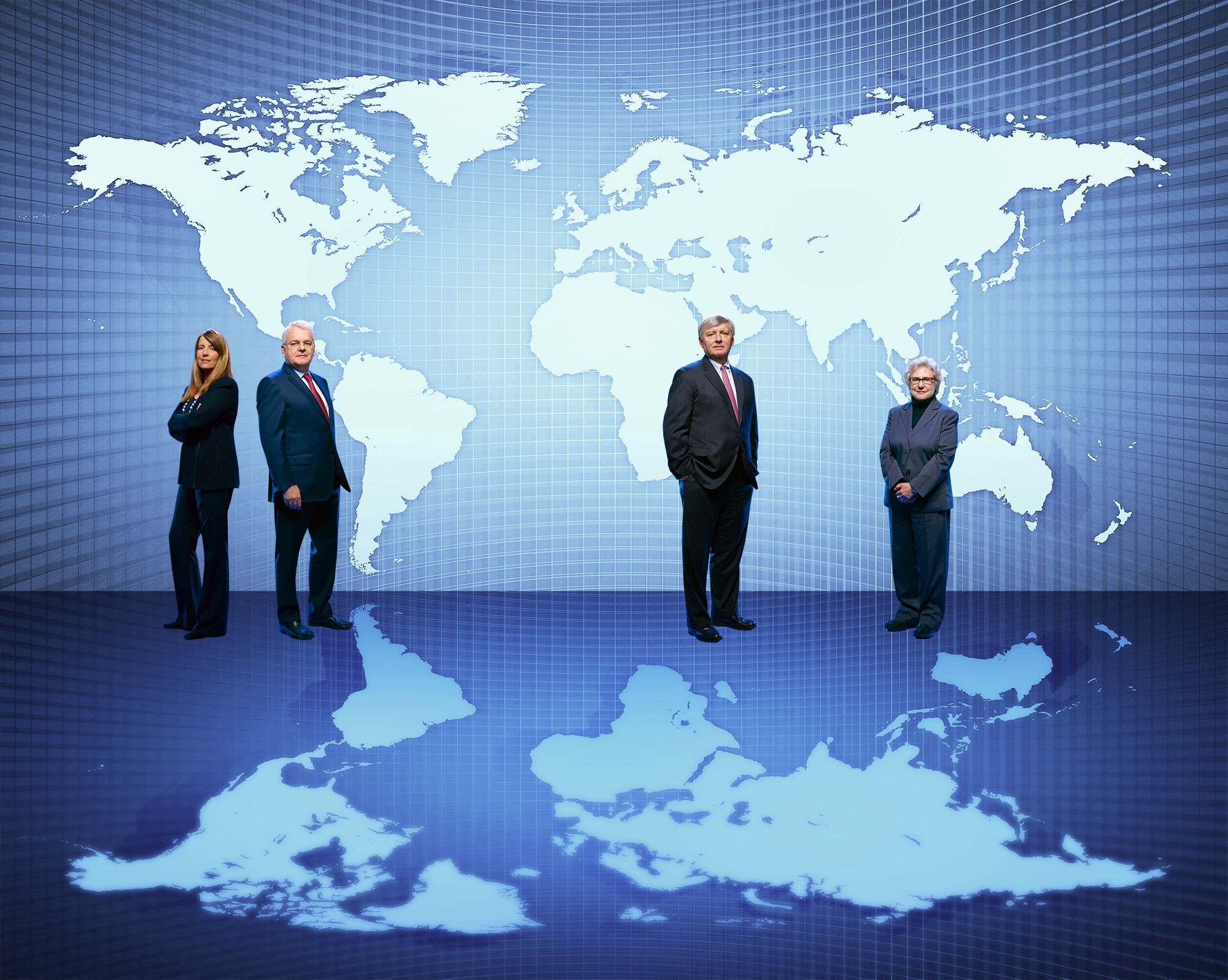
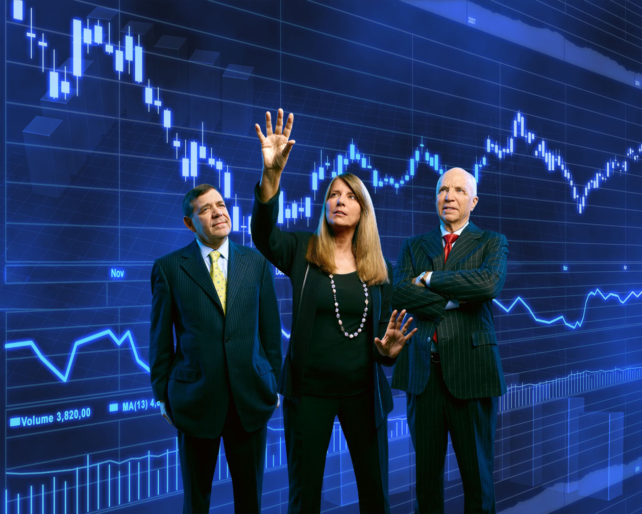
First, the background image…made a bit fuzzier for perspective…

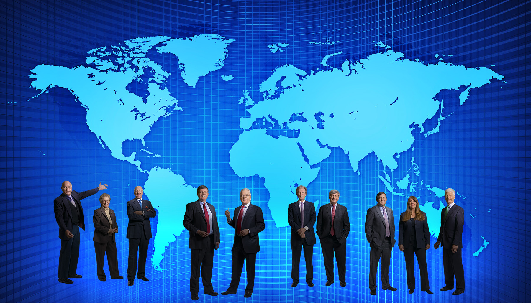
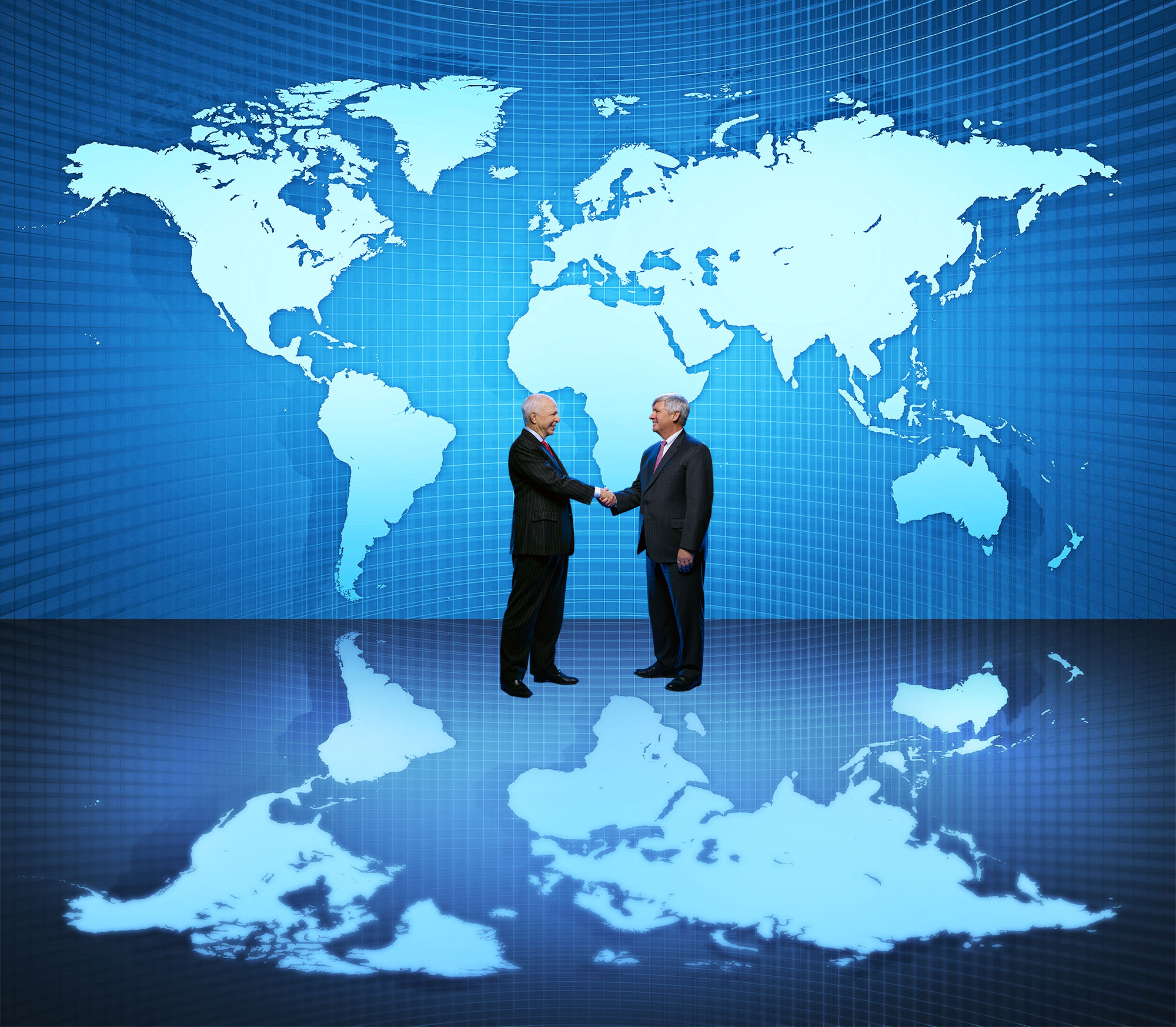
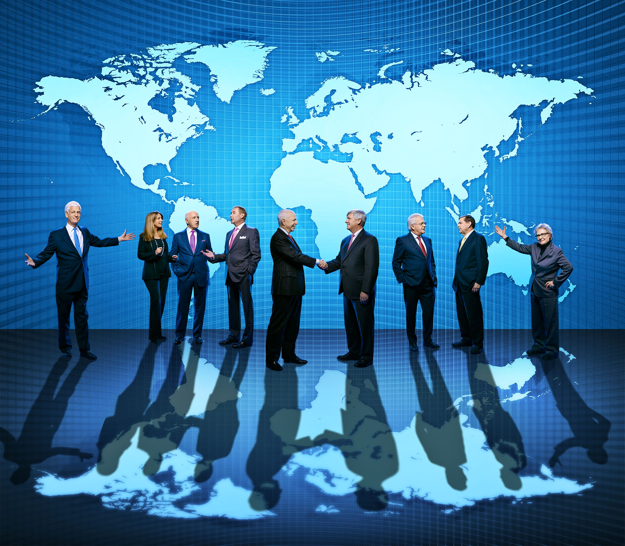
Now, add the people…
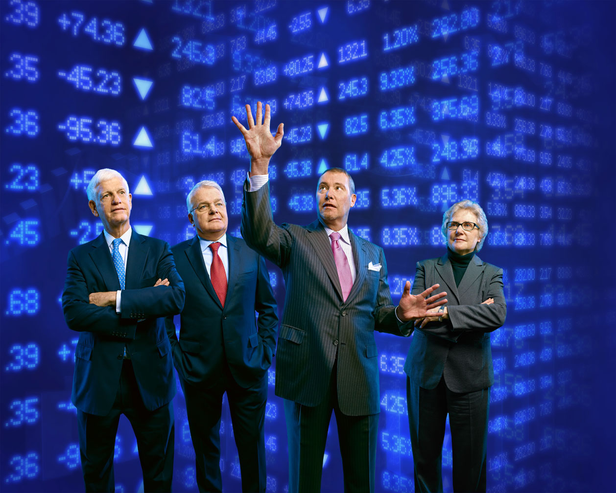
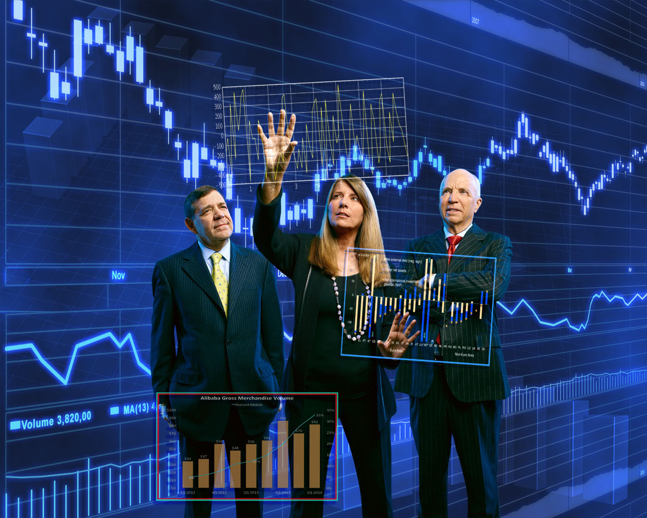
Then, the basic graphs…
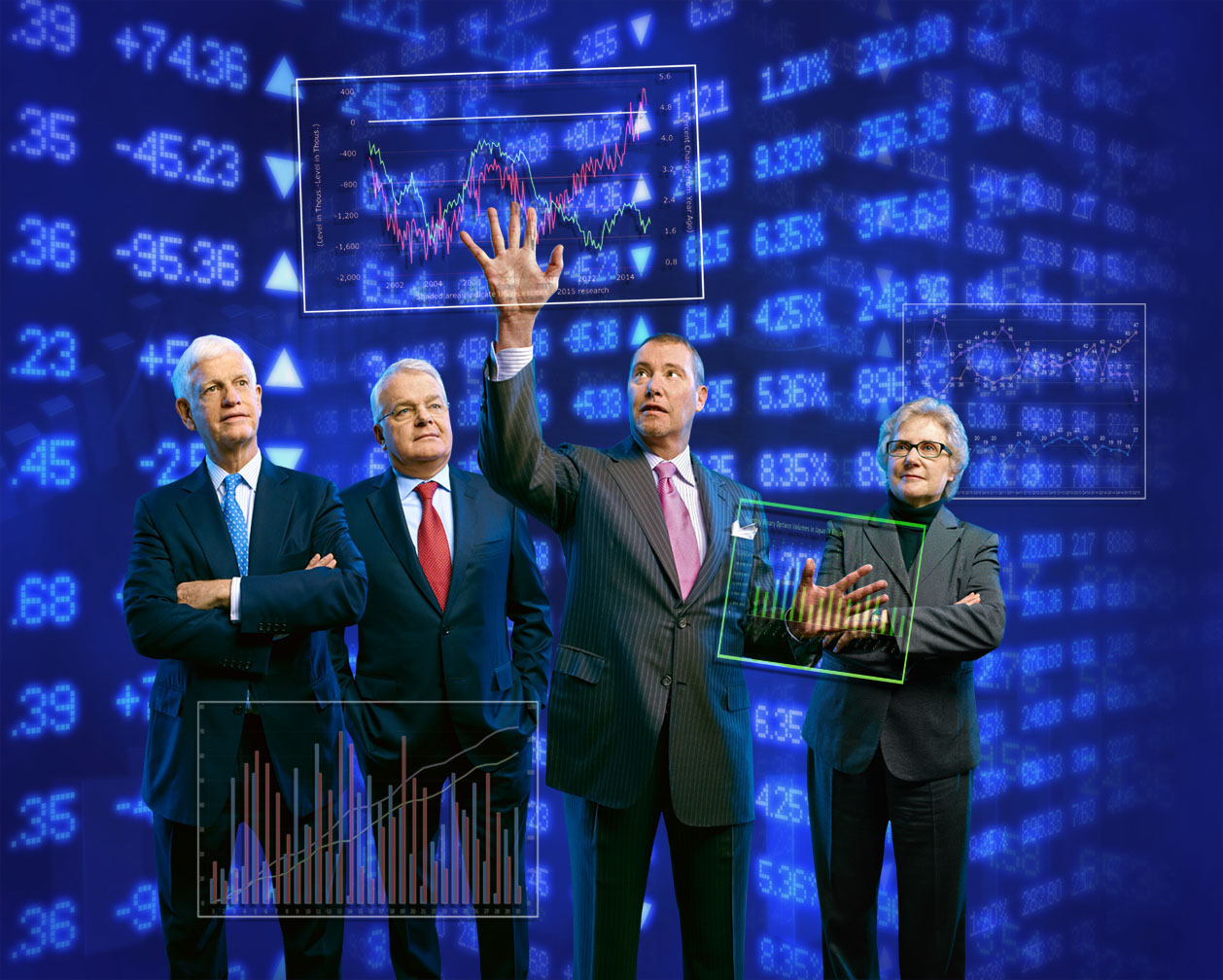
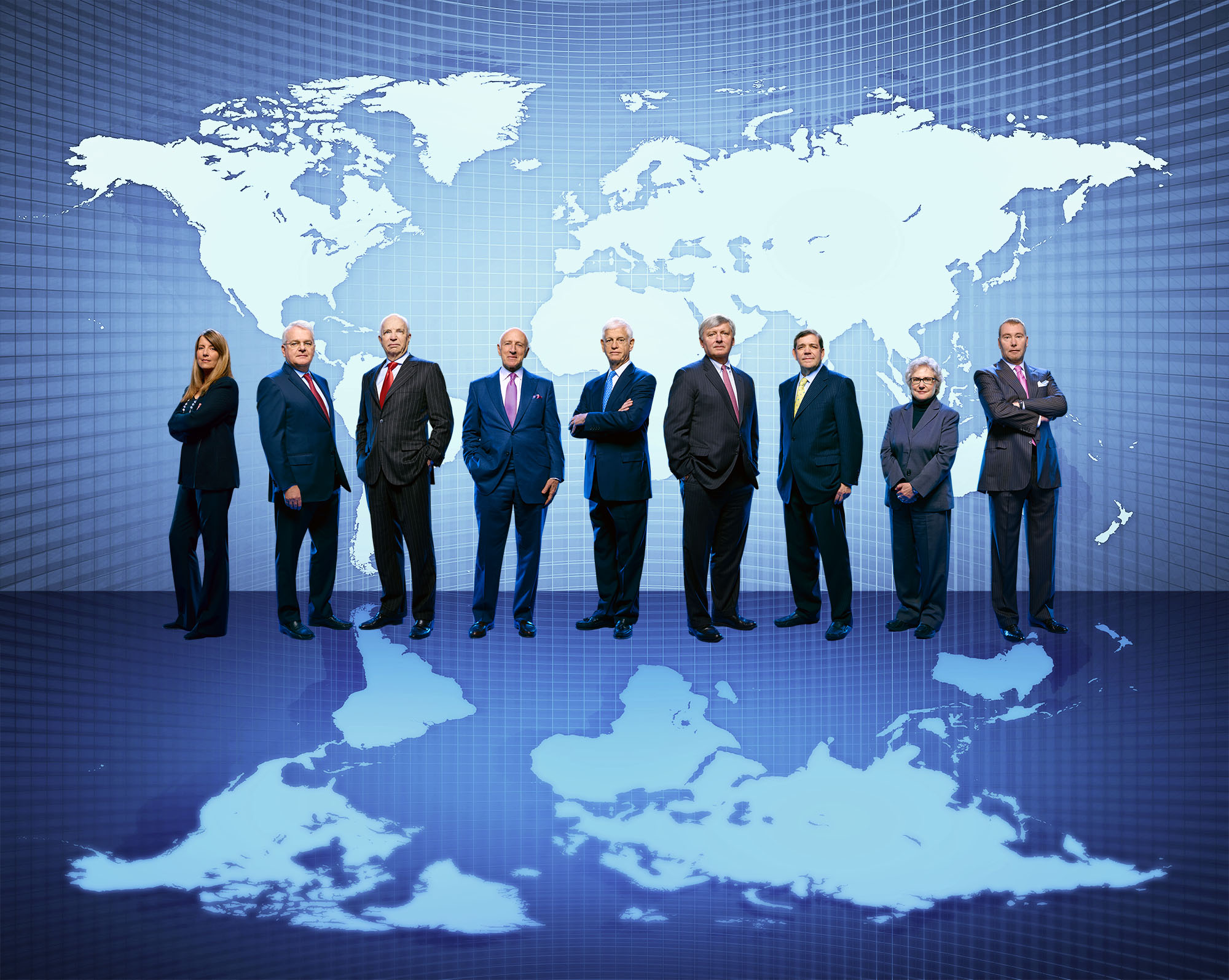
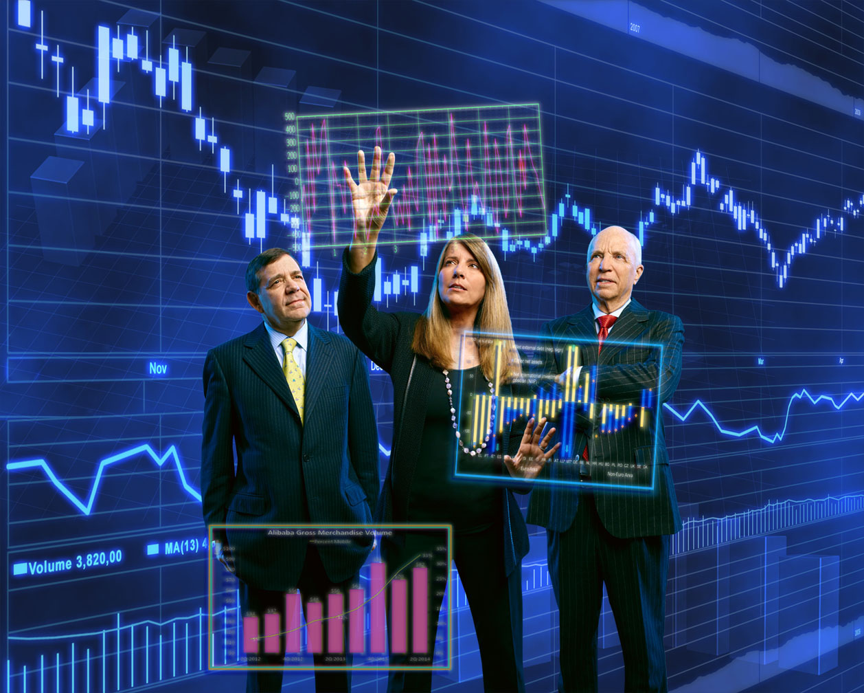
Now I had to add in some shadows, haloes and color shifts to the graphs so they looked like the were actually floating in space…
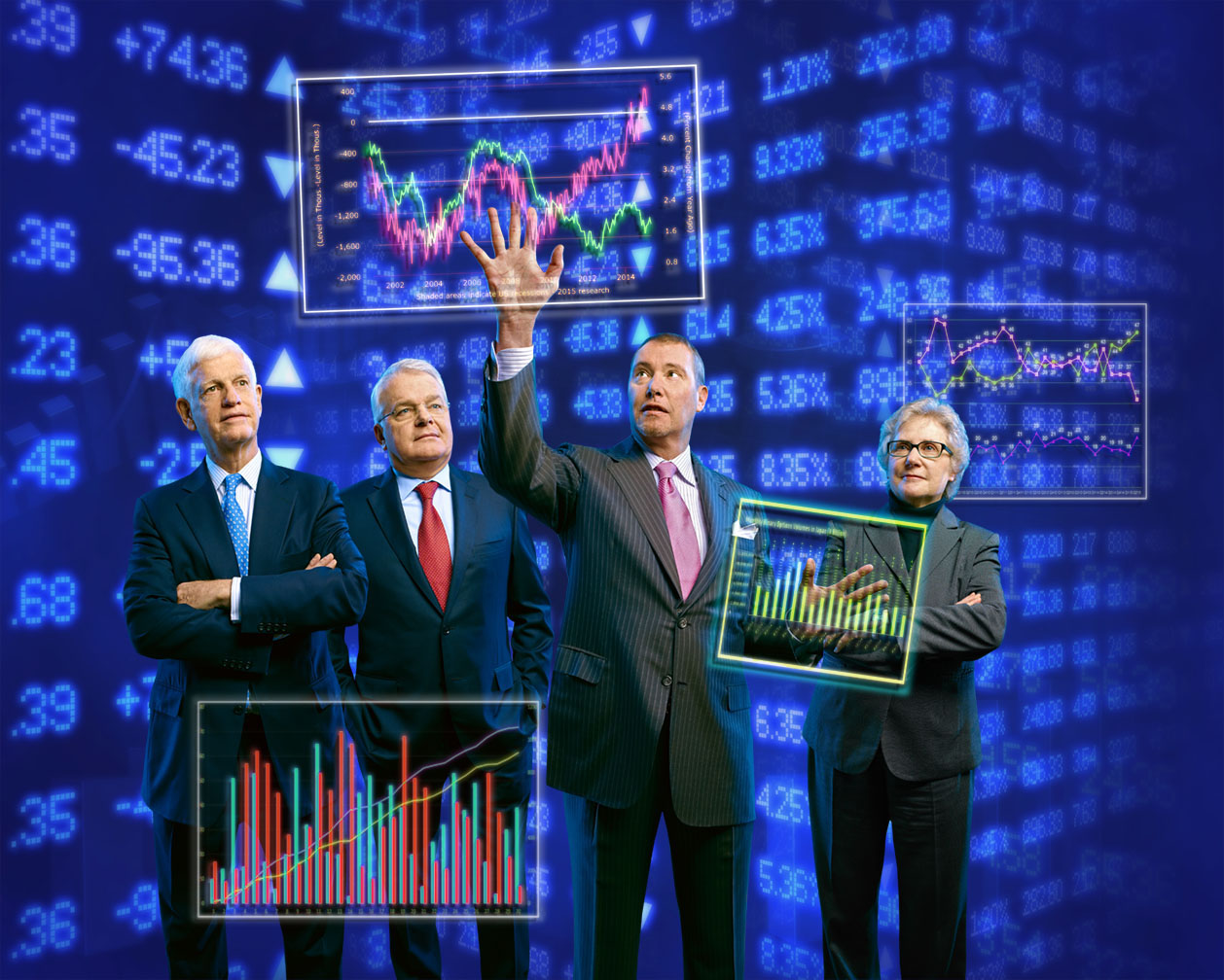
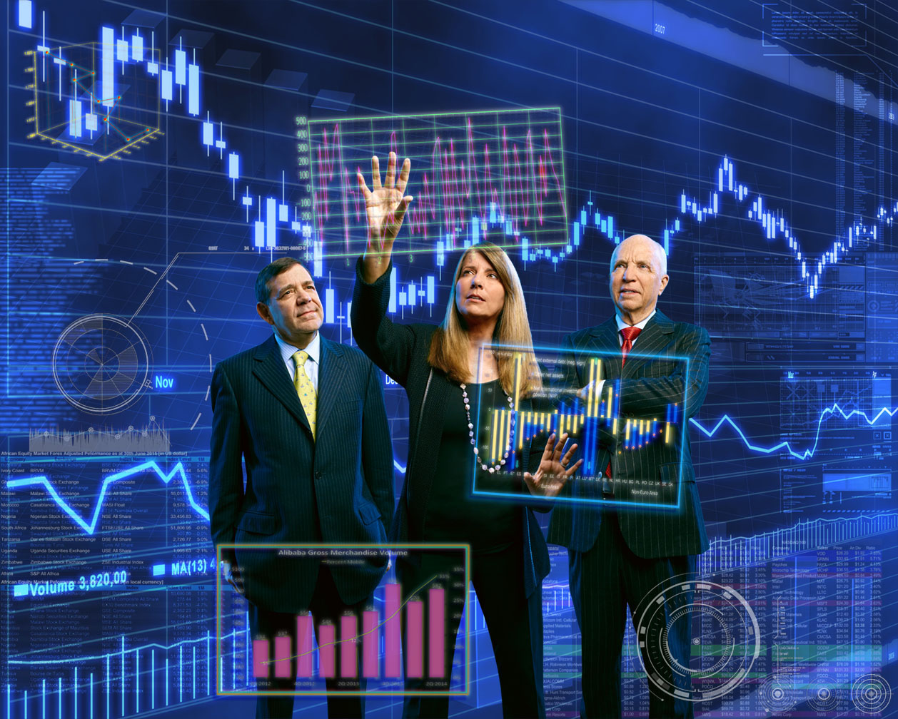
Next I pasted in a few techie-looking graphics and charts…

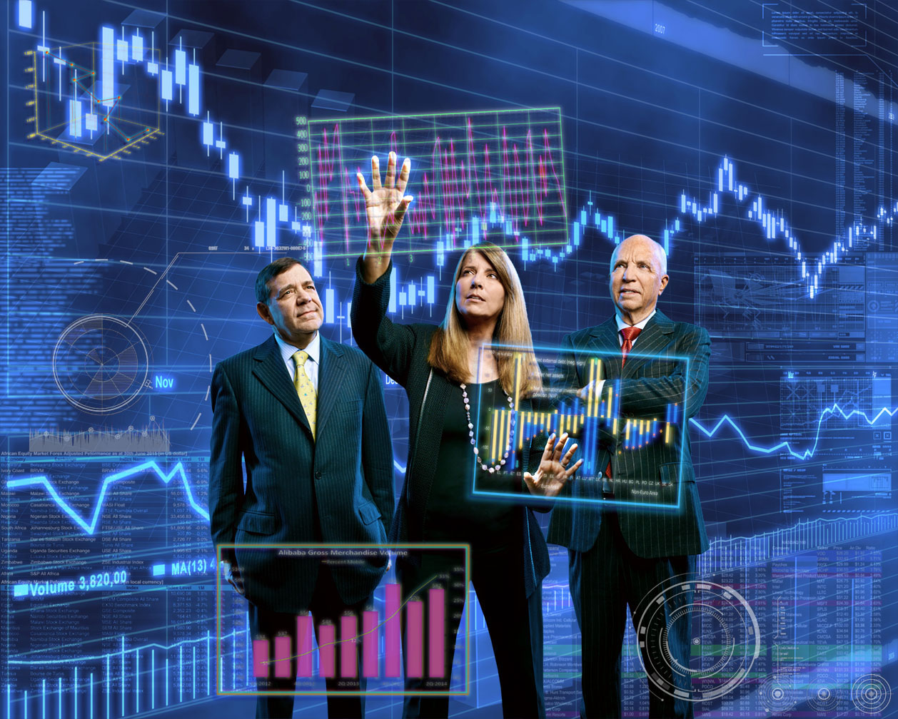
I decided to tone down the blue of the background cuz it as taking away from the overall dark mood I was aiming for…
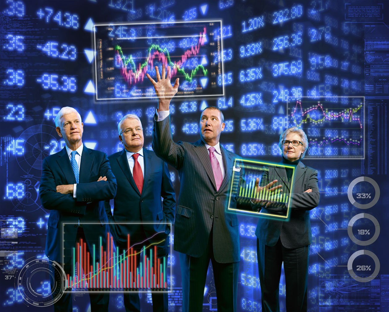
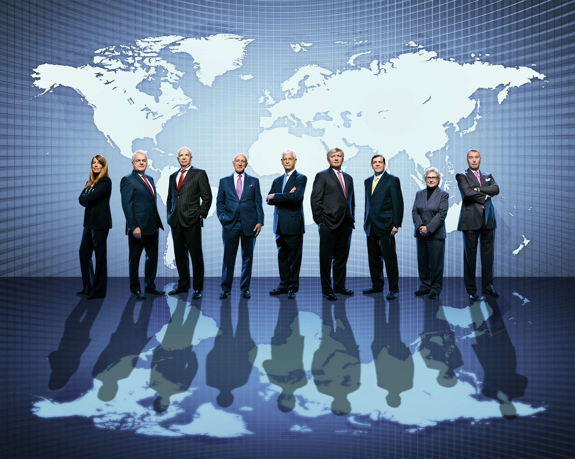
And finally I increased the contrast, desaturated the skin tones and added a glow around the fingertips…
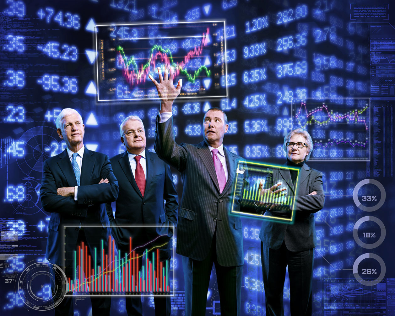
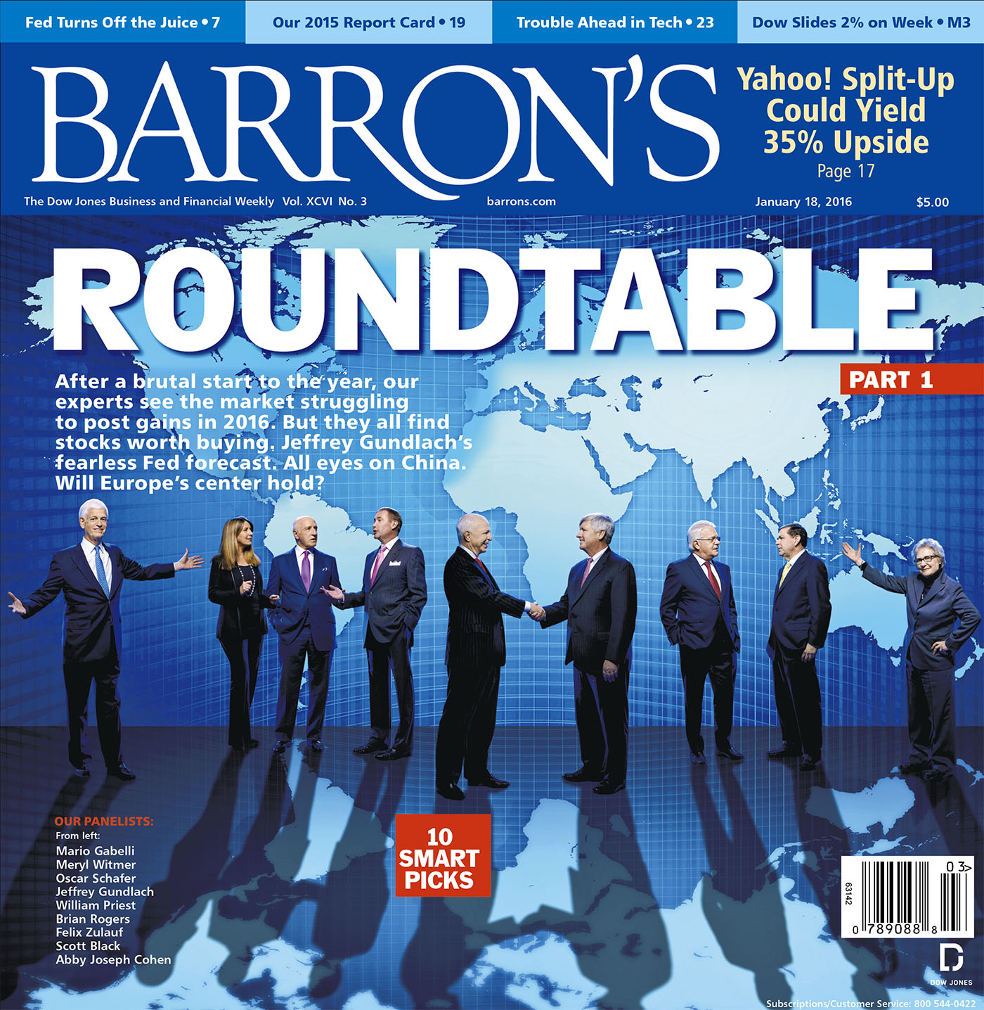
Our final cover…

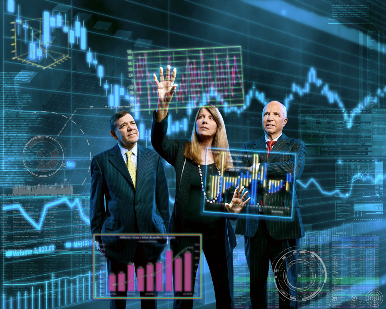
Using the same steps, I worked up another image for the opener…
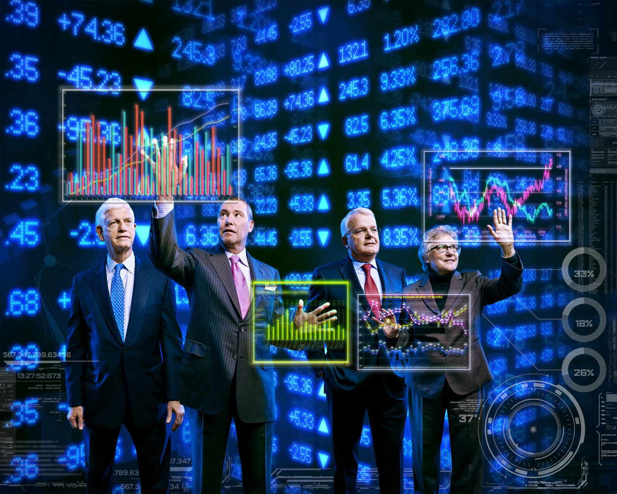

The Week Three images came together pretty much the same…


For the final steps, I messed with the focus on the background cuz it was drawing attention away from the foreground and shifted the overall blue cast more towards cyan/green…
Here’s the Week Three cover…
…and the opener…

Now if all that Photoshop geek talk hasn’t put you to sleep and you’re hankerin’ for more, you can watch the layers progressions on both cover images in these two YouTube videos…and then I promise, no more Roundtable talk for a while…..
Week Two Cover Layers:
Week Three Cover Layers: